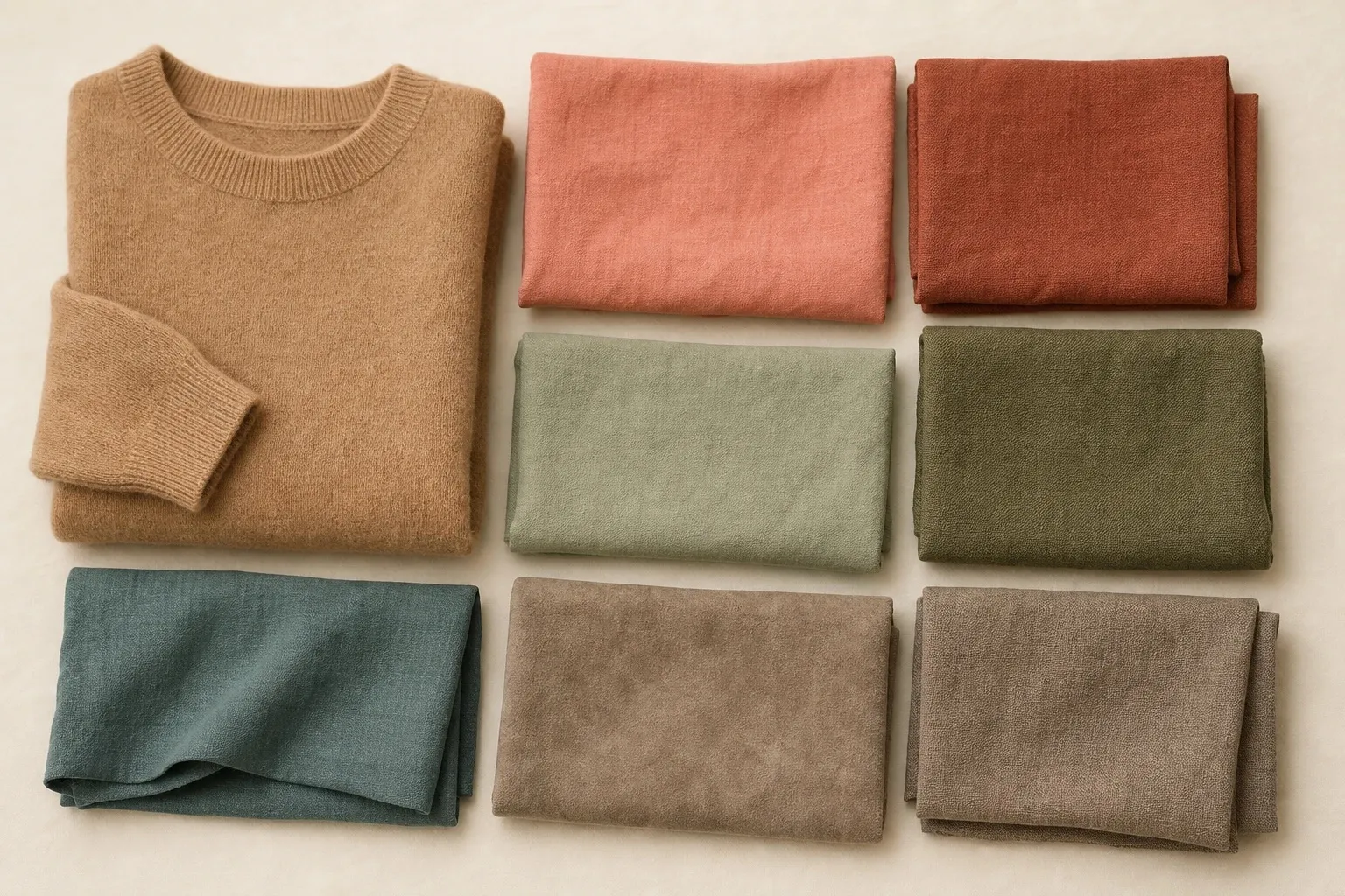
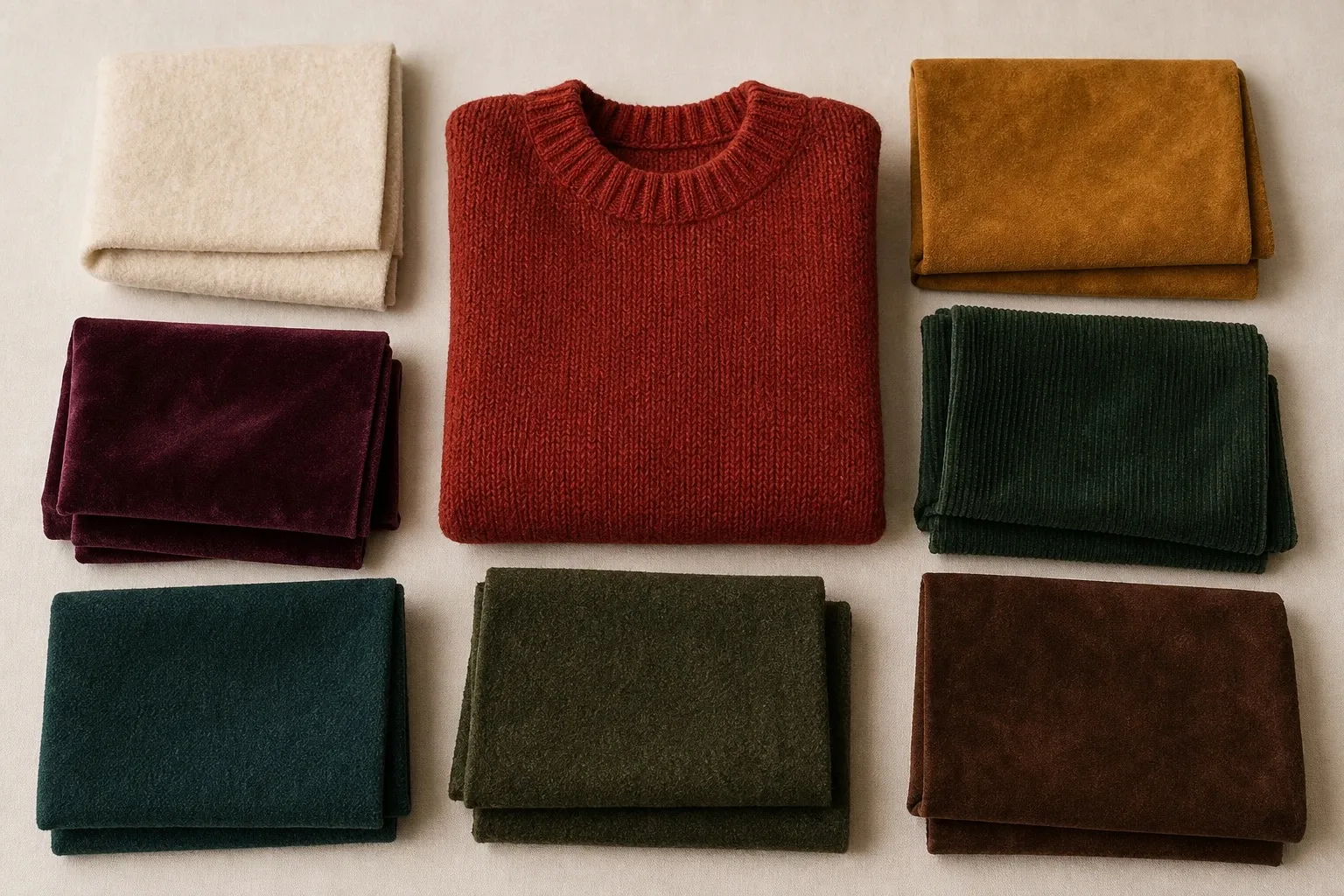
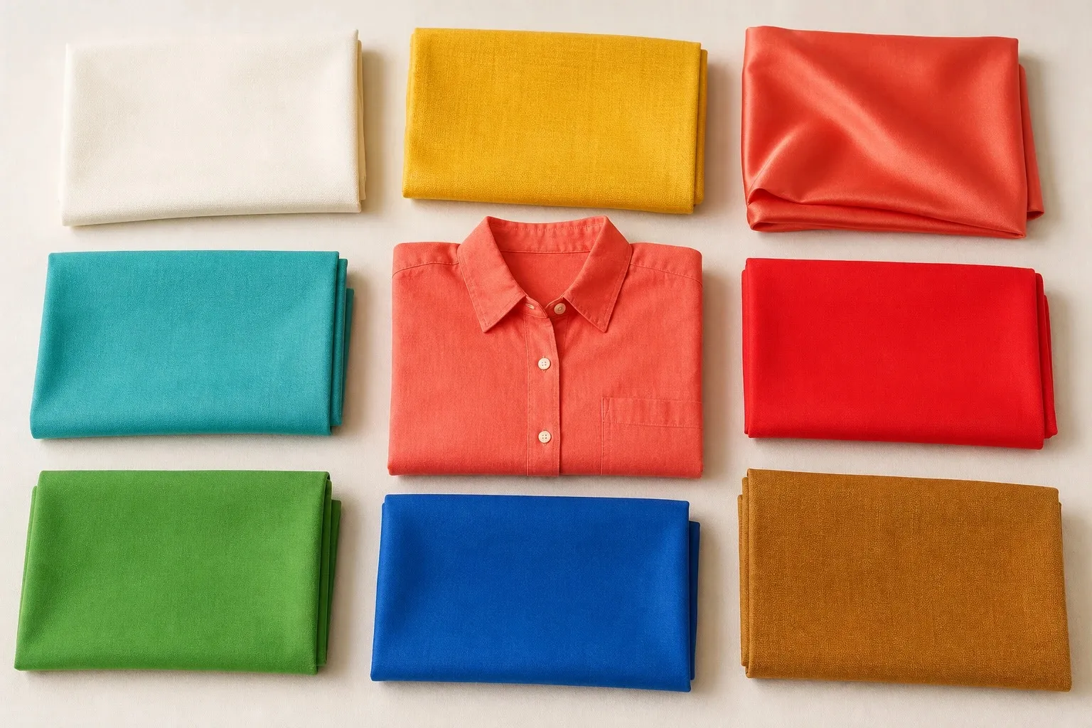
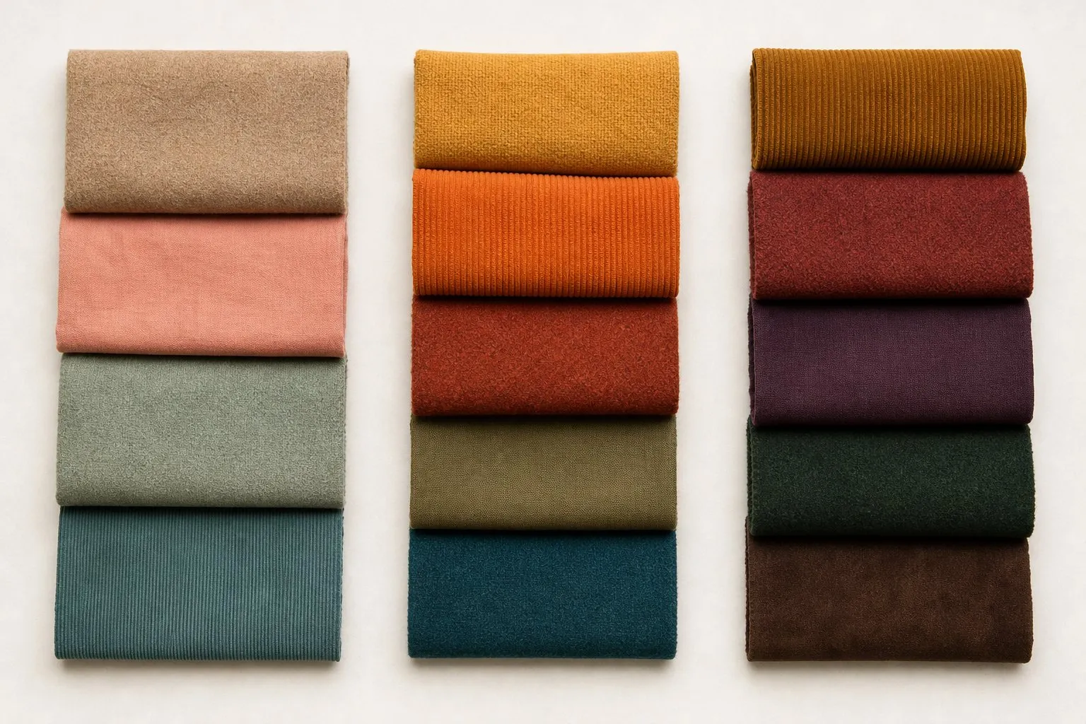
True Autumn, also called Warm Autumn, is the warmest of the three Autumns: golden, earthy and rich rather than clear, like spice and turning leaves. Its palette sets rust, mustard, pumpkin, olive, forest and deep teal on a base of cream and chocolate. Warmth is the leading trait, so the colors that fail are the cool ones: cool pinks, icy colors and pure white. If you know you are warm but not which Autumn, six questions further down sort Soft, True and Deep.
- cream
- mustard
- pumpkin
- rust
- olive
- forest
- deep teal
- chocolate
The Color Season Quiz ranks temperature, depth and clarity from twelve answers. When temperature leads and leans warm, the clarity reading decides between this season and True Spring.
What True Autumn looks like
Warmth shows up everywhere in True Autumn coloring. Skin tends to look golden, peachy, bronze or warm beige, at any depth from fair to deep. Natural hair usually has red or gold in it: copper, auburn and golden chestnut are common, and the glints show in sunlight even when the hair reads brown indoors. Eyes are often warm green, amber, topaz, golden hazel or warm brown. Contrast between hair, skin and eyes is medium, neither blended nor stark.
On the three axes, temperature leads by a clear margin. Chroma comes next and sits on the rich side of the middle: every color is saturated enough to hold its own, with a little brown in it. Depth is medium to deep. This is the original Autumn. The books that made color analysis popular, Bernice Kentner’s Color Me a Season (1979) and Carole Jackson’s Color Me Beautiful (1980), sorted people into four seasons with one warm Autumn; twelve-season analysis keeps that Autumn as True Autumn and places Soft and Deep Autumn on either side of it.
Undertones and color seasons are a styling framework, not a measurement of your skin. The tests here compare colors side by side, which anyone can repeat in daylight. On a True Autumn the result tends to be easy to read, because warmth leads: cool pinks make the skin look sallow or gray, and pure white makes it look yellow by comparison.
A quick mirror check takes two scarves. In daylight, hold a rust scarf and then a raspberry one under your chin. If the rust evens out your skin and the raspberry brings up redness around the nose or a gray tone along the jaw, warmth is doing the work, which is the first sign of this season.
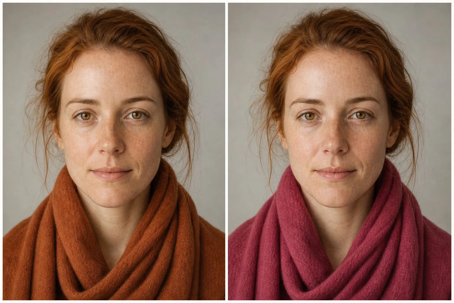
Red hair on its own does not settle the season. Copper and auburn are warm, but clarity and depth still count: bright copper hair with clear eyes and light skin can test as True Spring, and dark auburn with very dark eyes can lean Deep Autumn.
The True Autumn color palette
The eight core colors split into a frame of cream and chocolate and six accents. “Rich” sits between the dusty colors of Soft Autumn and the clear ones of True Spring: each hue has enough saturation to hold its own and just enough brown to keep it from looking bright.
| Role | From the palette | Same family, worth adding | What it does |
|---|---|---|---|
| Light neutral | Cream | Ecru | Shirts and tops at the neckline |
| Mid neutrals | None of the eight | Camel, khaki | Coats, jackets, knitwear |
| Dark neutral | Chocolate | Warm brown | Trousers, boots, bags; replaces black |
| Reds and oranges | Rust, pumpkin | Tomato | Knits and scarves; rust is the signature |
| Yellow | Mustard | Honey | Scarves, tops, a knit |
| Greens | Olive, forest | Moss | Jackets, knits, prints |
| Blue-green | Deep teal | None | The palette’s only blue |
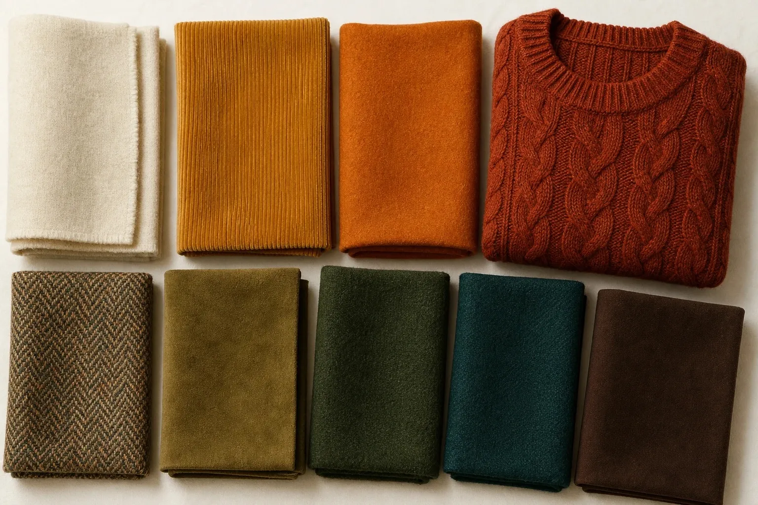
Rust is the natural signature color: it sits at the warm center of the set and repeats the copper in True Autumn hair. Deep teal is the one blue-green, and it belongs because it is dark and leans green rather than blue. Mustard is the yellow, golden with brown in it, and pumpkin the true orange.
The shared names show how the family is built. Olive appears in the Soft Autumn palette too, and forest and chocolate in the Deep Autumn palette, but the shades shift: the True Autumn olive is deeper and richer than Soft Autumn’s, and the Deep Autumn forest and chocolate are darker than yours. Moving through the family changes how muted or how dark the shared colors become.
Neutrals: cream, camel and chocolate
True Autumn neutrals are cream for tops near the face, camel and khaki in the middle, and chocolate as the dark. The step from cream to chocolate is a medium contrast, which echoes the medium contrast in your face. A stark black-and-white outfit is louder than the person wearing it; chocolate with cream keeps the same idea at your level.
Black. Black is not in the True Autumn palette, though it is not on the avoid list either. It is colder and starker than warm, medium-contrast coloring, so near the face it reads as a hard frame. Chocolate does its job: a chocolate coat, chocolate trousers, a chocolate knit. Black boots or a black bag further down cost little.
White. Pure white is on the avoid list, and the reason is glare. Next to optical white, warm skin looks yellow; cream keeps the brightness without the clash. One of the quiz’s twelve questions offers “cream or ivory” as an answer, and it counts as warm. For a wedding dress, look at cream, deep ivory or champagne before anything labeled bright white.
Navy. No Autumn palette has a plain blue, and chocolate rather than navy is the dark neutral here. Near the face, wear deep teal instead. A navy coat you already own can stay, with a cream or rust scarf between it and your face.
Gray. Cool, silvery gray is the weakest neutral for this season: it misses on temperature, the trait that matters most here, and leaves warm skin looking flat. If you want a gray, choose one with warmth in it, such as a taupe or a greenish khaki. Camel does the same job with more life.
Best True Autumn colors by hue
Warmth is the rule for every hue. The True Autumn version leans yellow or orange and has enough brown in it to look rich rather than bright, and the clear version of the same hue usually belongs to True Spring.
| Hue | Your version | Leave to True Spring | Skip near the face |
|---|---|---|---|
| Red | Rust, tomato | Poppy | Cherry, blue-red |
| Pink | Warm coral-brown | Coral-pink | Fuchsia, baby pink, icy pink |
| Orange | Pumpkin | Coral | Neon orange |
| Yellow | Mustard | Golden yellow | Lemon, icy yellow |
| Green | Olive, forest | Kelly green | Mint, icy green |
| Blue | Deep teal | Warm turquoise, clear blue | Royal blue, powder blue, icy blue |
| Purple | Aubergine, borrowed from Deep Autumn | None | Lavender, icy violet |
Reds and oranges. This is the season’s home ground. Rust is a red turned toward orange and brown, tomato a rounder, brighter red for days you want more color, and pumpkin the true orange of the set. A blue-based red pulls the other way: on warm skin cherry tends to look purple, and the jaw can look gray beside it.
Pinks. No Autumn palette contains a cool pink, and True Autumn lists cool pinks among its colors to avoid. Your pink is a warm coral-brown, a pink pushed toward peach and earth. Baby pink looks chalky on this coloring, and fuchsia makes the skin look flushed.
Yellows and greens. Mustard is your yellow; olive and forest are your greens, and between them they go with almost everything else in the palette. Golden yellow and kelly green are the clear versions: fresh on a Spring, loud on you, which is exactly why they make good test drapes.
Blues and purples. Deep teal is your only blue, and that is the point: a blue pulled toward green carries some yellow, so it sits on the warm side, while plain blues lean away from you, royal blue most of all. Purple is not in the palette. Aubergine, the browned, red-leaning purple of the Deep Autumn palette, is the version to borrow; lavender and icy violet are too cool and too light.
True Autumn colors to avoid
The True Autumn avoid list is short: cool pinks, icy colors and pure white. All three miss on the leading trait, temperature, and a miss on the leading trait shows faster than any other. A few colors that are not on the list still fail for a second reason: they are too clear, the way True Spring’s colors are.
| Avoid | Misses on | Wear instead |
|---|---|---|
| Fuchsia, bubblegum, cool rose | Temperature | Warm coral-brown |
| Icy pink, icy blue, lavender, mint | Temperature, depth | Cream, deep teal |
| Pure white | Temperature, glare | Cream |
| Cherry, blue-red | Temperature | Rust, tomato |
| Royal blue, cobalt | Temperature, clarity | Deep teal |
| Silver gray | Temperature | Camel, khaki |
| Black near the face | Temperature, starkness | Chocolate |
| Kelly green, poppy, lemon | Clarity | Olive, rust, mustard |
Each miss has its own look in the mirror. Cool pinks fight the golden undertone and leave the face flushed or gray. Icy colors are too cool and too light for medium-depth coloring, so the skin looks sallow beside them. Clear brights look fresh on a Spring and loud on you: the color arrives before your face does.
If a color on the list matters to you, keep it below the waist, or put cream or rust between it and your face.
Soft, True or Deep Autumn: which one is yours
Every Autumn is warm or neutral-warm, with a muted, rich quality rather than a sparkling one. Skin often looks golden, bronze or olive; hair shows golden, copper or warm brown tones; eyes are commonly hazel, green, amber or brown. Cool pinks, icy pastels and blue-white make all three look gray or sallow. Within the family, the season depends on the trait that leads: softness makes you a Soft Autumn, warmth a True Autumn, depth a Deep Autumn.
Soft Autumn is the gentle end: camel, salmon, terracotta, sage and muted teal, with gray blended in, for low-contrast coloring in which nothing stands out. Its sister outside the family is Soft Summer. True Autumn is the center and the warmest of the three, with True Spring as its sister. Deep Autumn is the dark end: brick, aubergine, forest, dark olive and chocolate for dark hair and eyes. It borders Deep Winter, which is equally deep but cool.
Six questions sort the three. Mark S, T or D for each answer and count.
- Natural hair: dark blonde to light or mid brown, with little shine of color (S); copper, auburn or golden brown (T); dark brown to near-black (D).
- Eyes: soft hazel, gray-green or muted green-brown (S); warm green, amber or topaz (T); dark brown or deep hazel (D).
- Contrast: low, everything blends (S); medium (T); medium to high, with dark features (D).
- Best red-orange under your chin: salmon or terracotta (S); rust or pumpkin (T); brick (D).
- Best green: sage (S); olive (T); forest or dark olive (D).
- When a color fails on you, it is usually: too bright or loud (S); too cool or icy (T); too pale or light (D).
Four of one letter is a clear result. A three-three split means you sit on the border between two Autumns. A worked example: golden brown hair (T), warm green eyes (T), medium contrast (T), rust a little better than salmon (T), sage better than olive (S), and colors that fail by looking loud (S). That is four T and two S: True Autumn, with Soft Autumn as the neighbor worth testing. If salmon had won the red-orange drape, it would be three and three, a true border case, and sage against olive would be the drape that decides.
- camel
- salmon
- terracotta
- sage
- olive
- muted teal
- mushroom
- warm taupe
- cream
- dark mustard
- brick
- aubergine
- forest
- dark olive
- dark teal
- chocolate
| Soft Autumn | True Autumn | Deep Autumn | |
|---|---|---|---|
| Strongest trait | Soft | Warm | Deep |
| Sister season | Soft Summer | True Spring | Deep Winter |
| Light neutral | Oatmeal | Cream | Cream |
| Dark neutral | Warm taupe | Chocolate | Chocolate, espresso |
| Red-orange | Salmon, terracotta | Rust, pumpkin | Brick |
| Green | Sage, olive | Olive, forest | Forest, dark olive |
| Blue-green | Muted teal | Deep teal | Dark teal |
| Metal | Brushed gold, bronze | Brushed or antique gold, bronze, copper | Bronze, antique gold |
| Avoid | Icy pastels, bright jewel tones, black | Cool pinks, icy colors, pure white | Light pastels, cool icy shades |
Olive skin needs a separate word, because it is common among Autumns and easy to misread. Its green-gray cast makes warm skin look muted, so among the three it usually lands in Soft Autumn or, with dark hair and eyes, Deep Autumn, more often than here. Olive is a cast, not a season: clarity and depth still decide where it lands. There is more on olive in the olive skin tone guide.
When the result is a border, test where the palettes diverge: sage against olive for Soft and True, rust against brick for True and Deep. The quiz follows the same map. When True Autumn is your result, the runner-up is Soft Autumn if softness came second and Deep Autumn if depth did, or Light Spring if your coloring reads light. Ending up near a border is no problem: the colors on the line suit you either way.
True Autumn or True Spring?
Outside the family, your sister is True Spring. These are the two warmest seasons: golden skin, copper or golden-brown hair and warm eyes are common in both, cool pinks and icy colors suit neither, and both palettes contain cream. The difference is clarity. True Spring’s warmth is clear and lively, like coral in sunlight; yours is rich and muted, like rust and olive, and usually a little deeper.
- cream
- golden yellow
- coral
- poppy
- warm turquoise
- kelly green
- clear blue
- golden brown
Two quick tests settle most cases. Hold coral and then rust under your chin: the same warm red-orange, clear against earthy. Then compare two pieces of gold, one bright and polished, one brushed or antique. Polished gold usually suits True Spring; the softer finish suits True Autumn.
On the quiz, chroma decides between the two once warmth leads, so watch the soft-to-bright dot on your result: if it sits near the middle, this is your border. If you land right on it, build on what both palettes share: cream, camel, a warm teal and tomato red. The True Spring color palette has the fuller test, a ladder of four greens from olive to kelly.
True Autumn outfits and a capsule
One formula covers most days: a cream knit near the face, chocolate trousers, a camel coat, and a mustard scarf or a rust sweater as the single accent. Accents combine easily because they share one temperature. Mustard with deep teal, rust with olive and pumpkin with forest are classic pairings; if you want a third color, let it be a neutral rather than another accent, so the outfit still reads warm and settled.
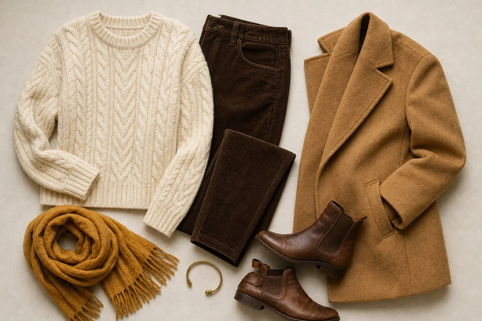
The capsule below holds twenty pieces in eight colors. Cream, camel and chocolate carry the structure; mustard, olive, forest and deep teal sit near the face; rust, the signature, appears more often than any single accent. The fabric column follows the season’s taste for texture.
| Piece | True Autumn color | Fabric |
|---|---|---|
| Coat | Chocolate or camel | Wool |
| Jacket | Camel or khaki | Tweed |
| Trousers | Chocolate | Corduroy or wool flannel |
| Jeans | Mid wash | Denim |
| Skirt | Khaki | Suede or wool |
| Dress | Rust | Wool jersey |
| Knit sweater | Camel | Lambswool |
| Knit sweater | Mustard | Cable knit |
| Cardigan | Cream | Chunky knit |
| Shirt | Cream | Cotton |
| T-shirt | Ecru | Cotton jersey |
| T-shirt | Olive | Cotton jersey |
| Top | Forest | Fine knit |
| Top | Rust | Silk or viscose |
| Scarf | Plaid of rust, mustard and olive | Wool |
| Light layer | Deep teal | Cotton or linen |
| Shoes | Chocolate | Leather |
| Shoes | Camel | Suede |
| Bag | Chocolate | Leather with some patina |
| Jewelry | Brushed gold, bronze or copper | Metal |
Fabrics with body and a little surface interest suit the palette: tweed, corduroy, suede, leather with some patina, cable knits and wool flannel. A soft sheen is fine. A high-gloss satin or patent finish adds a clarity the palette does not have.
Hair color for True Autumn
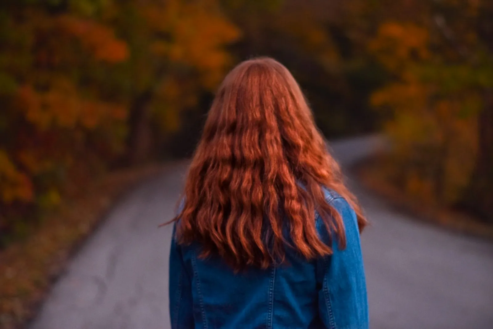
Most warm hair colors suit True Autumn, because hair and palette share one temperature. Copper, auburn, golden chestnut and warm brown are all safe, and they echo rust, pumpkin and chocolate in the clothes.
| Shades | |
|---|---|
| Safe | Copper, auburn, golden chestnut, warm brown |
| Stretch | Deep golden blonde |
| Avoid | Ash, icy platinum, blue-black |
The tone matters more than the level. Ash removes the warmth the whole palette depends on, icy platinum adds a cool, light frame, and blue-black puts a Winter edge around a warm face. A deep golden blonde can work, but copper often suits better: it adds warmth without lightening the frame much.
Keep the depth near your natural level. If your natural hair already has copper or gold glints, a warm gloss or a few golden lowlights often does more than a full color change. Gray, dyed and red hair each raise their own questions; the seasonal color analysis guide covers all three.
True Autumn makeup and nails
The True Autumn lipstick row runs from caramel or a warm peach-brown for every day, through a warm coral-brown, to rust or tomato as the statement shade, in satin or cream. That row is the whole makeup kit in miniature: every shade leans gold, none leans gray.
| Product | True Autumn shades | Finish |
|---|---|---|
| Lipstick | Caramel or warm peach-brown; warm coral-brown; rust or tomato | Satin, cream |
| Blush | Warm coral-brown, warm peach-brown | Satin |
| Eyeshadow | Camel, khaki, bronze | Satin, bronze shimmer |
| Liner | Chocolate, olive | Soft line |
| Nails | Caramel or honey nude; rust or tomato; chocolate or forest | Cream, satin |
Finish sits between the matte of the Soft seasons and the gloss of the Bright ones, so satin and cream look right, and a bronze shimmer on the lid works because the metal is warm. Frosted, icy shadows miss on temperature and look chalky.
For blush, choose the shade that looks like your own flush after a walk: warm coral-brown or warm peach-brown. A cool pink blush sits on top of warm skin as a separate patch of color. Your eye color can pull the liner toward a contrasting shade; the eye color chart shows which colors make each eye color stand out.
Nail colors for True Autumn mirror the lipstick: caramel or honey as the nude, rust or tomato as the red, and chocolate or forest when you want a dark shade. Your hands are further from your face than any garment, so nails are the place to try a color outside the palette if you love one.
Gold, glasses, denim and prints
Gold is the True Autumn metal, ideally brushed or antique rather than mirror-bright, along with bronze and copper. Polished silver tends to look gray and cool against warm coloring. Mixed warm metals, a copper ring beside a gold one, sit comfortably together because they share the palette’s temperature.
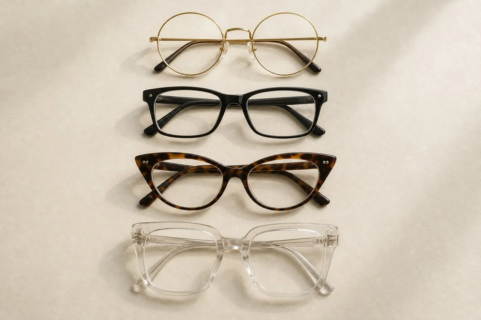
For frames, warm tortoiseshell is the classic choice: it mixes amber, honey and golden brown, while the cool kind is gray-brown and smoky. Rust, olive and forest acetate work too, as do gold, bronze and copper metal frames. Icy colors and cool gray are the frames to skip.
A mid wash is the True Autumn jean: medium in depth like your coloring, with a little fade. Ecru and cream are the white jeans, and mid-blue denim sits comfortably with all three neutrals.
Earthy prints work when their colors come from the palette: plaids, paisleys, herringbone tweed and autumn florals in rust, mustard and olive. Keep the print’s contrast medium, like your face. A high-contrast black-and-white graphic looks stark next to warm, medium coloring.