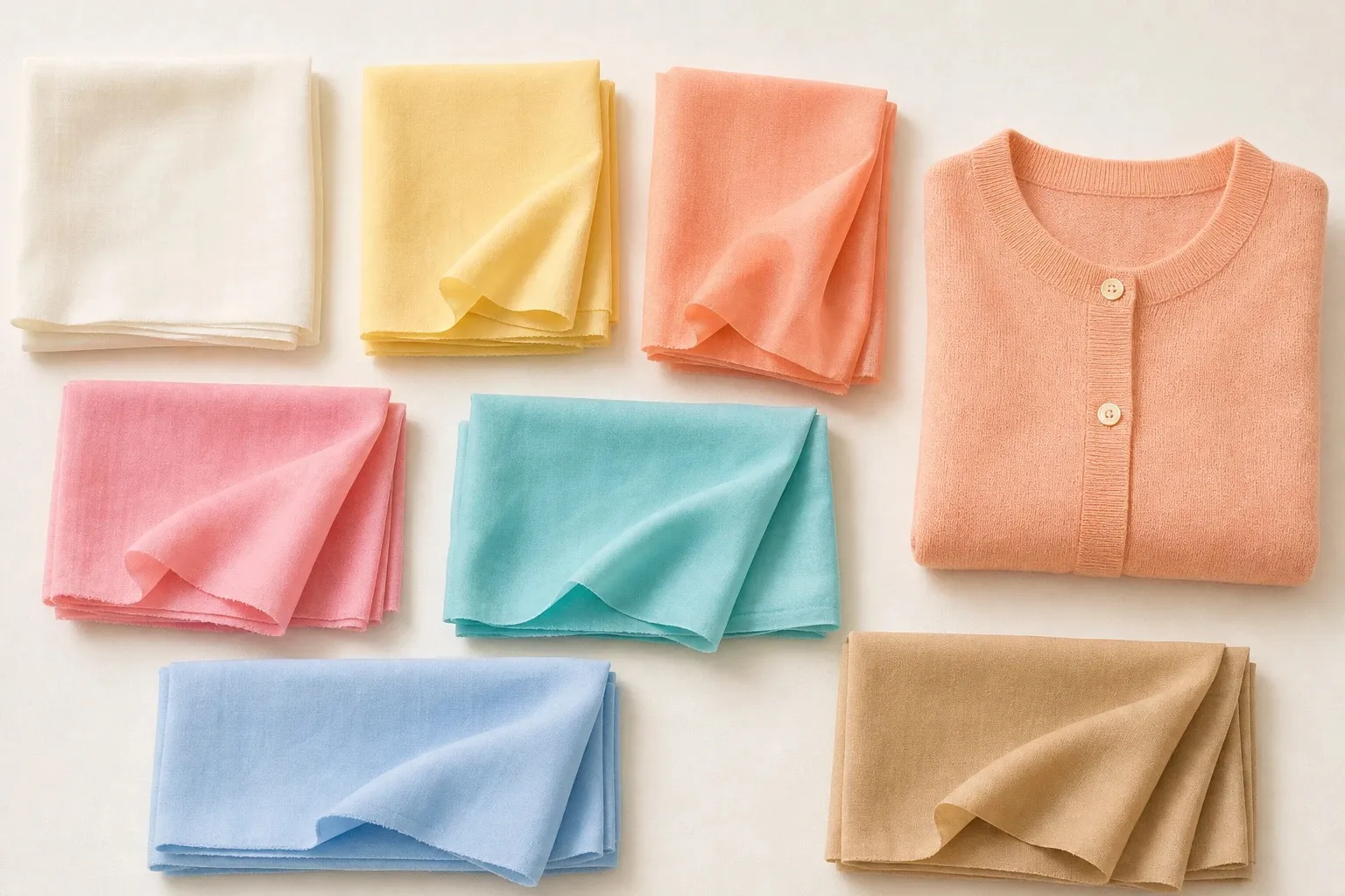
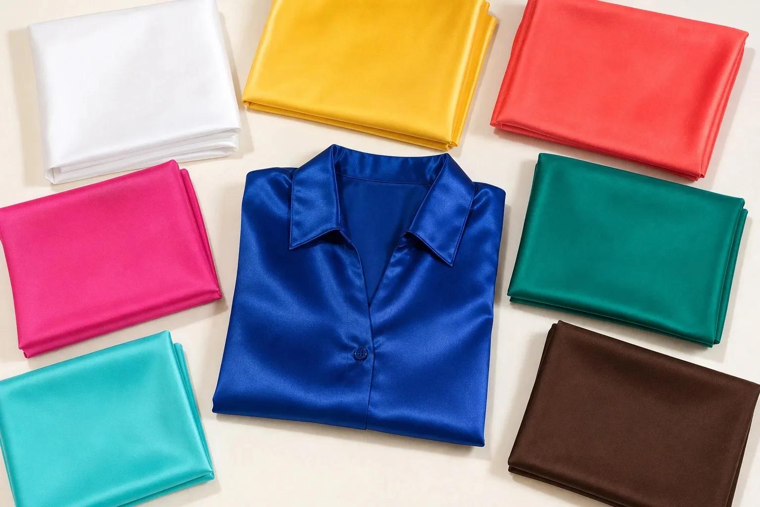
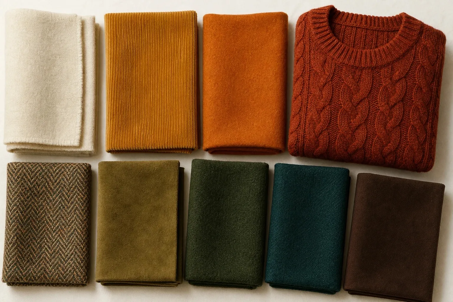
True Spring, also called Warm Spring, is warm first and clear second. The True Spring color palette is golden, saturated and lively: golden yellow, coral, poppy, kelly green, warm turquoise and clear blue, with cream as its white and golden brown as its darkest color. It is the warmest of the three Springs. Light Spring is the paler version, Bright Spring the more vivid one, and True Autumn the same warmth turned rich and muted; a green ladder and three drapes tell them apart.
What True Spring coloring looks like
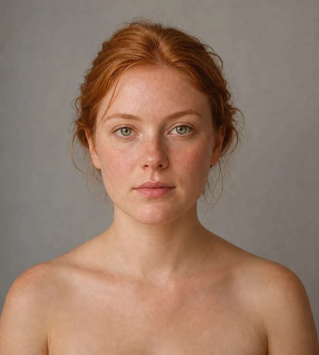
Warmth is the loudest note in True Spring coloring. Hair runs from golden blonde through strawberry and copper to golden brown, usually with golden glints in sunlight. Eyes are often warm green, golden hazel, topaz or a clear warm blue. Skin shows peach or golden tones, and a cool pink sweater gives it away: next to blue-based pink, True Spring skin turns sallow.

True Spring appears on fair, medium and deep skin. What marks it is a warmth that looks bright and fresh rather than earthy, and a medium contrast: in a black-and-white photo the hair is clearly darker than the skin, without the jump of a Winter face. Undertones and color seasons are a styling framework, not a measurement of your skin. The tests here compare colors side by side, which anyone can repeat in daylight.
Spring was one of the four seasons in Carole Jackson’s Color Me Beautiful (1980), the book that made seasonal color analysis popular. Twelve-season systems split each of the four into three, and the center of the Spring family keeps the plain name. Some call it Warm Spring instead, after its leading trait.
| Axis | True Spring | In practice |
|---|---|---|
| Temperature | Warm, the leading trait | Yellow in every color; gold over silver, cream over white |
| Chroma (clarity) | Clear, the second trait | Saturated color with no gray in it |
| Value (lightness) | Light to medium | The darkest neutral is golden brown, never black |
| Contrast | Medium | Colors one or two steps apart in lightness |
The True Spring color palette
- cream
- golden yellow
- coral
- poppy
- warm turquoise
- kelly green
- clear blue
- golden brown
Every color carries yellow and every one is clear: saturated without being neon. The range is narrower than it looks. The palette runs from cream down to golden brown, and golden brown sits at about a middle gray in lightness, so the whole season lives in the light and middle part of the scale. That is the practical reason black has no place in it: it would be the only color far below all the others.
| Role | Colors | Where it goes |
|---|---|---|
| Light | Cream, golden yellow | Shirts, tees, summer dresses |
| Middle | Coral, kelly green, warm turquoise, clear blue | Tops, knits, dresses, scarves |
| Deep | Golden brown, poppy | Trousers, coats, bags; the statement red |
| Middle neutral | Camel (not in the strip) | Jackets, knitwear, shoes |
| Second dark neutral | Warm navy (not in the strip) | Tailoring, a second coat |
| Metal | Polished yellow gold | Jewelry, frames, buttons |
Golden brown is the anchor: it does for True Spring what black does for a Winter. Warm navy, one that leans slightly warm rather than violet, is the second option for coats and trousers, and camel fills the middle. Even the blues lean warm. Warm turquoise and clear blue are pulled slightly toward green, which is why they sit comfortably next to coral and golden yellow.
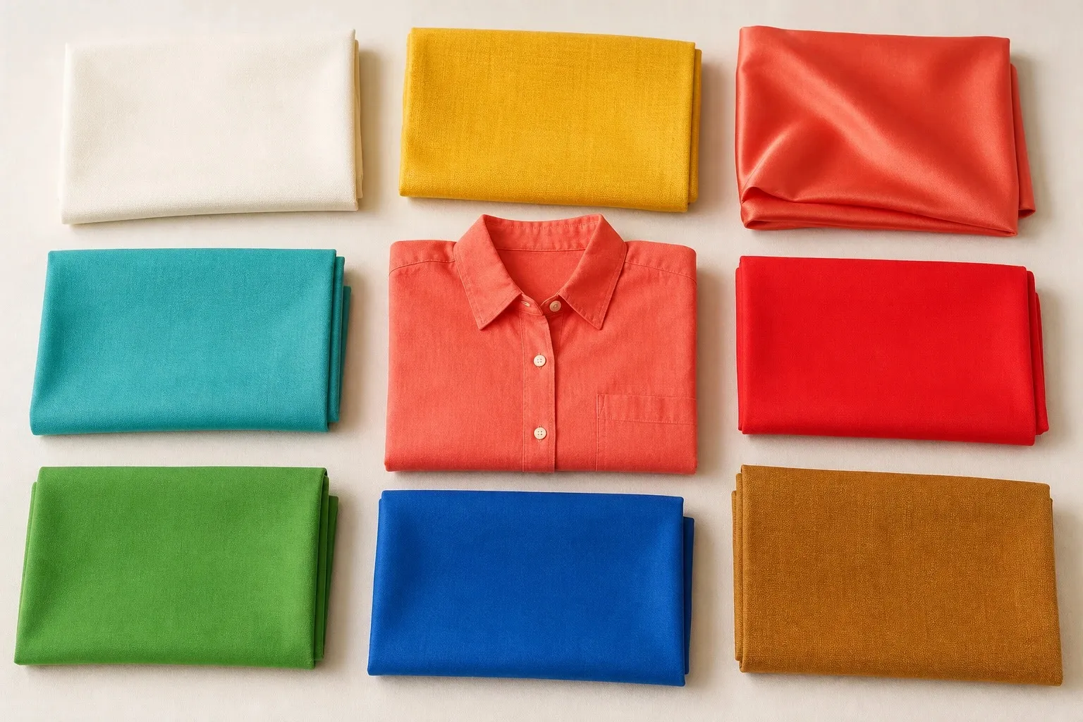
Neutrals: cream, camel and golden brown
| Neutral | On a True Spring | Instead |
|---|---|---|
| Black | Avoid near the face | Golden brown, warm navy |
| Pure white | Stark beside golden skin | Cream |
| Cream | Yes: the light neutral | |
| Navy | Warm navy, yes; violet or inky navy, no | Warm navy |
| Brown | Golden brown and camel, yes; ashy browns, no | Golden brown |
| Gray | Cool gray is on the avoid list | Camel |
| Denim | Mid wash | Cream or ecru jeans |
Black fails here for a different reason than on the paler Springs. True Spring has enough depth to carry a dark color; what it cannot carry is the coldness. Against golden skin, black looks hard and pulls the warmth out of the face, while golden brown gives the same weight and repeats the gold. Keep black for shoes, belts and bags if you own it.
Cream replaces pure white for a similar reason. Optical white is cool and stark, and beside it golden skin can look yellow. Gray is the trickiest neutral of all, since cool grays are on the avoid list: a camel or a cream does the job gray does for other seasons, which is to sit quietly next to every accent.
Navy needs a careful choice. A warm navy has a little green or teal in it and looks clean against the skin; a violet or inky navy pulls the face toward gray. If a navy looks almost black on you, it is too dark for this palette.
True Spring colors by hue
| Hue | Wear | Leave out |
|---|---|---|
| Red | Poppy, coral | Cherry, burgundy, raspberry |
| Pink | Coral-pink, peach | Fuchsia, powder pink, mauve |
| Orange | Coral, poppy | Rust, burnt orange |
| Yellow | Golden yellow | Mustard, icy lemon |
| Green | Kelly green, warm turquoise | Olive, khaki, sage |
| Blue | Clear blue, warm turquoise, warm navy | Icy blue, slate, violet-blue |
| Purple | No purple; a clear red-violet, borrowed | Lavender, plum, mauve |
Reds and pinks. True Spring’s reds are orange-based and clear: poppy for a statement, coral for every day. The quickest temperature test uses two reds of similar strength, a tomato with visible orange in it and a cherry with a hint of blue. On True Spring coloring the tomato makes the skin look clear and the lips naturally colored, while the cherry brings out sallowness. Your pink follows your red: coral-pink, a pink with yellow in it. Fuchsia and powder pink are both blue-based, and both land on the wrong side.
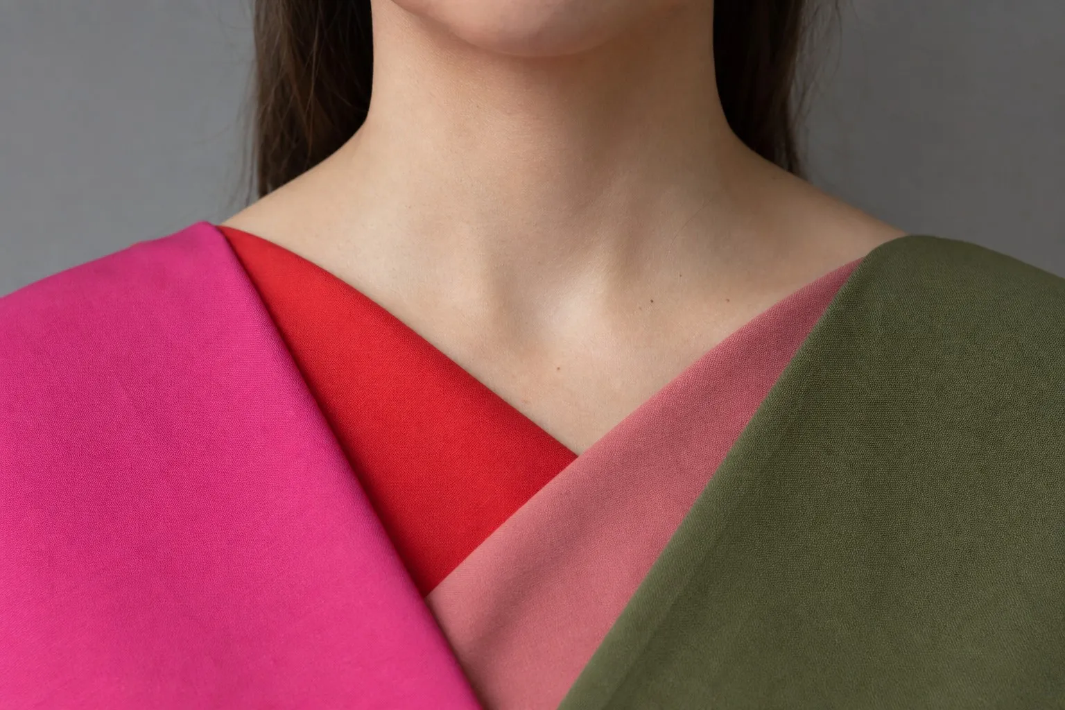
Blues and greens. Warm seasons wear blues pulled toward green, and True Spring wears three of them: clear blue, warm turquoise and, as a neutral, warm navy. Kelly green is the signature green, a clear grass green with yellow in it. Olive and khaki have the warmth but not the clarity, which makes them the True Autumn versions, and slate or icy blue are simply too cool.
Yellows and oranges. Golden yellow is the most telling color in the palette. Yellow is unforgiving near the face, so when golden yellow looks sunny on you rather than sallow, that is a good sign of warm, clear coloring. Mustard is its muted twin and belongs to Autumn. Coral and poppy are the oranges; burnt orange and rust carry too much brown.
Purples. Purple is missing from the palette, and True Spring borrows it less easily than any other Spring: the season leads with warmth, and purple carries the coolness of the blue mixed into it. If you want one, a clear red-violet worn with cream or coral at the neckline is the closest fit. Lavender brings in icy coolness, the very thing this season cannot carry.
Colors to avoid, and the swaps
Three cool families head the avoid list: icy pastels, cool grays and black. On golden skin a cool color shows up as a gray or sallow cast. Dusty, heavily muted shades are the second risk: they belong to the Autumn side of the line and make True Spring coloring look tired rather than wrong.
| Color | Why it fails | Swap |
|---|---|---|
| Black | Cold and hard against golden skin | Golden brown, warm navy |
| Icy pink, icy blue, lavender | Cool pastels: a gray cast | Peach, clear blue, coral-pink |
| Cool gray, charcoal | Cool and flat | Camel |
| Pure white | Stark; the skin looks yellow beside it | Cream |
| Olive, khaki, mustard | Muted: the Autumn versions of your colors | Kelly green, golden yellow |
| Fuchsia, burgundy | Blue-based reds and pinks | Coral-pink, poppy |
Worn away from your face, or with cream or coral at the neckline, most of these become easy. Mustard trousers under a cream shirt, a gray coat with a coral scarf, black boots under golden brown trousers: the off-palette color is still there, just not under your chin.
Light, True or Bright Spring?
Every Spring is warm or neutral-warm with a fresh, clear quality: coral rather than rust, turquoise rather than teal, ivory or cream rather than stark white or gray. Dusty, grayed colors make all three look tired. The season name tells you which trait comes first.
- True Spring is the center of the family, where warmth is strongest. Its neighbor outside the family is True Autumn, equally warm but richer and more muted.
- Light Spring is the pale end: ivory, butter, peach, light coral and aqua, with nothing dark near the face. It shares its lightness with Light Summer, the cooler sister. The Light Spring color palette covers it in full.
- Bright Spring is the intense end: saturated color held between pure white and espresso, for coloring with high contrast and clear eyes. Its sister is Bright Winter. See the Bright Spring color palette.
Light Spring and Bright Spring sit slightly closer to neutral than True Spring, because each borders a cool season.
- ivory
- butter
- peach
- light coral
- warm pink
- aqua
- clear sky
- light camel
- white
- sunflower
- hot coral
- bright pink
- emerald teal
- bright aqua
- royal blue
- espresso
Six questions sort the three in a mirror. Mark each answer L, T or B and count the letters; it is a sorting aid, and the drapes or the quiz confirm it.
- Natural hair: light golden or strawberry blonde (L); golden blonde, copper or golden brown (T); dark brown or near-black, clearly darker than your skin (B).
- Eyes: light blue, aqua or light green (L); warm green, golden hazel or topaz (T); vivid blue, green or bright brown that stands out sharply (B).
- Contrast between hair, skin and eyes: low, everything light (L); medium (T); high (B).
- Best coral under your chin: peach or light coral (L); coral (T); hot coral (B).
- Best blue-green: aqua (L); warm turquoise (T); emerald teal or bright aqua (B).
- When a color fails on you, it is usually: too dark or heavy (L); too cool or gray (T); too dull or dusty (B).
Four of one letter settles it. A three-three split points to the border between two Springs.
| Light Spring | True Spring | Bright Spring | |
|---|---|---|---|
| Strongest trait | Light | Warm | Bright |
| Sister season | Light Summer | True Autumn | Bright Winter |
| White | Ivory | Cream | Pure white |
| Dark neutral | Light camel, warm gray-brown | Golden brown | Espresso |
| Coral and pink | Peach, light coral | Coral, poppy | Hot coral, bright pink |
| Blue | Clear sky, aqua | Warm turquoise, clear blue | Bright aqua, royal blue |
| Yellow | Butter | Golden yellow | Sunflower |
| Metal | Polished light gold | Polished yellow gold | Bright polished gold |
| Avoid | Black, very dark and very dusty shades | Icy pastels, cool grays, black | Dusty, muted and grayed colors |
When two Springs tie, test the colors where their palettes part. Peach against coral separates Light from True. Coral against hot coral separates True from Bright. Ivory against pure white separates Light from Bright.
The quiz asks the same question its own way. For a True Spring result the runner-up is Light Spring, Bright Spring or Deep Autumn, never True Autumn, because the quiz picks its runner-up from the trait that came second, and warmth already came first. Light Spring means lightness came second, Bright Spring means clarity did, and Deep Autumn means depth did.
True Spring or True Autumn?
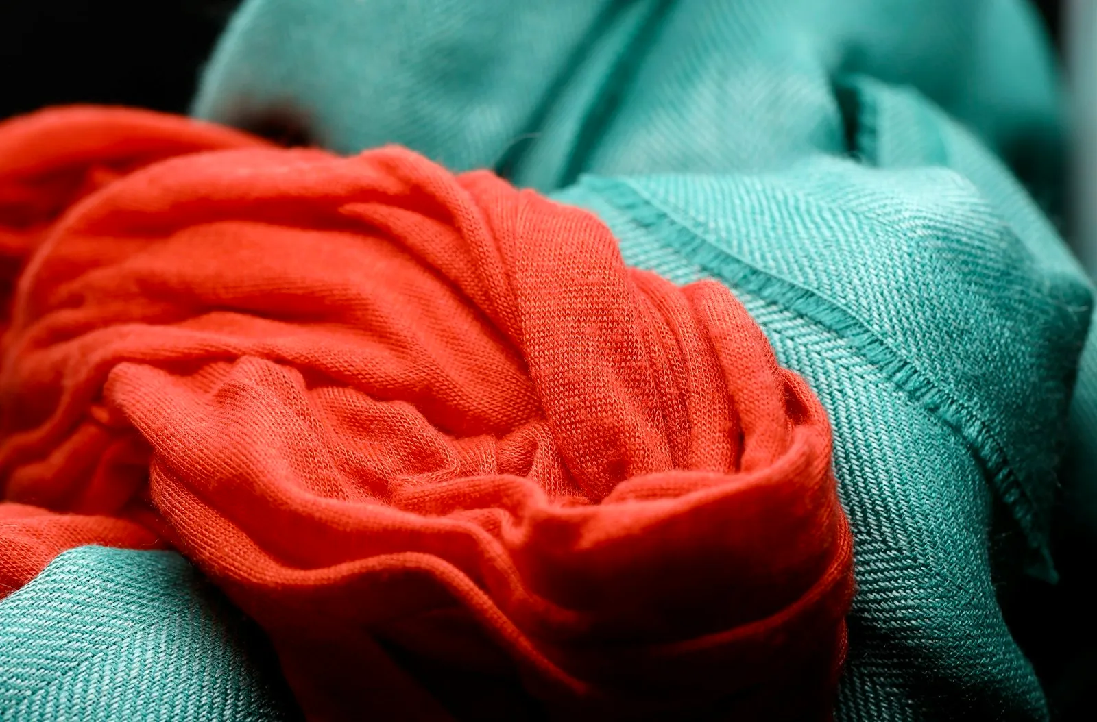
True Spring and True Autumn are the two warmest seasons. Golden skin, copper or golden-brown hair and warm eyes are common in both; gold beats silver, cream beats pure white, and blue-based pinks leave the skin sallow. The two palettes even come in pairs: golden yellow and mustard, coral and rust, warm turquoise and deep teal, with cream in both. The difference is clarity. True Spring’s warmth is clear and lively, while True Autumn turns the clarity down and the depth up, with a little brown or gray in every color.
The green ladder shows your chroma on its own. Find four greens of similar depth, from muted to clear: olive, moss, grass green and kelly green; towels and T-shirts will do. Hold them under your chin in order and note the step where your face looks best, with the skin even, the eyes clear and nothing standing out. A peak at the clear end leans Spring. A peak at olive or moss leans Autumn. A peak in the middle means medium chroma, and the drapes below settle it.
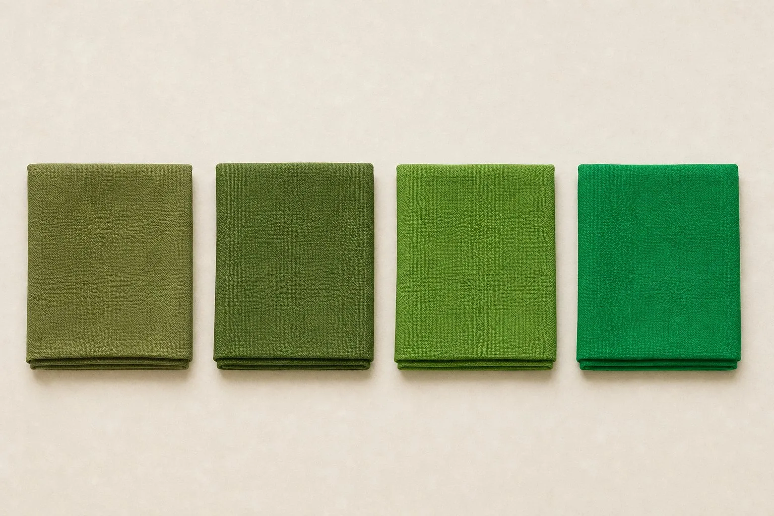
Then three drapes and a gold test, by a window, bare-faced, hair out of sight:
- Kelly green vs olive. The clarity test in its purest form.
- Coral vs rust. The same warm red-orange, clear against earthy.
- Golden yellow vs mustard. Yellow shows every mismatch, which makes it a sharp test.
Finally, compare two pieces of gold, one bright and polished, one brushed or antique. Polished gold usually suits True Spring; the softer finish suits True Autumn.
- cream
- mustard
- pumpkin
- rust
- olive
- forest
- deep teal
- chocolate
| True Spring | True Autumn | |
|---|---|---|
| Clarity | Clear | Muted, rich |
| Depth | Light to medium | Medium to deep |
| Greens | Kelly green | Olive, forest |
| Reds | Coral, poppy | Rust, pumpkin |
| Blue | Warm turquoise, clear blue | Deep teal |
| Dark neutral | Golden brown | Chocolate |
| Metal | Polished yellow gold | Brushed or antique gold, bronze |
| Avoid | Icy pastels, cool grays, black | Cool pinks, icy colors, pure white |
The quiz draws the same line, and a worked example shows how thin it can be. Answer as a warm, copper-haired reader might: veins green, gold over silver, cream over white, peach or golden skin, burns first and then tans, red or copper hair, golden glints, warm brown or golden hazel eyes, medium contrast, black looks heavy, pastels fine either way, vivid colors make you look more alive. The quiz returns True Spring, with the temperature marker at the warm end and the chroma marker exactly in the middle; the tie goes to Spring only because your value reads light. Change three answers, so that the eyes are soft hazel, the contrast is low and vivid colors wear you, and the same warm reading becomes True Autumn. That is the green ladder in questionnaire form.
If you land between the two, cream, camel, warm teal and tomato red work on both sides and make a good base. Red hair alone does not settle the question: copper is warm, but the season also depends on clarity and depth, and bright copper with clear eyes and light skin can test as Spring. The True Autumn color palette shows the muted side.
Outfits and a True Spring capsule
The formula: one clear accent near the face, one neutral that shares its warmth, and golden brown as the base. A coral shirt with a camel blazer and golden brown trousers works; so does a kelly green sweater over cream with mid-wash jeans.
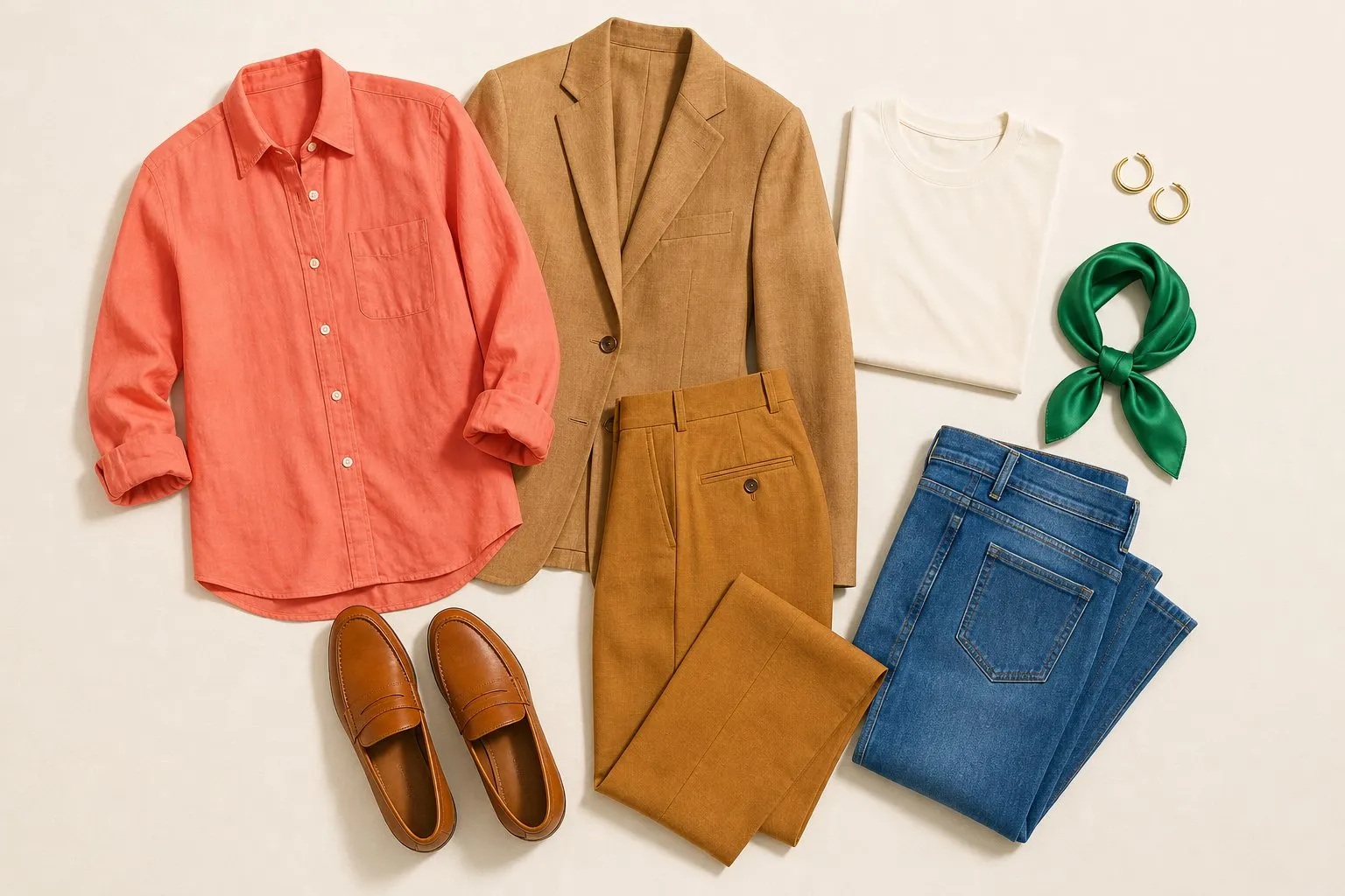
True Spring sits in the middle for contrast, so pair colors one or two steps apart in lightness rather than at the extremes. Cream with golden brown, or warm turquoise with camel, has enough difference to look defined; golden yellow with warm navy is about as strong as it needs to get. Shoes and bags in camel or golden brown finish the outfit without the hard line black draws at the hem.
The common rule of thumb of three colors per outfit fits this palette well: two neutrals and one clear accent, or one neutral and two accents of similar depth, such as coral with warm turquoise.
| Role | True Spring color | Pieces |
|---|---|---|
| Dark neutral | Golden brown | Trousers, coat, boots |
| Second dark neutral | Warm navy | Blazer or a second coat |
| Middle neutral | Camel | Jacket, a knit, bag, loafers |
| Light neutral | Cream | Shirts, tees |
| Four accents | Golden yellow, warm turquoise, kelly green, clear blue | Knits, tops, a light layer |
| Signature | Coral | A shirt, a dress or the scarf |
| Denim | Mid wash | Jeans |
| Metal | Polished yellow gold | Jewelry |
Put the neutrals into coats, trousers and shoes and the accents near your face, and every piece goes with every other, because each color carries yellow and none carries gray.
Clear color looks best on fabrics that keep it clear: smooth cotton, crisp linen, silk with a satin sheen. Heathered, brushed or washed-out textures mute the color, and muting is exactly what this palette does not need.
Hair color for True Spring
| Shades | |
|---|---|
| Safe | Golden blonde to golden brown, strawberry, copper |
| Stretch | Warm caramel brown |
| Avoid | Ash, icy platinum, blue-black |
True Spring hair needs warmth you can see and a finish that catches light. Ash, icy platinum and blue-black each take the gold out of the frame around your face, the one thing this season cannot spare. Copper and strawberry are fully in range, even though people often file red hair under Autumn.

Stay within a level or two of your natural depth. A golden brown can move up to golden blonde or down to a warm caramel brown without leaving the season, while a jump to near-black adds contrast and coolness at once. Ask your colorist for golden, honey or copper tones rather than neutral or ash, and for a glossy finish that keeps the color clear.
True Spring makeup: lips, blush, eyes and nails
| Shade | Finish | |
|---|---|---|
| Everyday lip | Peach | Satin |
| Pink lip | Coral-pink | Satin or gloss |
| Statement lip | Poppy, coral | Satin or gloss |
| Blush | Peach, coral | Satin |
| Eyeshadow base | Cream, camel | Golden shimmer |
| Liner | Warm brown, with warm turquoise for color | |
| Nails | Peach-beige or honey, poppy or coral, golden brown |
The lip runs warm and clear. Peach is the everyday shade, coral-pink the pink and poppy or coral the statement, and a satin or glossy finish keeps the color clear, where a flat matte would soften it toward Autumn.
Blush comes from the same family, peach or coral, placed so it looks like warmth from inside the skin. On the eyes, cream and camel make the base, a golden shimmer suits the season, and a warm brown liner defines the lash line. A thin line of warm turquoise is the accent if you want color on the eyes.
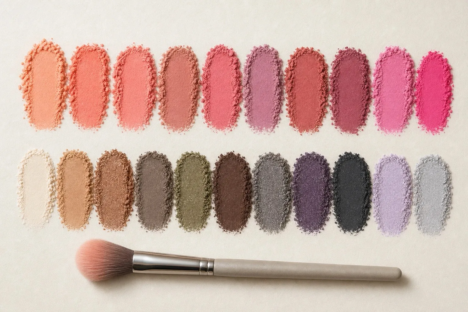
Nails are the easiest place to be bolder, since a polish is seen beside your hands rather than under your chin. A peach-beige or honey nude, poppy or coral as the red and golden brown as the dark shade cover the year; match the nude to the skin of your fingers rather than your face.
Metals, glasses, denim and prints
Metals. Polished yellow gold matches both halves of the season, the warmth and the clarity. Silver looks cool against golden skin. Brushed or antique gold, bronze and copper lean toward True Autumn; on a True Spring they read as a step toward muted.
Glasses. Warm tortoise, golden brown, a warm red or a clear turquoise acetate suit True Spring, with polished yellow gold for metal frames. Black and cool gray frames draw a hard, cool line at eye level. Take the depth from your brows: a golden brown frame on golden-brown brows looks like part of the face. Shape is a separate question, answered in what suits your face shape.
Denim. Mid-wash denim matches the season’s medium depth. A very dark rinse reads as a dark neutral close to navy, and a heavily faded wash looks dusty. For white jeans choose cream or ecru over optical white. Gray denim is the color most likely to look flat on you; a mid blue or ecru does the same job.
Prints. Prints should repeat medium contrast and clear color: coral and kelly green on cream, a golden yellow and clear blue stripe, a warm floral on a camel ground. Muted, earthy paisleys and faded florals belong to True Autumn, and stark black-and-white graphics to the Winters.