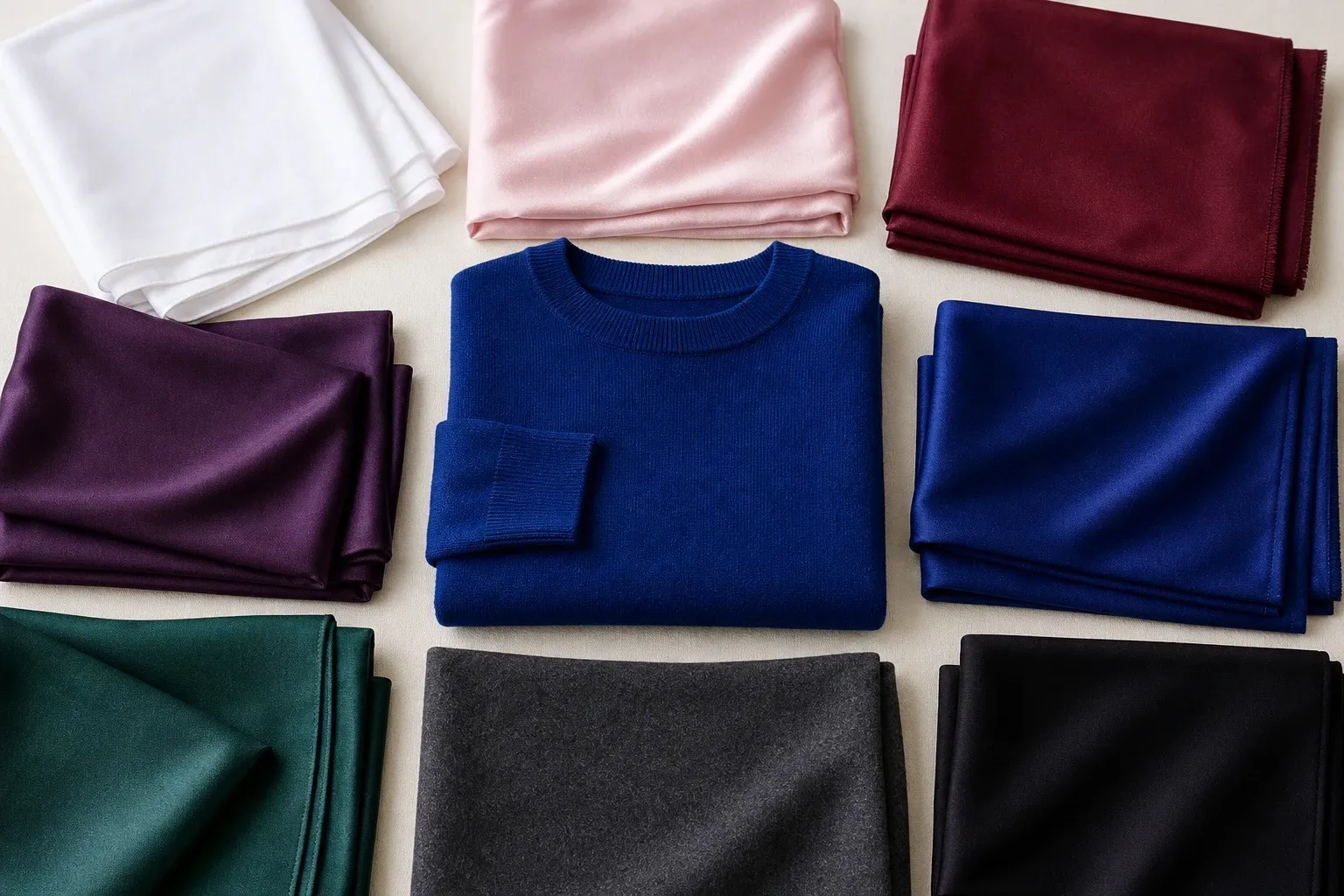
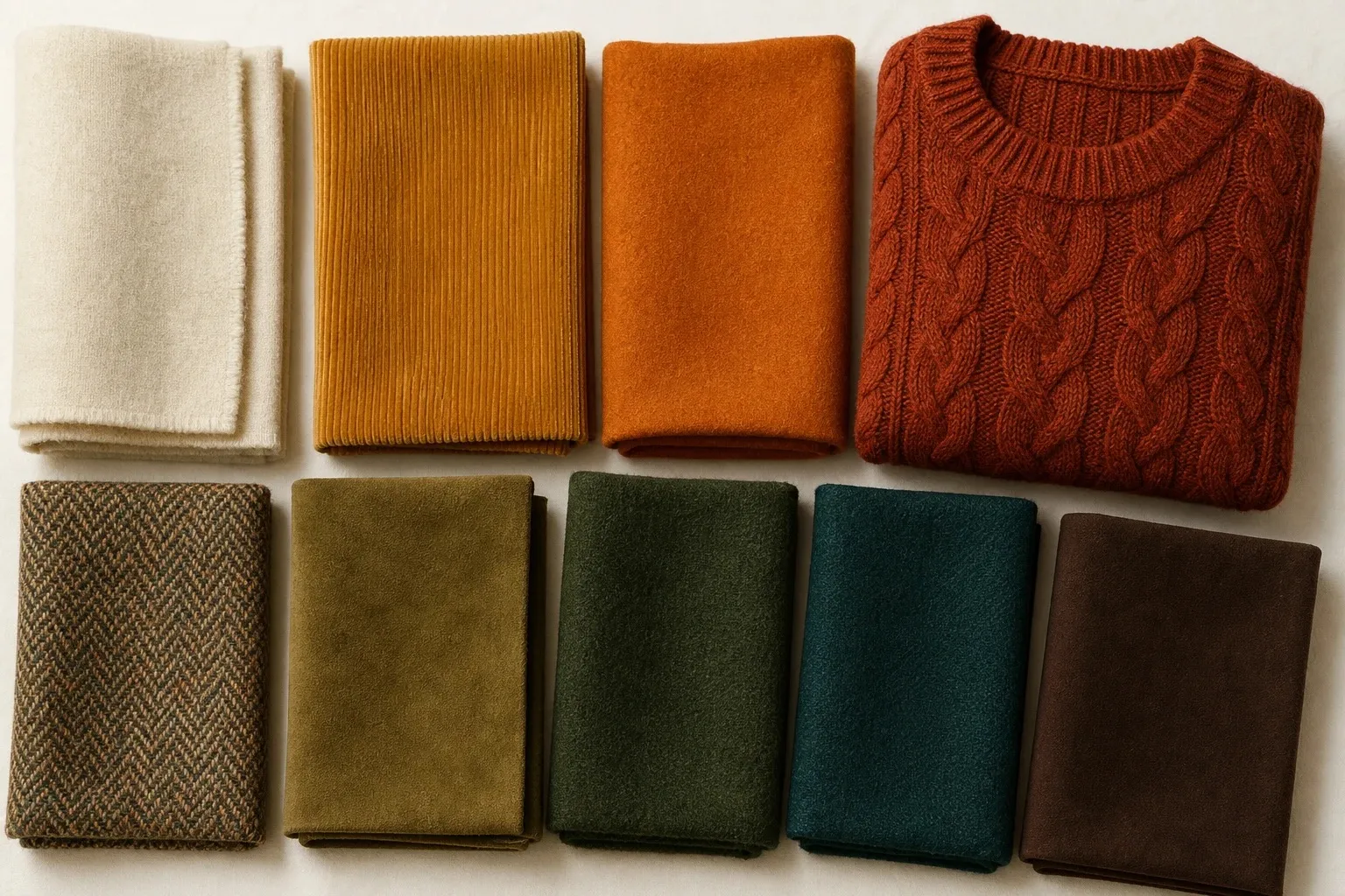
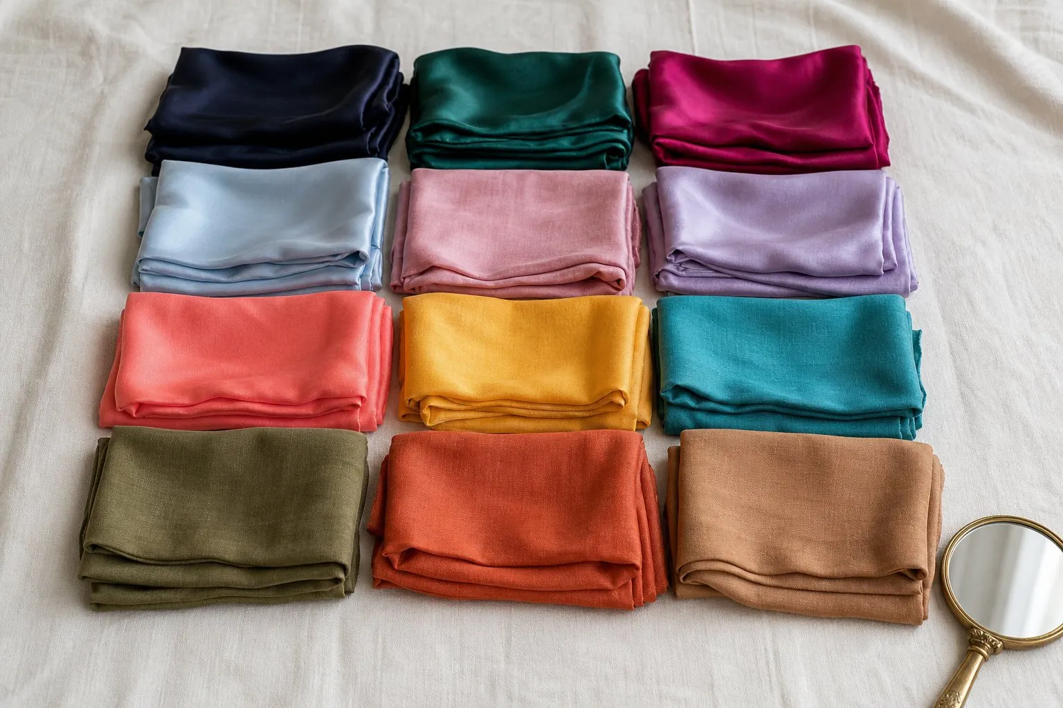
Deep Autumn, also called Dark Autumn, is deep first and warm second: its colors are dark, rich and earthy, with gold underneath rather than blue. The Deep Autumn color palette sets brick, aubergine, forest, dark olive, dark teal and dark mustard on chocolate and cream. Black is not part of it; chocolate and espresso do its job. The season’s one real doubt, Deep Autumn or Deep Winter, comes down to temperature, and a lipstick test, brick against blue-red, settles it.
- cream
- dark mustard
- brick
- aubergine
- forest
- dark olive
- dark teal
- chocolate
To check which trait leads in your own coloring, the Color Season Quiz ranks depth, temperature and clarity and names a runner-up. A worked example further down shows how to read its result for this season.
What Deep Autumn looks like
Depth comes from the whole face. Hair tends to be dark brown to near-black, sometimes with a deep auburn or bronze glint in sunlight. Eyes are often dark brown or deep hazel, and brows are usually strong. Skin ranges from fair to very deep and leans warm or neutral-warm. Contrast is medium to high, and the dark features carry most of it.
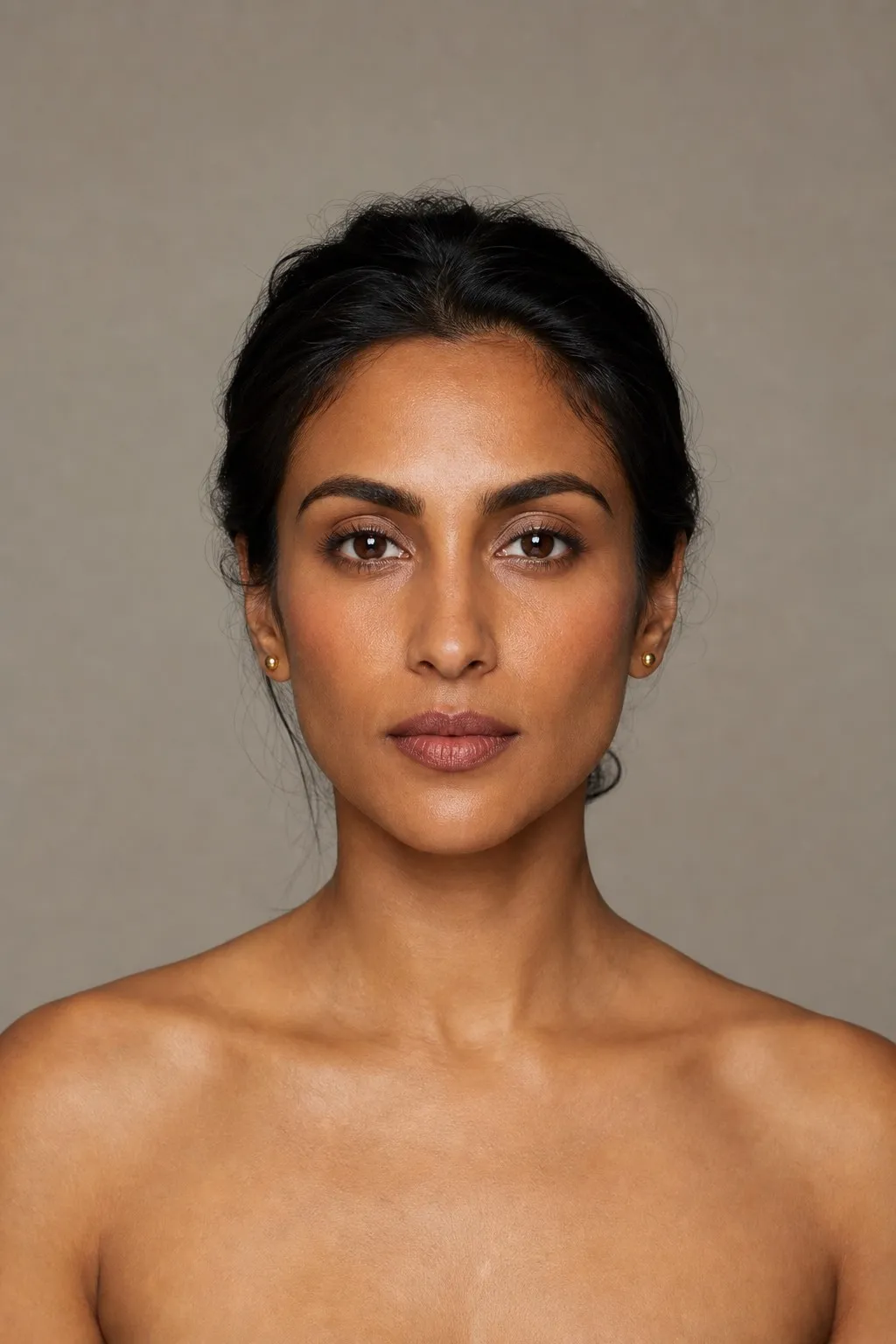
On the three axes, value leads. Value is the Munsell word for how light or dark a color is, and here the answer is dark. Temperature comes second and leans warm, which is what separates you from Deep Winter. Chroma sits in the rich middle, neither dusty nor jewel-bright. Because depth leads, fair skin under very dark hair can be Deep Autumn as surely as deep skin can; the depth sits in the whole picture, not in the skin alone.
Undertones and color seasons are a styling framework, not a measurement of your skin. The tests here compare colors side by side, which anyone can repeat in daylight. The first one needs only a phone: turn a daylight photo of your face to black and white, and on a Deep Autumn the hair, brows and eyes sit in the darkest grays. The others are everyday clues. Pastels look faded on you, and icy colors leave the skin gray.
Olive skin under dark hair and eyes often lands here. The depth of the features leads, and the olive cast keeps the temperature on the warm side of neutral rather than the cool one.
The Deep Autumn color palette
Most of the palette sits at the dark end of the value scale, and cream is its only truly light color. That shapes every outfit: you build from dark to darker and add cream as the light point, instead of starting from a light base and adding color.
| Role | Colors | What it does |
|---|---|---|
| Light | Cream | The one light point; tops and collars near the face |
| Mid neutral | Dark olive | Jackets, knits and trousers that go with everything |
| Dark neutral | Chocolate, plus espresso | Coats, trousers, boots; your black |
| Red and purple | Brick, aubergine | Knits, dresses, lipstick; brick is the signature |
| Green and blue-green | Forest, dark teal | Coats, knits, scarves |
| The lift | Dark mustard | The brightest color; one piece lightens a dark outfit |
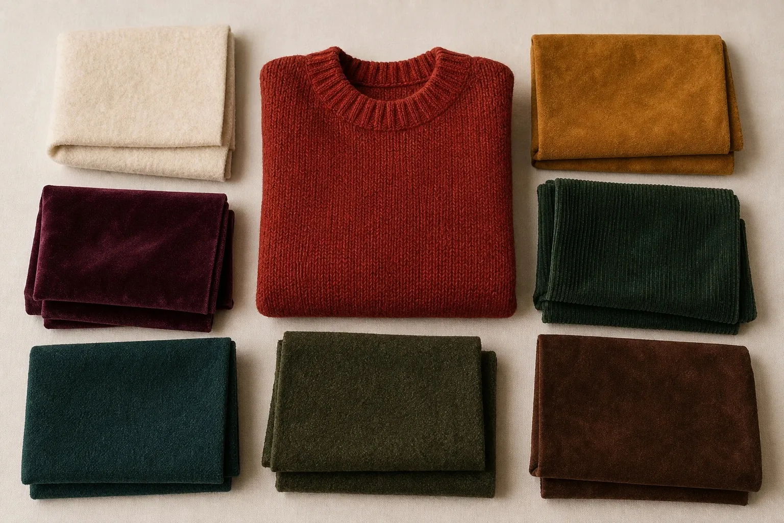
Brick is the signature: a red darkened with brown, warm without being orange. Aubergine and dark teal are the shades nearest the Winter line, which is why a Deep Autumn can often borrow a deep wine or a dark green-blue without trouble. Dark mustard is the brightest color in the set and still brown enough to sit beside chocolate.
Next to its family the palette is easy to place. It shares cream, forest and chocolate by name with True Autumn, but its forest and chocolate are darker, and its brick sits deeper than any red the other two Autumns own.
Deep Autumn neutrals and black
Deep Autumn neutrals are cream as the light, dark olive in the middle and chocolate or espresso as the dark. The jump from cream to chocolate is large, and your face can carry it, because your features already hold that much depth. A Light or Soft season would look overpowered by the same pairing.
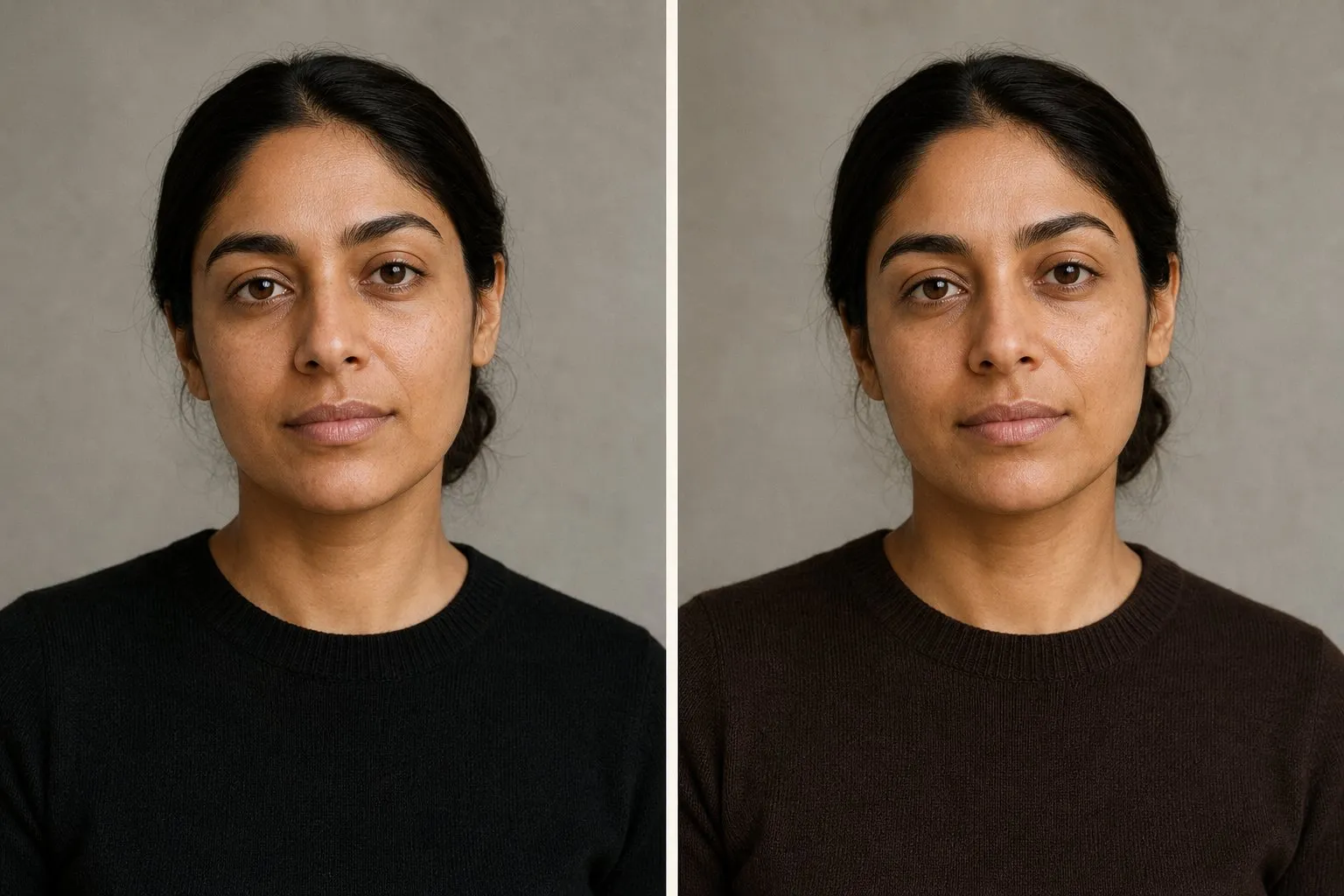
Black. Is black good for Deep Autumn? It is not in the palette, but this is the one Autumn with the depth to carry a soft black, one with brown in it. Jet black tends to look cold against warm skin: the face loses some of its warmth, and the dark features stop standing out against the clothes. Chocolate and espresso are the safer darks, and in everyday wear they do everything black does.
White. Cream is your white. Pure optical white is not in the palette, and next to warm skin it can make the face look yellow by comparison. For a wedding or an event, choose cream or champagne and skip optical white and icy tints.
Gray and navy. Light, silvery gray and icy gray are the versions to skip: they are pale and cool, two misses at once. Dark olive does the job that gray does in other wardrobes, a mid neutral that goes with everything here. Navy is not in any Autumn palette either. Chocolate replaces it, and dark teal is the blue to wear near your face.
Deep Autumn colors by hue
Every hue in the palette arrives dark and warm. Where the light or icy version of a hue fails you, the dark, browned version works, and the clear jewel-tone version usually belongs to Deep Winter.
| Hue | Your version | Deep Winter’s version | Skip near the face |
|---|---|---|---|
| Red | Brick, wine | Burgundy, cranberry | Light coral, cherry |
| Pink | Brick-rose, deep rose-brown | Deep berry, icy pink | Baby pink, icy pink |
| Orange | Brick, a borrowed rust | None | Peach, pale apricot |
| Yellow | Dark mustard | None | Lemon, butter yellow |
| Green | Forest, dark olive | Emerald | Mint, pastel green |
| Blue | Dark teal | Sapphire | Powder blue, icy blue |
| Purple | Aubergine | Deep plum | Lavender, lilac |
Reds and pinks. Brick is your red, a red with brown in it, and wine sits on the border with Deep Winter, where it works for both. Can a Deep Autumn wear pink? Yes, a dark and earthy one: brick-rose and deep rose-brown. Baby pink and icy pink are too light, and fuchsia is too cool and too bright.
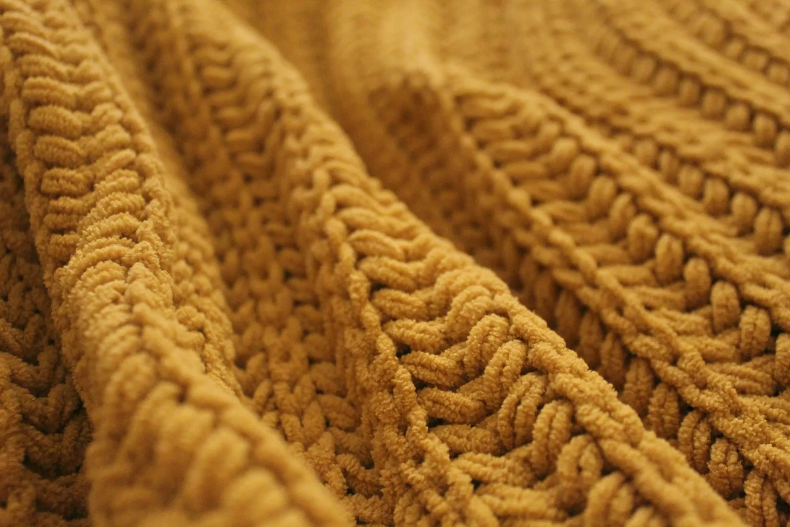
Yellows and oranges. Dark mustard is the palette’s only yellow and the color to reach for when a dark outfit needs lifting. Pale yellow, lemon and butter fail on depth: next to dark features they look faded. Orange comes browned and dark, as brick or a rust borrowed from True Autumn; peach and pale apricot are the light versions that wash you out.
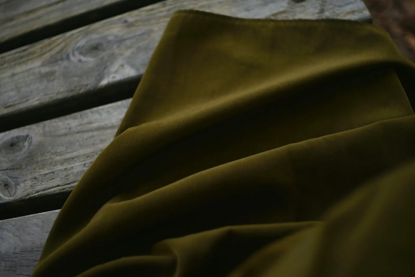
Greens and blues. Forest and dark olive are your greens and dark teal your only blue; no Autumn palette has a plain blue. Emerald and sapphire are their clear, cool counterparts in the Deep Winter palette, close enough in depth to tempt you and different enough in temperature to show.
Purples. Aubergine is the one purple in any Autumn palette, and it is yours: a purple with red and brown in it. Deep plum is the cooler Winter version. Lavender and lilac are too light and too cool.
Deep Autumn colors to avoid
The Deep Autumn avoid list names light pastels and cool icy shades. Pastels miss on depth: next to dark features they look faded, and the face seems to float above them. Icy colors miss on depth and temperature at once, so they add a gray cast as well. Two further groups are not on the list but still fail: Winter’s extremes, jet black and pure white, and the clear jewel tones that sit next to yours in the Deep Winter palette.
| Avoid | Misses on | Wear instead |
|---|---|---|
| Baby pink, peach, butter yellow | Depth | Brick-rose, dark mustard |
| Powder blue, mint, lavender | Depth, temperature | Dark teal, forest, aubergine |
| Icy pink, icy blue, silver gray | Depth, temperature | Cream, dark teal, dark olive |
| Jet black | Temperature | Chocolate, espresso |
| Pure white | Temperature | Cream |
| Fuchsia, hot pink | Temperature, clarity | Brick-rose |
| Cranberry, blue-red | Temperature | Brick |
| Sapphire, royal blue | Temperature, clarity | Dark teal |
| Emerald | Temperature, clarity | Forest |
You can spot both effects in a mirror. A color that is too light makes your features look as if they sit on top of it, sharper than the clothes. A color that is too cool leaves the skin gray around the mouth and eyes. Icy pink misses both ways and shows both at once.
Away from the face the list matters less. A pale blue shirt under a chocolate jacket, or light trousers, costs little; the color nearest your face does the work.
Deep Autumn or Deep Winter? The lipstick test
Deep Autumn and Deep Winter are the two darkest seasons, and from across a room they can look the same: dark hair, dark eyes, strong brows, a face that carries deep color without strain. Depth is the strongest trait in both, and pale pastels fail on both. What separates them is temperature. Deep Winter leans cool and wants clear, blue-based jewel tones with sharp contrast, black next to white; Deep Autumn leans warm and wants golden, earthy color with brown in it. You will also see them called Dark Winter and Dark Autumn; the names are interchangeable.
Wearing the wrong side shows quickly. Cool, icy colors make warm skin look gray or sallow. Golden, earthy colors can make cool skin look yellow, or bring up redness around the nose and mouth.
The lipstick test. A lip color is a small, concentrated drape in the middle of your face, which makes it the quickest way to read temperature. You need two reds: a blue-red such as cranberry or berry, and a brick red with brown or orange in it. Apply one on bare lips in daylight and step back from the mirror to arm’s length; then switch. The right red looks like a deeper version of your own lips and leaves the skin around your mouth even. The wrong one arrives before your face does. On warm skin a blue-red tends to look purple and makes the chin look gray; on cool skin a brick red looks brown and muddy, and the face looks slightly yellow.
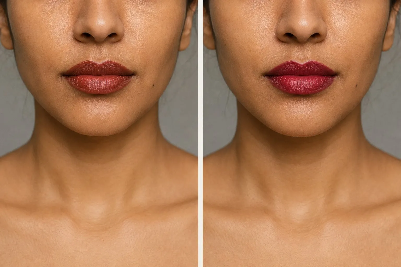
Three drapes to confirm it. Lipstick is a strong hint, not a verdict. Confirm it with fabric under your chin: daylight, no makeup, hair covered with a gray towel, and watch the skin, not the cloth.
| Pair | Deep Winter side | Deep Autumn side | What it tests |
|---|---|---|---|
| 1 | Black | Dark chocolate | The dark neutral you will wear most |
| 2 | Burgundy or cranberry | Brick | The red family |
| 3 | Pure white | Cream | The light end of the palette |
If the lipstick and two of the three drapes agree, you have your answer.
Depth already tells you that you are a Deep season. The drapes only have to answer whether you are cool or warm.
- white
- icy pink
- burgundy
- deep plum
- sapphire
- emerald
- charcoal
- black
| Deep Autumn | Deep Winter | |
|---|---|---|
| Undertone | Warm to neutral-warm | Cool to neutral-cool |
| Dark neutral | Chocolate, espresso | Black, charcoal |
| Light neutral | Cream | Pure white, icy pink |
| Reds | Brick | Burgundy, blue-red |
| Greens | Forest, dark olive | Emerald |
| Blues | Dark teal | Sapphire |
| Metal | Bronze, antique gold | Silver, platinum |
| Avoid | Light pastels, cool icy shades | Soft muted shades, orange, camel |
Because the main trait is shared, the two palettes overlap at the dark end. Aubergine, dark teal, wine and deep forest green sit close to the line, and a deep berry-brown lipstick works on both sides. If you are still undecided, build around those.
Reading the quiz. The quiz never names Deep Winter as a Deep Autumn’s runner-up, because the runner-up comes from your second-strongest trait, not from flipping your temperature. The undertone line is the one to watch, and a worked example shows why. Take one set of answers: green-looking veins, gold over silver, cream over pure white, neutral beige skin, tans easily, medium to dark brown hair with no visible glints, very dark brown eyes, medium contrast, black “fine, nothing special”, pastels that wash you out, vivid and dusty colors about equal. On the quiz’s scales, which run from -1 to +1, that puts value at +0.68, temperature at +0.38 and chroma at 0: Deep Autumn, runner-up True Autumn, undertone warm.
Now change three answers: veins “a mix”, metals “both look fine”, hair “black or near-black”. Value rises to +0.75 and temperature falls to +0.08. The result still says Deep Autumn, but the undertone line now reads neutral and the runner-up becomes True Spring. Nothing on the screen mentions Deep Winter, yet the second person is exactly the one who should run the lipstick test. The Deep Winter color palette shows the cool side in full.
True or Soft Autumn instead?
Inside the family, True Autumn is warmer and a little lighter, with rust and mustard, and Soft Autumn is muted and low in contrast. Brick against rust under your chin is the quickest check for the first border: if brick makes your face look clearer, depth is leading; if rust does, warmth is. Chocolate against camel covers the second. On a Deep Autumn, camel looks pale and slightly washed out next to the features, while chocolate looks like it belongs.
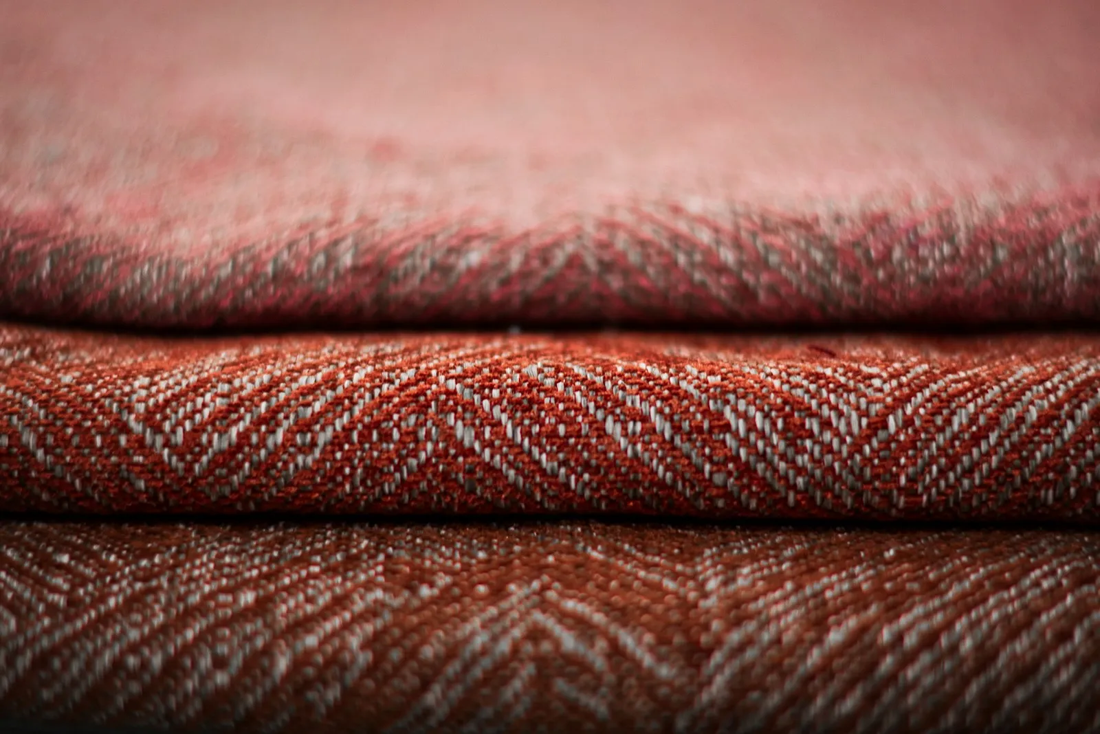
Two other runners-up point outside the Autumns. True Spring appears when warmth comes second and your answers read slightly clear; Bright Spring when clarity comes second. Both mean your coloring may carry more clarity than this palette. Test a clear coral against brick: if the coral makes your face look sharper rather than louder, read the Bright Spring color palette too. The True Autumn color palette sorts all three Autumns with six questions.
Deep Autumn outfits and a capsule
A dependable formula: cream at the neckline, a brick or forest knit over it, chocolate trousers and an espresso jacket or coat. Dark-on-dark outfits work as long as the colors share their warmth: forest with chocolate, aubergine with brick, dark teal with espresso. They read rich rather than somber because every piece has color in it. When an outfit feels heavy, dark mustard is the lift; a scarf or a top is enough.
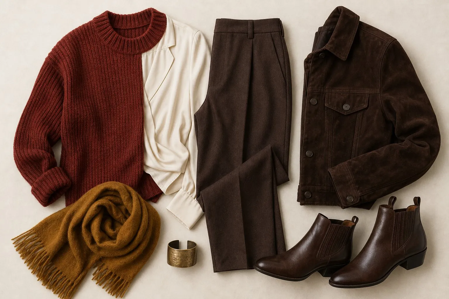
The Deep Autumn capsule is the darkest of the three Autumn capsules. Chocolate, dark olive and cream are the neutrals; dark mustard, aubergine, forest and dark teal the accents; brick the signature. Since cream is the only light color, it goes where light does the most good, right under the face. Twenty pieces, grouped by color:
| Pieces | Deep Autumn color |
|---|---|
| Coat, trousers, first pair of shoes | Chocolate |
| Jacket, knit sweater, second pair of shoes | Dark olive |
| Skirt, bag | Espresso |
| Jeans | Dark wash |
| Dress | Brick |
| Shirt, T-shirt, cardigan | Cream |
| Second knit sweater | Dark mustard |
| Second T-shirt | Aubergine |
| Top | Forest |
| Top | Brick |
| Light layer | Dark teal |
| Scarf | A print of brick, dark mustard and forest |
| Jewelry | Bronze, antique gold |
Choose fabrics with weight and density: leather, suede, heavy knits, wool coating, corduroy and velvet in the darker shades. A soft sheen is fine, since the palette is rich rather than muted, but a pale, flimsy fabric looks washed out whatever its color.
Hair color for Deep Autumn
Deep Autumn hair looks most natural in dark chocolate, warm dark brown or deep auburn, and dark copper is the stretch shade. Those colors keep the two things the palette depends on: depth and warmth.
| Shades | |
|---|---|
| Safe | Dark chocolate, warm dark brown, deep auburn |
| Stretch | Dark copper |
| Lightest | A few fine pieces of dark honey |
| Avoid | Pale or platinum blonde, ash |
Pale blonde fights the palette. It removes the depth that makes dark colors look natural on you, so the brick and forest that suited you start to look heavy. Ash does the same to the warmth. If you want to go lighter, a few dark honey pieces around the face are as far as this season usually goes.
Keep close to your natural shade and let the tone carry the change: a warm gloss over very dark brown, or a deep auburn that shows only in sunlight, changes the look without changing the season. Gray hair lightens the frame around your face and lowers your contrast, which can move you within the palette; seasonal color analysis, explained covers graying and dye.

Deep Autumn makeup and nails
Deep Autumn makeup needs pigment. The lipstick row starts with a rose-brown for every day, moves to a brick-rose, and ends with brick or aubergine as the statement, in a fully pigmented cream or satin. Sheer formulas tend to disappear against dark features.
| Product | Deep Autumn shades | Finish |
|---|---|---|
| Lipstick | Rose-brown; brick-rose; brick or aubergine | Cream, satin |
| Blush | Brick-rose, deep rose-brown | Cream, satin |
| Eyeshadow | Bronze, chocolate | Cream, satin |
| Liner | Espresso, dark olive, aubergine | Defined |
| Nails | Terracotta-brown nude; brick; aubergine or chocolate | Cream |
The season picks the shade, and your skin depth picks the strength. Deep Autumn includes fair skin under very dark hair as well as deep skin, and both wear the same brick-rose family: sheer on fair skin, fully pigmented on deep skin. Test blush in daylight from arm’s length; the right one looks like warmth from inside the skin, the wrong one like a patch.
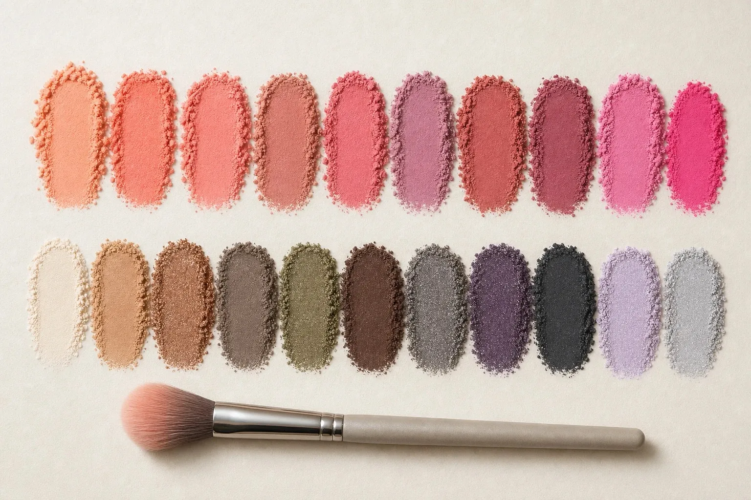
On the eyes, bronze and chocolate make the base and espresso, dark olive or aubergine the liner. Icy, frosted pastels look chalky on you, and black liner belongs to the Winter palettes; espresso gives the same definition with warmth.
For nails, wear a terracotta-brown nude, brick as the red and aubergine or chocolate as the dark. A pale nude looks chalky beside darker hands, so choose the nude by your fingers, not your face.
Metals, frames, jeans and prints
Bronze and antique gold suit Deep Autumn best, and this coloring can carry substantial pieces if you like them: a wide cuff, a heavy chain. Bright polished silver tends to look cold and thin against deep, warm coloring.
For glasses, choose dark warm tortoiseshell, chocolate, dark olive or aubergine acetate, or antique gold and bronze metal. A frame looks most natural when its depth is close to your brows, and strong, dark brows can carry a dark frame. Light pastel frames and clear acetate look faint on a face with this much depth.
What color jeans suit Deep Autumn? A dark wash, which keeps the palette’s depth. Ecru and cream are the light alternatives. Black jeans belong to the Winter palettes, though below the waist, with a palette color on top, they are an easy compromise.
Prints can be rich and fairly dense: paisleys, dark florals and warm animal prints on brown or forest grounds, with cream as the only light. Pastel prints and small, washed-out patterns look faint. Let the print’s contrast match the face, medium to high.