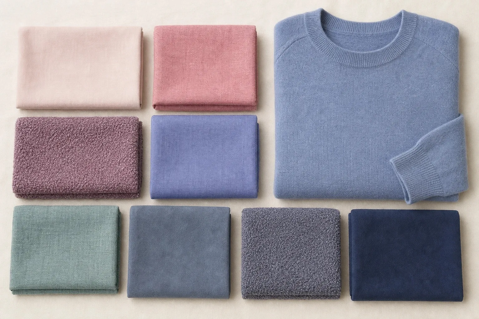
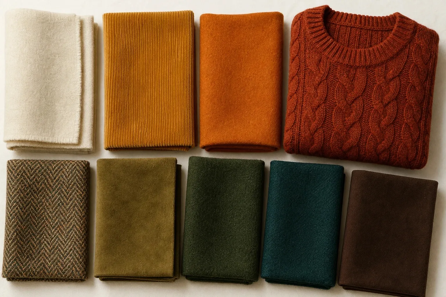
The Soft Autumn color palette is warm but muted: camel, salmon, terracotta, sage, olive, muted teal, mushroom and warm taupe, each with a little gray or brown blended in. It suits coloring that is soft first and warm second, where hair, skin and eyes sit close together and nothing in the face is sharp. Wear these colors in close, blended combinations, use warm taupe where other people wear black, and keep icy pastels and bright jewel tones away from your face.
- camel
- salmon
- terracotta
- sage
- olive
- muted teal
- mushroom
- warm taupe
Not sure the season is yours? The Color Season Quiz places you on three color axes in twelve questions, and the three drapes further down settle the most common mix-up, Soft Autumn against Soft Summer.
What Soft Autumn looks like
Soft Autumn coloring is blended. Natural hair tends to be dark blonde to medium brown, with a soft golden or bronze tone rather than bright copper. Eyes are often soft hazel, gray-green or a muted green-brown. Skin is warm or neutral-warm; its depth varies widely and does not decide the season. From a few steps away the features melt into each other instead of standing apart: contrast is low.
Color analysis describes coloring on three axes, and Soft Autumn takes them in this order. Chroma, the Munsell term for how clear or grayed a color is, leads: you are soft. Temperature is second: warm, but gently, close enough to neutral that the season borders a cool one. Depth is usually medium and decides little. So a Soft Autumn is a soft person who leans warm, not a warm person who happens to be muted, and the palette follows that order: every color has been dulled before it has been warmed.
Undertones and color seasons are a styling framework, not a measurement of your skin. The tests here compare colors side by side, which anyone can repeat in daylight. For this season the giveaway is behavior rather than a hair color: vivid colors wear you, so people notice the fabric before your face, and black looks heavy, as if it had been cut out and placed under your chin.
Olive skin often lands here. Its yellow base is warm, but its green-gray cast reads softer than the warmth alone would suggest, which is why the quiz’s olive answer moves you a little warm and a little soft at the same time. The olive skin tone guide covers the colors that turn olive skin sallow. Lists of Soft Autumn celebrities are easy to find and rarely agree, because photos are lit, edited and often show dyed hair; your own face in daylight is better evidence.
The Soft Autumn color palette
The eight colors in the strip at the top are the core of the palette, the shades the quiz returns. Learn them by role, because the role tells you what each color does in an outfit.
| Role | From the palette | Same family, worth adding | What it does |
|---|---|---|---|
| Light neutral | None of the eight | Oatmeal, warm off-white | Tops right under the face |
| Mid neutrals | Camel, mushroom | Soft caramel | Knitwear, jackets, layers |
| Dark neutral | Warm taupe | Warm brown | Coats, trousers, shoes; your black |
| Warm accents | Salmon, terracotta | Peach, soft coral | Pinks, reds and oranges near the face |
| Greens | Sage, olive | Moss | Knits, scarves, prints |
| Blue-green | Muted teal | Petrol | The only blue; a signature color |
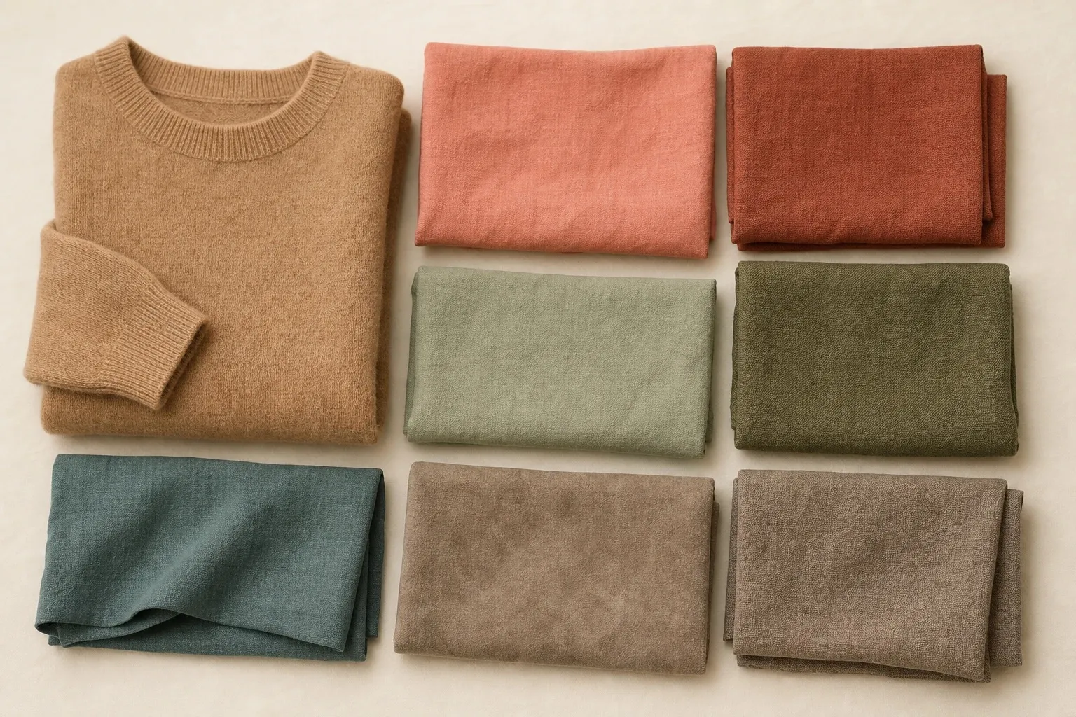
The warmth is gentle. Camel is the warmest of the neutrals, mushroom and warm taupe carry more gray, and sage and muted teal sit near the middle of the temperature scale, so the palette reads earthy rather than golden. Terracotta and salmon carry the warmth, and muted teal, the one touch of blue, makes the easiest signature color because it goes with everything else here.
The palette has no truly light color, which fits the face it is made for. A Soft Autumn face has no stark light point either, so the lightest thing you wear should be a soft, warm off-white such as oatmeal, never a bright white. The darkest is warm taupe, a gray-brown well short of black. Everything in between sits in a middle band of depth, which is why these colors combine so easily with each other.
Soft Autumn neutrals
Soft Autumn neutrals are oatmeal for the light role, mushroom and camel in the middle, and warm taupe as the dark. They replace the black, white and gray that most wardrobes are built on, and since you wear neutrals more often than any accent, getting them right does more than any single color.
Black. It is on the Soft Autumn avoid list, and it is the color most people find hardest to give up. On low-contrast coloring black becomes the darkest, hardest-edged thing in view, and the face looks pale and slightly tired above it. Warm taupe gives the same anchoring depth without the edge. Keep black for trousers, boots and bags if you already own it; away from the face it costs little.
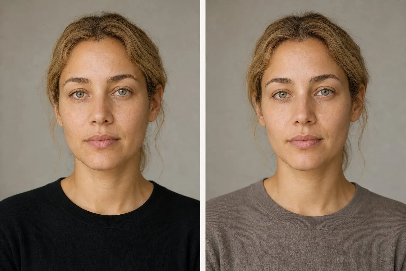
White. Pure optical white has the same problem at the light end: it glares, and soft skin looks gray beside it. The quiz has an answer for exactly this face, “soft off-white or oatmeal”, and it counts toward soft. For a wedding or an evening dress, a warm off-white or champagne does what optical white cannot.
Navy and gray. Navy is not in the palette; warm taupe does the job that navy does for the Summers. If you wear navy, choose a softened, grayed one and keep it below the waist. Gray depends on its temperature: silver gray and cool charcoal miss on warmth and leave a gray cast, while mushroom and warm taupe are grays with brown in them, and they work.
Brown. Camel and a soft warm brown are your browns. The black-and-white idea still works if you lower the gap: warm taupe with oatmeal makes a quiet two-tone outfit that matches a face where nothing jumps.
The best colors, hue by hue
Every hue has a Soft Autumn version, with gray or brown mixed in and a lean toward gold, and a version to keep away from your face.
| Hue | Your version | Skip near the face |
|---|---|---|
| Red | Terracotta, salmon | True red, cherry |
| Pink | Salmon, peach, warm rose-brown | Fuchsia, hot pink, icy pink |
| Orange | Terracotta, soft coral | Bright orange, neon coral |
| Yellow | Camel, or a yellow dulled toward soft gold | Lemon, bright yellow |
| Green | Sage, olive, moss | Emerald, kelly green |
| Blue | Muted teal, petrol | Royal blue, cobalt, icy blue |
| Purple | A grayed plum-brown, away from the face | Lavender, vivid purple |
Reds and pinks. Your red is terracotta, a red that has gone toward brown and orange, with salmon as its lighter version. Pink shows temperature faster than any other color, because it either repeats the pink in cool skin or fights the gold in warm skin, so your pinks lean peach: salmon first, then peach and a warm rose-brown. Fuchsia misses twice, too bright and too cool at once, which makes it one of the hardest colors you can wear.
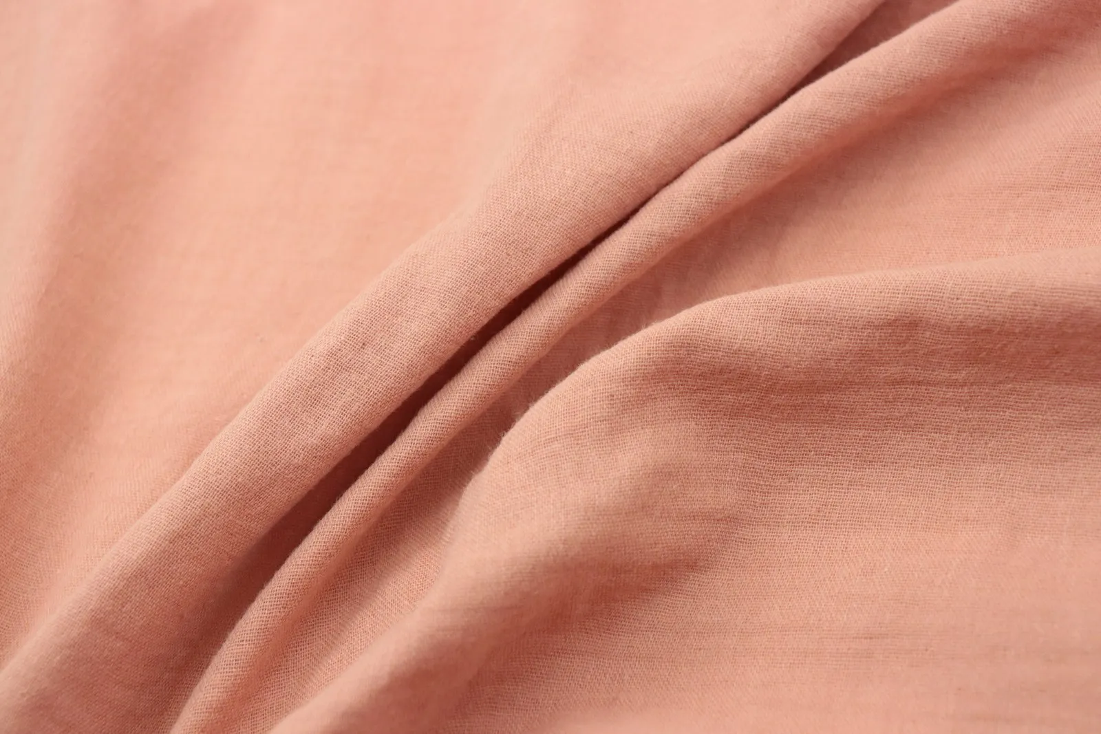
Greens and blues. Green is the easy family: sage, olive and moss all have gray or brown in them already. Blue is the opposite. There is no plain blue in the palette, only muted teal, a blue pulled toward green, and petrol, its darker relative. Royal blue and cobalt are too clear and too cool, and muted teal takes the same place in an outfit.
Yellows and oranges. Orange arrives as terracotta and soft coral, never as a clean, bright orange. Yellow has no swatch of its own among the eight. A yellow dulled almost to camel follows the palette’s traits, and camel itself is the swap for lemon.
Purples. Purple is the hue furthest from this palette, because most purples lean cool. If you want one, choose a grayed plum with brown in it and start with a skirt or a bag. Lavender is on the avoid list: light, cool and slightly icy, three steps away from you.
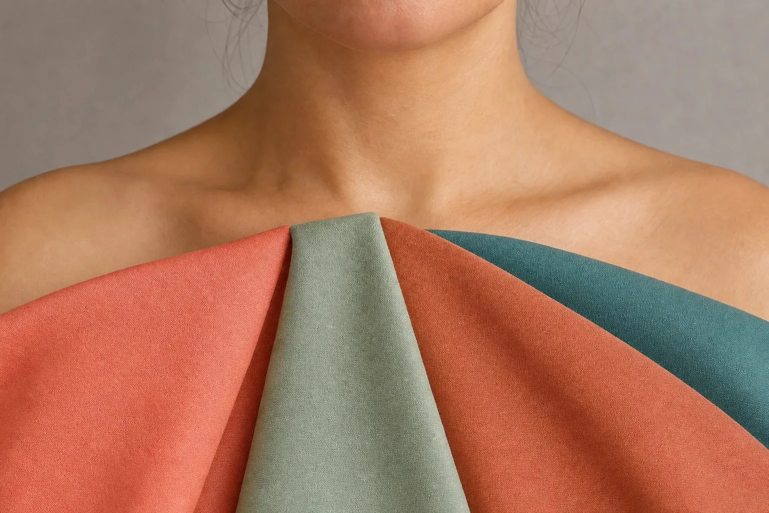
Colors to avoid, and the swap for each
Soft Autumn colors to avoid are the ones that break its traits. A color can miss in three ways, one per axis:
- Too bright. This is the failure that defines a soft season. Emerald, cobalt or hot pink are far clearer than anything in a Soft Autumn face, so the skin looks dull by comparison and people see the color first.
- Too cool. Icy pastels, blue-pinks and silvery grays fight the warm undertone. The skin picks up a gray cast, most visible around the eyes and mouth.
- Too stark. Black and pure white are the two ends of the value scale, with no softness in either. Next to them, blended coloring looks faint.
The worst colors for Soft Autumn miss on two axes at once. Fuchsia is bright and cool; black is dark and stark. Each problem color has a swap from the palette that keeps the hue and drops the problem:
| Avoid | Misses on | Wear instead |
|---|---|---|
| Emerald, kelly green | Clarity | Sage, olive |
| Royal blue, cobalt | Clarity, temperature | Muted teal |
| Fuchsia, hot pink | Clarity, temperature | Salmon |
| True red, cherry | Clarity, temperature | Terracotta |
| Bright orange, neon coral | Clarity | Terracotta, salmon |
| Lemon, bright yellow | Clarity, temperature | Camel |
| Icy pink, icy blue, lavender | Temperature, clarity | Salmon, sage |
| Silver gray, charcoal | Temperature | Mushroom, warm taupe |
| Black | Depth, clarity | Warm taupe |
| Pure white | Clarity, temperature | Oatmeal |
If a color would make a Winter look striking, check it twice before wearing it near your face.
To see the difference on your own face, hold a vivid color and its dusty relative, say emerald and sage, under your chin in daylight. If the dusty one makes the skin look smoother and the vivid one makes it look flat, you have confirmed the soft side of your coloring.
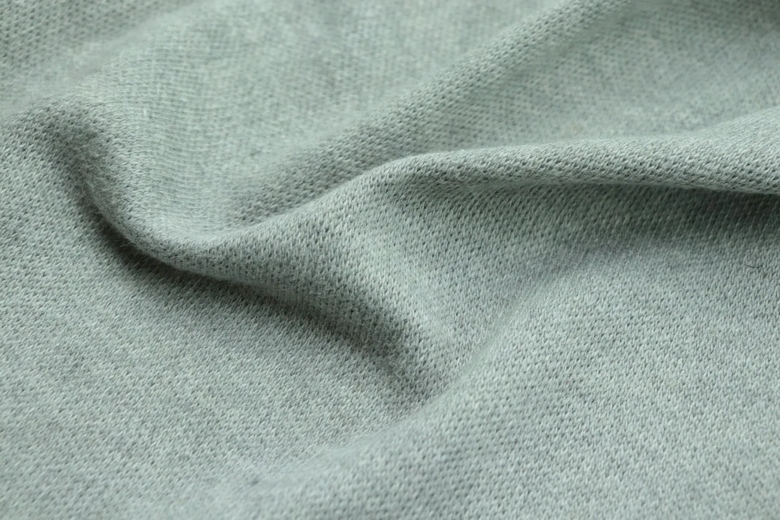
The list only matters near your face: an emerald bag or cobalt shoes do far less than an emerald top.
Soft Autumn or Soft Summer? Three drapes
Soft Autumn and Soft Summer are the two seasons people confuse most, because their strongest trait is the same: softness. Both look best in muted, blended color and both are overwhelmed by saturated color; both palettes even contain a sage. The only difference is temperature. Soft Summer leans cool, toward mauve and slate; Soft Autumn leans warm, toward camel and olive.
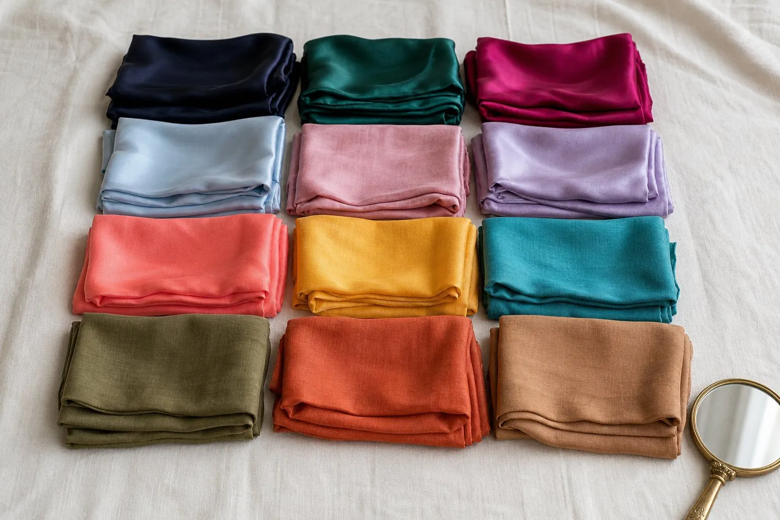
You need daylight from a window, a mirror, a bare face, and your hair pulled back or covered with a neutral gray towel. Hold each pair under your chin, one color at a time, for a few seconds, and watch your skin rather than the fabric. The right color makes the skin look even, the eyes clearer and the area under the eyes lighter. The wrong one shows up as shadows around the mouth and nose, a gray or yellow cast, or redness.
- Dusty rose against muted salmon. Dusty rose is the Soft Summer side, salmon the Soft Autumn side. Start with this pair.
- Slate blue against muted teal. A blue-gray against a green-blue. If teal makes you look tired and slate makes you look calm, you lean cool.
- Mid gray against camel. The neutral test, and the one with the most consequences: the neutral you buy most often should come from the right side.
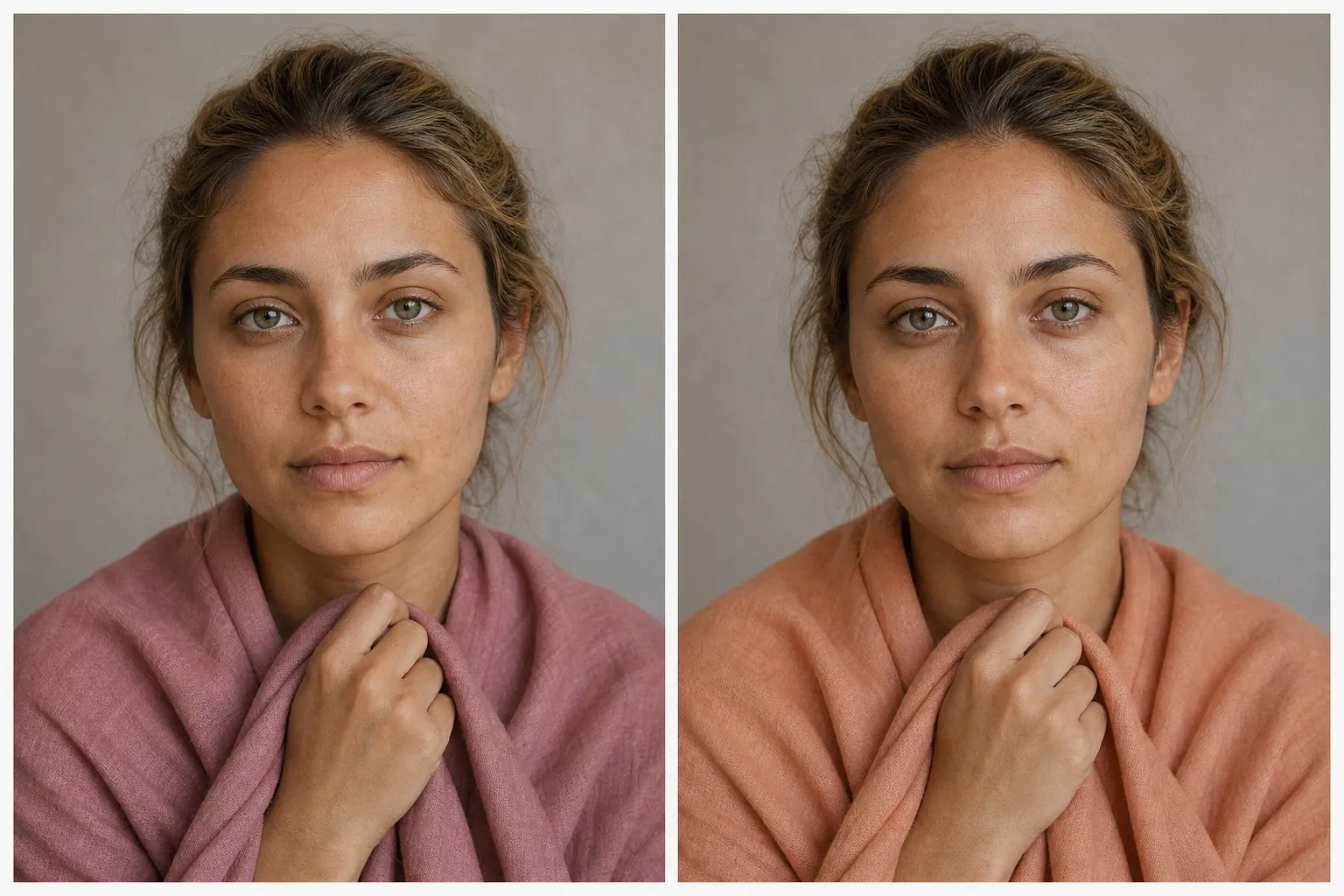
A worked reading: say the salmon evens out your skin while the dusty rose leaves a faint gray shadow beside the nose: one point to Autumn. Slate and teal look about the same: no point either way. Gray drains the color from your lips and camel brings it back: a second point to Autumn. Two out of three on the same side, with none pointing the other way, is enough. Three out of three and you can stop wondering; one each with a tie means you sit on the line.
- powder
- rose
- mauve
- periwinkle
- dusty blue
- seafoam
- sage
- soft navy
- slate
- pewter
- ivory
| Soft Autumn | Soft Summer | |
|---|---|---|
| Undertone | Warm to neutral | Cool to neutral |
| Pinks | Salmon, peach, soft coral | Dusty rose, mauve |
| Blues | Muted teal, petrol | Slate, dusty blue, soft navy |
| Greens | Olive, moss, sage | Sage gray, seafoam |
| Neutrals | Oatmeal, mushroom, camel, warm taupe | Ivory, pewter, slate, soft navy |
| Lipstick | Warm rose-brown, terracotta | Mauve, dusty rose |
| Metal | Brushed gold, bronze | Brushed silver, pewter |
| Avoid | Icy pastels, bright jewel tones, black | Bright saturated color, stark black and white |
If the drapes split, you are close to the line, and that is a normal place to be: the two seasons share a trait, and the border between them is drawn by convention. Build on the colors that belong to both while you decide: sage, a soft teal, mushroom and a muted rose-brown, which also works as a lipstick on either side. Olive skin often sits right on this border, because its green-gray cast can read cool in one light and warm in another.
Do not expect the quiz to name this border. Its runner-up is the season you would be if your second trait were stronger: True Autumn, Deep Autumn or Light Spring for a Soft Autumn, never Soft Summer. Watch the undertone line instead. “Neutral” means the temperature dot sits near the middle, and that is when these drapes matter most. For the cool side in full, see the Soft Summer color palette.
True or Deep Autumn instead?
Inside the family, the question is which trait leads. True Autumn is warmer and richer, with rust, mustard and pumpkin; Deep Autumn is darker, with brick, aubergine and chocolate. One pair of fabrics covers each border.
Sage against olive separates Soft from True. Choose a dusty sage and a rich olive of similar depth. If the sage makes your skin look smoother and the olive looks heavy, softness leads. If the olive brings your face forward and the sage looks washed out, warmth leads.
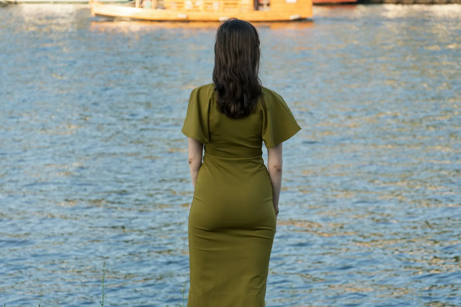
Camel against chocolate separates Soft from Deep. On a Soft Autumn, chocolate is darker than anything in the face and sits under it like a block, while camel looks like it belongs. If chocolate looks natural and camel looks pale, your depth is stronger than your softness.
The way colors fail on you is a third clue. When a color goes wrong on a Soft Autumn, it usually looks too bright or too loud; on a True Autumn it usually looks too cool, and on a Deep Autumn too pale. The True Autumn color palette runs a six-question comparison of all three Autumns, and the Deep Autumn color palette covers the dark end.
Soft Autumn outfits and a capsule wardrobe
Start with one formula: an oatmeal knit near the face, warm taupe trousers, a mushroom coat and a salmon scarf as the only color. Every piece sits within a narrow band of depth, which mirrors the low contrast in your face. Tonal outfits built from camel, mushroom and olive look finished on you in a way that black and white rarely do.
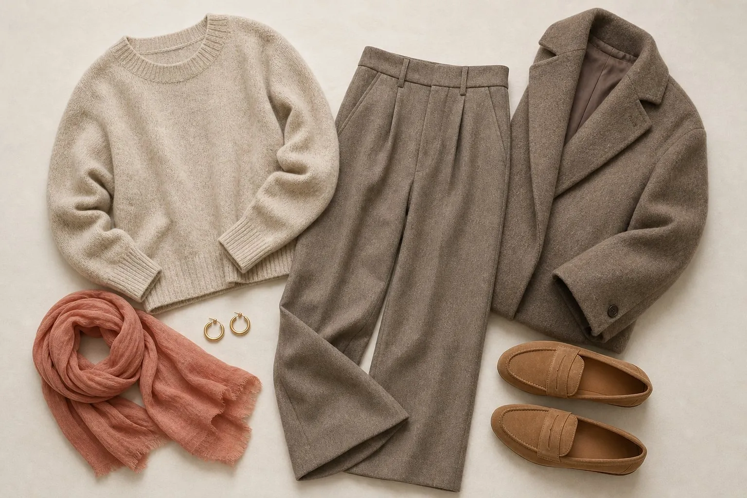
When you pair two accents, keep them at a similar depth: sage with terracotta, olive with salmon, muted teal with camel. A light piece against a very dark one draws a hard line across the body that nothing in your face repeats.
For a capsule, pick eight colors: three neutrals, four accents and one signature. For Soft Autumn that means oatmeal, mushroom and warm taupe; salmon, sage, olive and terracotta; and muted teal as the signature. Spread them over about twenty pieces, with the neutrals in the structural pieces and the color near your face:
| Piece | Soft Autumn color |
|---|---|
| Coat | Warm taupe |
| Jacket or blazer | Mushroom |
| Trousers | Warm taupe |
| Jeans | Vintage mid wash |
| Skirt | Mushroom |
| Dress | Muted teal |
| Knit sweater | Camel |
| Knit sweater | Sage |
| Cardigan | Oatmeal |
| Shirt | Oatmeal |
| T-shirt | Warm off-white |
| T-shirt | Salmon |
| Top | Olive |
| Top | Muted teal |
| Scarf | A blended print of salmon, sage and muted teal |
| Light layer | Terracotta |
| Shoes | Warm taupe |
| Shoes | Camel |
| Bag | Mushroom |
| Jewelry | Brushed gold |
About two thirds of the pieces are neutral, and almost every colored piece sits at or near the face, where the palette does its work.
Texture does what contrast does for other seasons. Suede, brushed wool, linen, cashmere and matte cotton scatter light and read soft. High shine works the other way: satin, patent leather and polished metal throw bright highlights, which is a form of clarity. Keep shine to small accents and let the fabric carry the interest.
Hair color for Soft Autumn
The best hair color for Soft Autumn keeps the palette’s three traits: gentle warmth, medium depth and, above all, softness. In salon terms that means golden or beige tones rather than ash, a level close to your natural one, and color that is blended rather than striped.
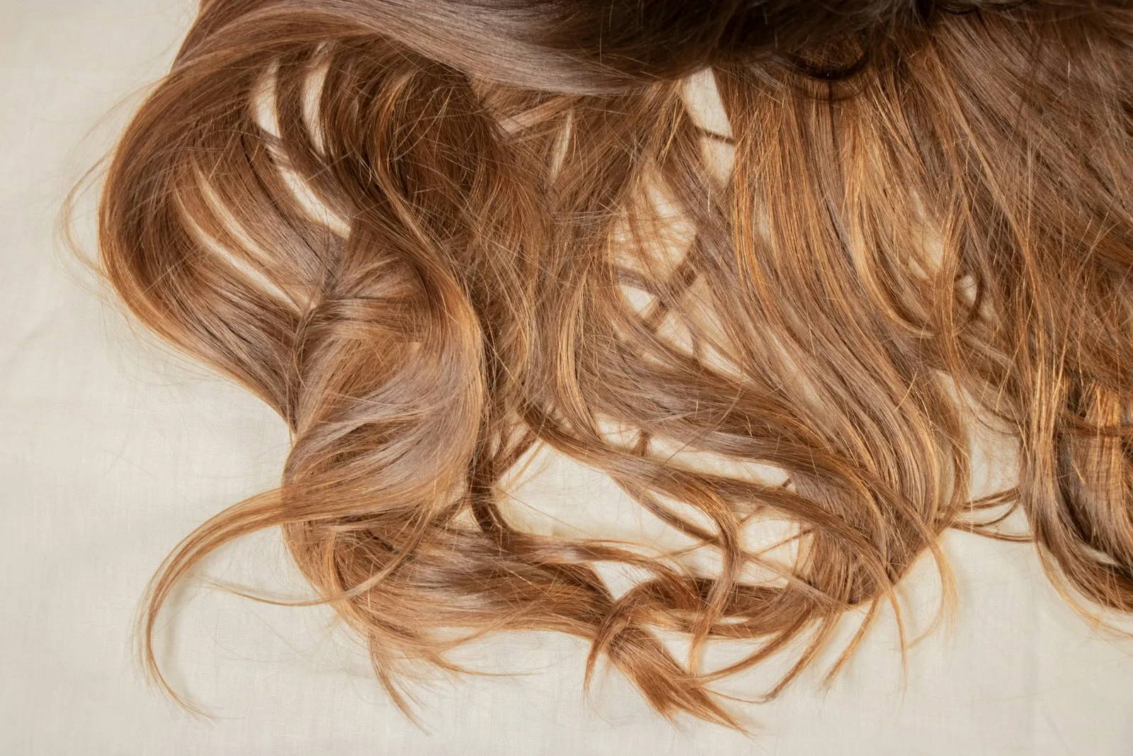
| Shades | Notes | |
|---|---|---|
| Safe | Soft golden brown, honey brown, muted caramel | The natural range for this season |
| Lighter | Honey or soft golden blonde | Fine pieces through the length, not stripes |
| Stretch | Soft copper | Keep it muted; a bright copper reads clear |
| Avoid | Black, icy platinum, ash pieces, vivid jewel-tone red | Each adds contrast or coolness the face lacks |
Soft seasons sit closest to neutral, so beige and soft golden tones that do not push hard in either direction suit them best. A brassy, orange result after lightening is as wrong as ash, only on the other side.
Clarity is the part people miss. A single, saturated, very even color is stronger than anything in a blended face; the hair becomes the loudest thing in view and the skin recedes. Fine, low-contrast highlights or lowlights break the color up and bring it back to the face’s level, while a chunky highlight reads as stripes.
Tired of your natural shade? Move a step or two in the same direction rather than across: a mousy light brown can become honey brown without leaving the season.
Soft Autumn makeup and nails
Makeup follows the same muting as the clothes. Temperature picks the family, peach, rose-brown and terracotta, and softness picks the finish: matte or soft satin, because shine reads as clarity.
| Product | Soft Autumn shades | Finish |
|---|---|---|
| Lipstick | Warm rose-brown every day, salmon as the pink, terracotta as the statement | Matte, soft satin |
| Blush | Salmon, warm rose-brown | Matte, soft satin |
| Eyeshadow | Camel, warm taupe | Matte, soft satin |
| Liner | Olive, muted teal | Soft, smudged |
| Nails | Soft caramel nude, terracotta red, warm taupe or muted teal as the dark | Soft satin or a matte top coat |
Lipstick shows a wrong temperature first, because it sits at the center of your face. The everyday shade should look like your lips on a good day, a touch darker; warm rose-brown does that for most Soft Autumns. Bright fuchsia and glossy cool pinks are the shades that look pasted on.
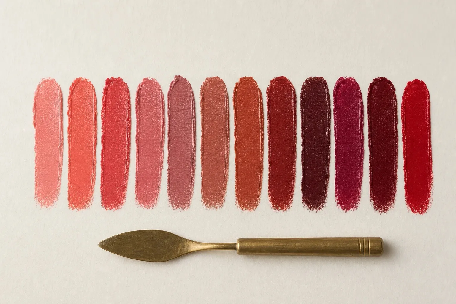
Blush should look as if it came from inside the skin: salmon or warm rose-brown, a little lighter and softer than the lipstick. Build the eyes on your neutrals, camel and warm taupe, and bring color in only at the lash line, where a thin, smudged line of olive or muted teal is enough. Drop black liner: only the three Winter palettes include black, and on you it draws a line that nothing else in the face repeats.
Nails can follow the season loosely, since hands sit away from the face; treat the Soft Autumn nail colors in the table as a starting set. Hold a nude against your fingers rather than your face: it should sit close to their depth, or it looks chalky.
Metals, glasses, denim and prints
Soft Autumn is a gold season, but not a shiny one. Brushed, matte or antique gold and bronze match warm, muted coloring, while bright polished silver looks cold beside it. If you love silver, choose a brushed or oxidized piece, and if you sit near the Soft Summer line, rose gold bridges the two.
For glasses, soft, blended tortoiseshell with honey and brown patches, olive, mushroom and muted teal acetate all work, as do brushed gold and bronze metal frames. Matte finishes and mottled patterns read soft; glossy black is the frame to avoid, along with bright jewel tones. A frame close to your brow color never becomes the darkest thing on your face.
For jeans, a vintage mid wash suits Soft Autumn best. Washing strips indigo from the surface so more of the white threads show, which lightens and softens the blue the way the palette is softened. A crisp dark rinse looks harder than your face. Ecru and oatmeal are your white jeans, and gray denim tends to look flat on warm coloring.
Prints follow your contrast. Low-contrast, blended patterns, such as a tonal check in camel and mushroom, a watercolor floral in salmon and sage or a soft paisley, look like they belong. Choose prints whose colors come from the palette and whose lights and darks sit close together.