Soft Summer is soft first and cool second, so the Soft Summer color palette is muted and smoky, with gray blended into every shade: mauve, dusty blue, periwinkle, seafoam, sage, slate and pewter, anchored by soft navy and lightened with ivory. Bright, saturated color is what overwhelms it. If muted colors look natural on you and vivid ones seem to arrive before your face does, start here; the season to rule out next is Soft Autumn, which is just as muted but warm.
What Soft Summer coloring looks like
Nothing in a Soft Summer face stands apart: hair, skin and eyes blend into one another. Natural hair often sits between dark blonde and mid brown, ash or mousy rather than golden. Eyes tend to be gray-green, soft hazel, muted blue or a soft, grayed brown. Skin leans cool to neutral, and it is common for the undertone tests to disagree, because temperature is not the strongest trait.

Contrast is low. In a black-and-white photo the features sit in the middle grays, close to one another. Contrast is relative, though, which answers one of the most common questions about this season: dark brown hair on medium or deep skin can still sit close to the skin in value. Skin depth can be anything from fair to deep. The common thread is a blended, gentle look that bright color seems to sit on top of.
The axis that decides this season is chroma, the measure of how vivid or grayed a color is (the term comes from the Munsell color system). A Soft Summer reads low on it, so softness leads, with a cool lean as the second trait and value in the middle. In the Color Season Quiz, answers such as “vivid colors wear me”, “my features blend into each other” and “a soft off-white looks better than pure white” all push the chroma reading toward soft, and a reading on the cool half of the temperature axis makes the result Summer rather than Autumn.
Undertones and color seasons are a styling framework, not a measurement of your skin. The tests here compare colors side by side, which anyone can repeat in daylight.
The Soft Summer color palette
- powder
- rose
- mauve
- periwinkle
- dusty blue
- seafoam
- sage
- soft navy
- slate
- pewter
- ivory
With eleven swatches, this is the largest palette on the site, and the quietest. Every color is low in chroma; several, such as slate, pewter and dusty blue, are barely more than tinted grays. Value runs from ivory and powder at the light end to soft navy at the dark end, with most of the palette gathered in the middle, which is where Soft Summer coloring sits too.
| Role | Colors | Where they go |
|---|---|---|
| Light neutrals | Ivory, powder | Shirts, tees, knits near the face |
| Mid neutrals | Pewter, slate | Knits, trousers, coats, bags |
| Dark neutral | Soft navy | Coats, trousers, shoes |
| Pinks and red | Rose, mauve | Tops, scarves, lips, cheeks |
| Blues and purple | Dusty blue, periwinkle | Shirts, knits, dresses |
| Greens | Seafoam, sage | Knits, layers, prints |
| Metals (outside the strip) | Brushed silver, pewter | Jewelry, frames |
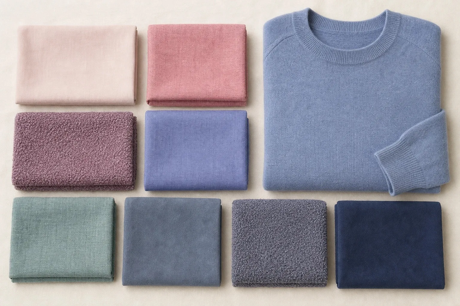
Soft navy is the deepest color, and slate and pewter fill the middle, so the palette can build a whole wardrobe without a single stark shade. Slate here is a plain mid gray with no blue in it, and pewter is a light gray-beige: both sit close to neutral, which is why the Soft Summer neutrals feel calmer than the bluer grays of the other Summers. Powder, a pale pink-beige, and ivory are the light end.
Mauve, a grayed pink with a touch of violet, is the palette’s signature shade. Rose is the warmest pink in any of the three Summer palettes, a dusty rose that leans slightly toward coral, which suits a season whose other border is Soft Autumn. Sage and seafoam are the greens, both grayed enough to stay calm beside the pinks and blues.
Neutrals: slate, pewter and soft navy
| Neutral | Soft Summer choice | Instead of |
|---|---|---|
| Light | Ivory, powder | Optical white |
| Mid | Pewter, slate | Bright cool grays, camel |
| Dark | Soft navy, slate, grayed charcoal-blue | Stark black |
| Denim | Faded gray-blue | Dark crisp rinse |
| Brown and beige | Taupe, rose-brown, pewter | Camel, golden beige |
Black. Stark black is on the Soft Summer avoid list. It is darker and harder-edged than blended coloring, and it makes the face look gray beside it. Soft navy and slate give the same depth with a softer edge; a grayed charcoal-blue works for the coat or trousers you would otherwise buy in black.
Navy. Yes, if it is soft. Soft Summer’s navy is grayed and quiet, close in depth to a dark navy but without its crisp edge. A bright, clean navy is closer to True Summer or the Winters and can look sharp on muted coloring.
White. Ivory, the palette’s lightest swatch, is the Soft Summer white: a soft off-white rather than optical white, which is the brightest color in any wardrobe and makes a muted face look dull. The quiz asks the same thing with its white question, and the soft off-white answer is the one that pushes toward the soft seasons.
Gray and beige. Both are welcome, with conditions. The grays should be soft and mid-depth, like slate and pewter, rather than bright silver or near-black. Beige works when it leans pink or gray, like powder and pewter; golden beige and camel are Soft Autumn’s neutrals and tip the face warm.

Brown. Taupe and a muted rose-brown are the browns that work here. They sit near the middle of the temperature line, which is also why they are shared with Soft Autumn.
For a crisp moment, such as a white shirt under a dark jacket, use soft navy with ivory; it is as much contrast as the palette ever needs.
Soft Summer colors, hue by hue
Soft Summer can borrow from almost any hue family, as long as the color has been grayed down. The table names the Soft Summer member of each family and the louder relatives to leave on the rack.
| Hue | Soft Summer version | Skip |
|---|---|---|
| Red | Dusty rose-red | True red, tomato |
| Pink | Dusty rose, mauve, rose | Fuchsia, hot pink, baby pink |
| Blue | Dusty blue, periwinkle, soft navy | Royal blue, cobalt |
| Green | Seafoam, sage, soft teal | Kelly green, emerald |
| Purple | Mauve, periwinkle, soft plum | Vivid purple |
| Yellow | None in the palette | Butter, golden and lemon yellow near the face |
| Orange | None | Coral, rust, bright orange |
| Neutrals | Slate, pewter, ivory, soft navy | Black, optical white |
Red is the question with the most precise answer. Soft Summer’s red is a dusty rose-red: cool-leaning, muted, as if a true red had been mixed with gray. It works as a statement because it stays at the face’s level of softness. A clear red is read before the face is, and tomato is both clear and warm.
The greens are wider than in the other Summers. Seafoam and sage are both in the palette, and soft teal sits between Soft Summer and Soft Autumn, so any green that stays grayed and mid-depth fits. Emerald is the green people ask about, usually as jewelry; as a color it is cool but clear and saturated, the opposite of soft. A grayed teal or sage gives you green without the shout.
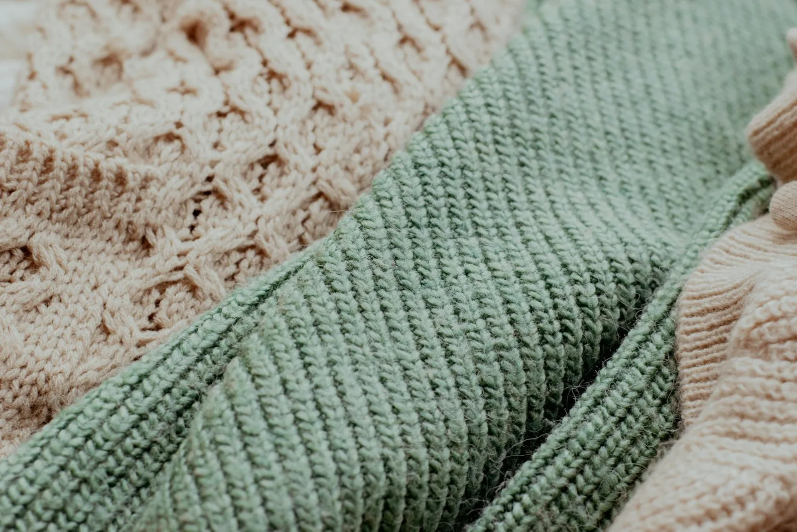
Yellow is the hardest hue for any Summer, and the most asked about for this one, in the form of butter yellow. It is not in the palette: yellow carries warmth by nature, and butter yellow is fairly clean as well. A pale, grayed lemon is the closest Soft Summer yellow; wear it below the waist or with ivory or mauve at the neckline. Orange has no Soft Summer version at all.
Pinks and purples are the heart of the palette. Mauve, dusty rose and periwinkle sit between pink, violet and blue, which is why they combine so easily with each other and with the grays.
Worst colors for Soft Summer, and the swaps
Two entries make up the season’s avoid line, bright saturated color and stark black and white, and both fail the same way: they are clearer than the face, so people notice the color first.
| Worst near the face | Why it fails | Wear instead |
|---|---|---|
| Fuchsia, hot pink | Saturated; louder than the face | Mauve, dusty rose |
| Royal blue, cobalt | Clear and intense | Dusty blue, periwinkle |
| Kelly green, emerald | Clear green | Sage, seafoam, soft teal |
| Orange, coral | Bright and warm at once | Rose |
| Black, especially with white | The hardest edge in clothing | Soft navy with ivory |
| Optical white | Glaring next to muted coloring | Ivory |
| Mustard, rust, camel | Warm earth tones; tip the face toward Soft Autumn | Pewter, taupe |
Shine belongs on the list too, even though it is not a color. A glossy surface throws back bright highlights, which read as clarity, so a mauve in high-shine satin can look louder than the same mauve in washed silk.
None of these colors has to leave the wardrobe. Worn below the waist, in shoes and bags, or in a print that mixes them with softer colors, they lose most of their effect on the face.
Soft Summer or Soft Autumn?
Soft Autumn is Soft Summer’s sister season, and the two are the pair people confuse most, because their strongest trait is the same: softness. Both look best in muted, blended colors and both are overwhelmed by bright ones. The difference is temperature. Soft Summer leans cool; Soft Autumn leans warm.
- camel
- salmon
- terracotta
- sage
- olive
- muted teal
- mushroom
- warm taupe
On the quiz, this border hides in one place. Soft Autumn can never be a Soft Summer’s runner-up, since both seasons are decided by softness and differ only in temperature, so read the cool-to-warm marker and the undertone line. “Undertone: neutral” under a Soft Summer result means you sit close to Soft Autumn, which is where olive skin often lands. The olive skin tone guide explains why.
You need a window, a mirror, a bare face and a neutral gray towel over your hair. Give each color a few seconds under the chin and judge the skin, never the fabric: the right color evens it and lightens the under-eye area, the wrong one casts gray or yellow, or deepens the shadows around the mouth.
- Dusty rose against salmon. Pink shows temperature fastest. Soft Summer’s rose is already close to the line, so this is a fine distinction: on cool skin, salmon looks slightly yellow at the jaw.
- Dusty blue against muted teal. If teal makes you look tired and dusty blue makes you look calm, you lean cool.
- Pewter or slate against camel. The neutral test, and the one that matters most, because the neutral is what you will wear most often.
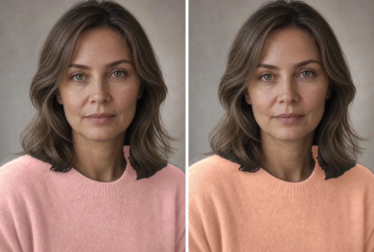
Two of three on the same side settles it. If the drapes split, wear what the two seasons share while you keep testing: sage, soft teal, a muted rose-brown and taupe. Both palettes contain a sage, and they are not the same: Soft Summer’s is darker and grayer, Soft Autumn’s lighter and clearly greener. That difference is the whole border in one color. For the warm half of the pair, see the Soft Autumn color palette.
The other two Summers are easier to tell apart: Light Summer is paler, True Summer cooler and a little clearer. If powder blue looks better on you than dusty blue, or raspberry better than mauve, the six-question tally on the True Summer color palette page sorts the family.
Soft Summer outfits and a capsule
Soft Summer looks best in tonal outfits: three or four colors close together in value, joined by a shared grayness rather than set against each other. Dusty blue with slate and soft navy, mauve with pewter and ivory, or sage with seafoam and soft navy each read as one considered look. Mauve works as the single accent in an otherwise neutral outfit.
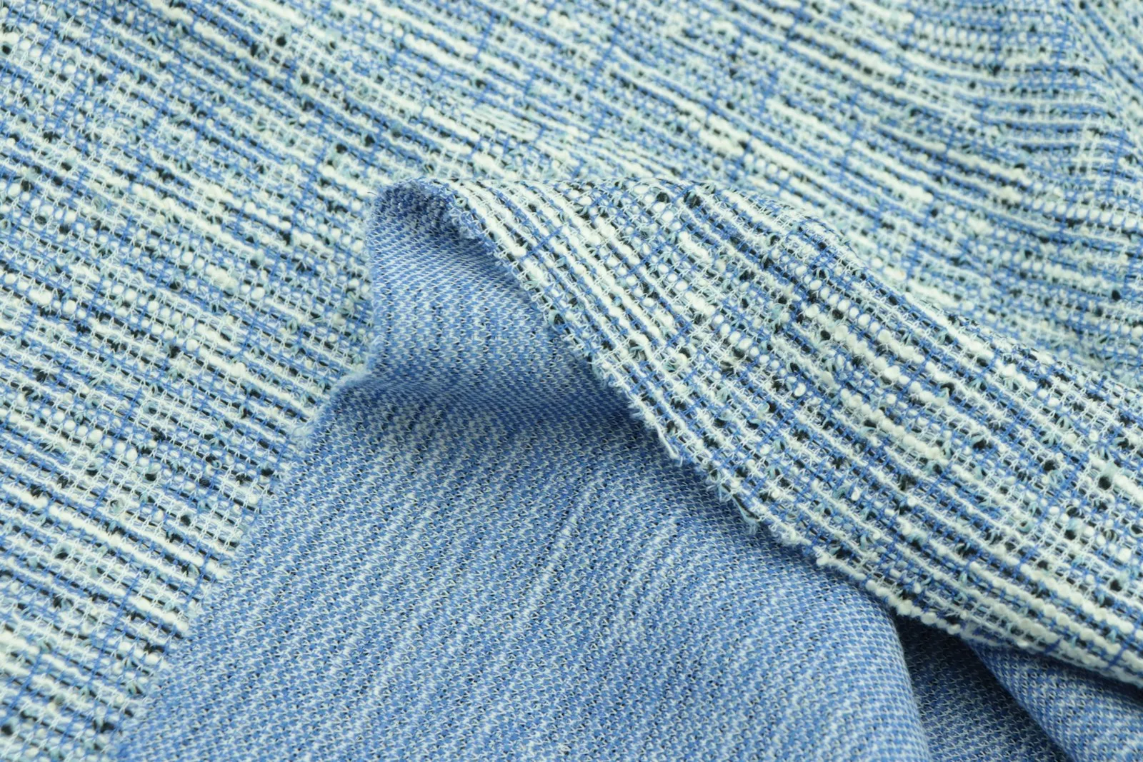
Texture does the work that contrast does for other seasons. Matte and textured fabrics, such as cashmere, bouclé, brushed wool, linen, suede and washed silk, add interest without brightening the color. A soft navy coat in brushed wool over a mauve cashmere sweater has enough depth to look finished and no hard edge anywhere.
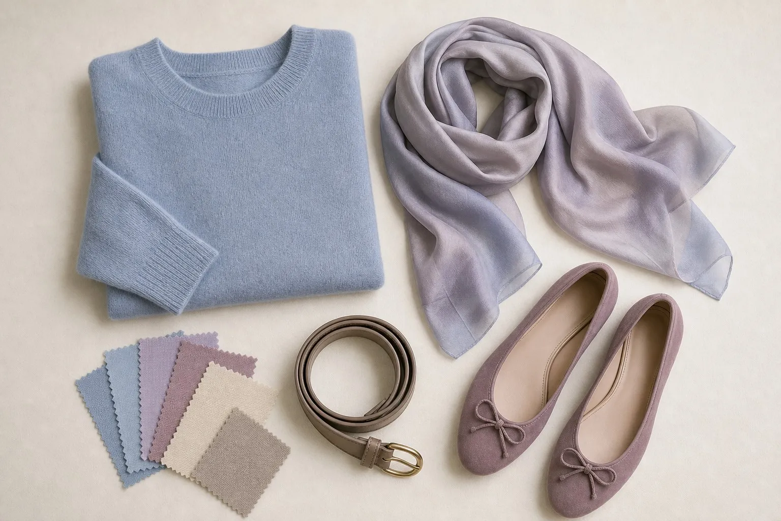
A Soft Summer capsule needs eight colors for about twenty pieces. The neutrals are ivory, pewter or slate, and soft navy; the accents rose, periwinkle, dusty blue and seafoam; the signature, the color that turns up most, is mauve.
| Piece | Soft Summer color |
|---|---|
| Coat | Soft navy or slate, brushed or bouclé |
| Trousers and skirt | Soft navy, slate |
| Jeans | Faded gray-blue |
| Two knits | Pewter, dusty blue |
| Shirt and tee | Ivory |
| Two tops | Rose, mauve |
| Light layer | Periwinkle or seafoam |
| Dress | Mauve or soft navy |
| Scarf | A watercolor print of the accents |
| Shoes and bag | Pewter, taupe, soft navy |
Prints follow the same rule as the outfits: colors close in value, edges blurred. A watercolor floral or a soft check suits Soft Summer better than a crisp graphic, and a small print in a soft navy and ivory reads as texture from a distance.
Hair color for Soft Summer
Of the three things a hair color has, tone, level and finish, the finish matters most for Soft Summer. The color should be blended and slightly smoky, with soft transitions, because a crisp, single-tone shade with high shine adds the clarity the face does not have.
| Safe | Stretch | Avoid |
|---|---|---|
| Mushroom brown, ash or beige blonde, soft cool brown | Low-contrast ash balayage | Jet black, platinum, bright red |
Jet black and platinum fail for the same reason: they add contrast at the edge of the face. Bright red adds warmth and saturation at once. Highlights are the common mistake. Chunky, high-contrast highlights on a Soft Summer read as stripes; fine, low-contrast ones that stay close to the base color blend in.
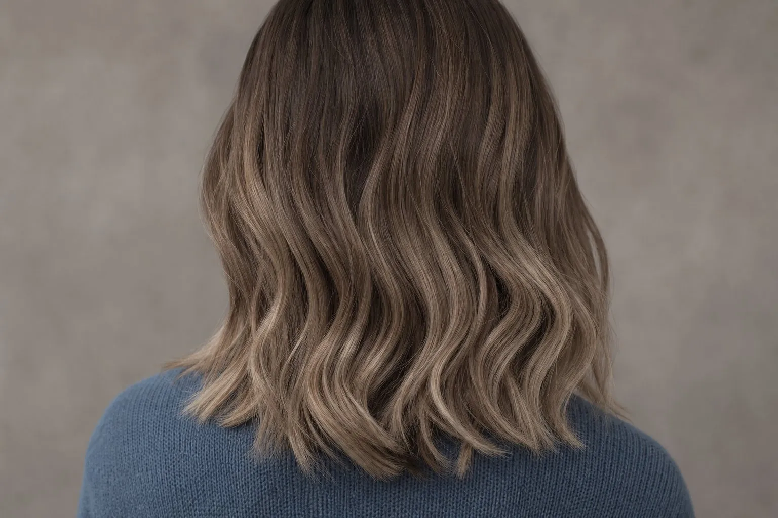
Brunettes do not need to lighten to suit the season: soft cool brown and mushroom brown are already in the safe column.
Soft Summer makeup
| Soft Summer | |
|---|---|
| Everyday lip | Mauve |
| Pink lip | Dusty rose |
| Statement lip | Dusty rose-red |
| Lip finish | Matte or soft satin |
| Blush | Dusty rose, mauve |
| Eyeshadow base | Pewter, mauve |
| Liner | Taupe, gray-brown or soft plum, smudged |
| Nails | Mauve or dusty pink nude, dusty rose-red, soft navy or slate |
Makeup should look blended and slightly muted. Finish matters as much as color: shine reads as clarity, so matte and soft satin suit Soft Summer even in exactly the right shade, while gloss and shimmer can make a mauve lip look like a different, louder color. Blush follows the lip family; bright pinks and shimmery corals tend to sit on top of soft, cool skin instead of melting into it.
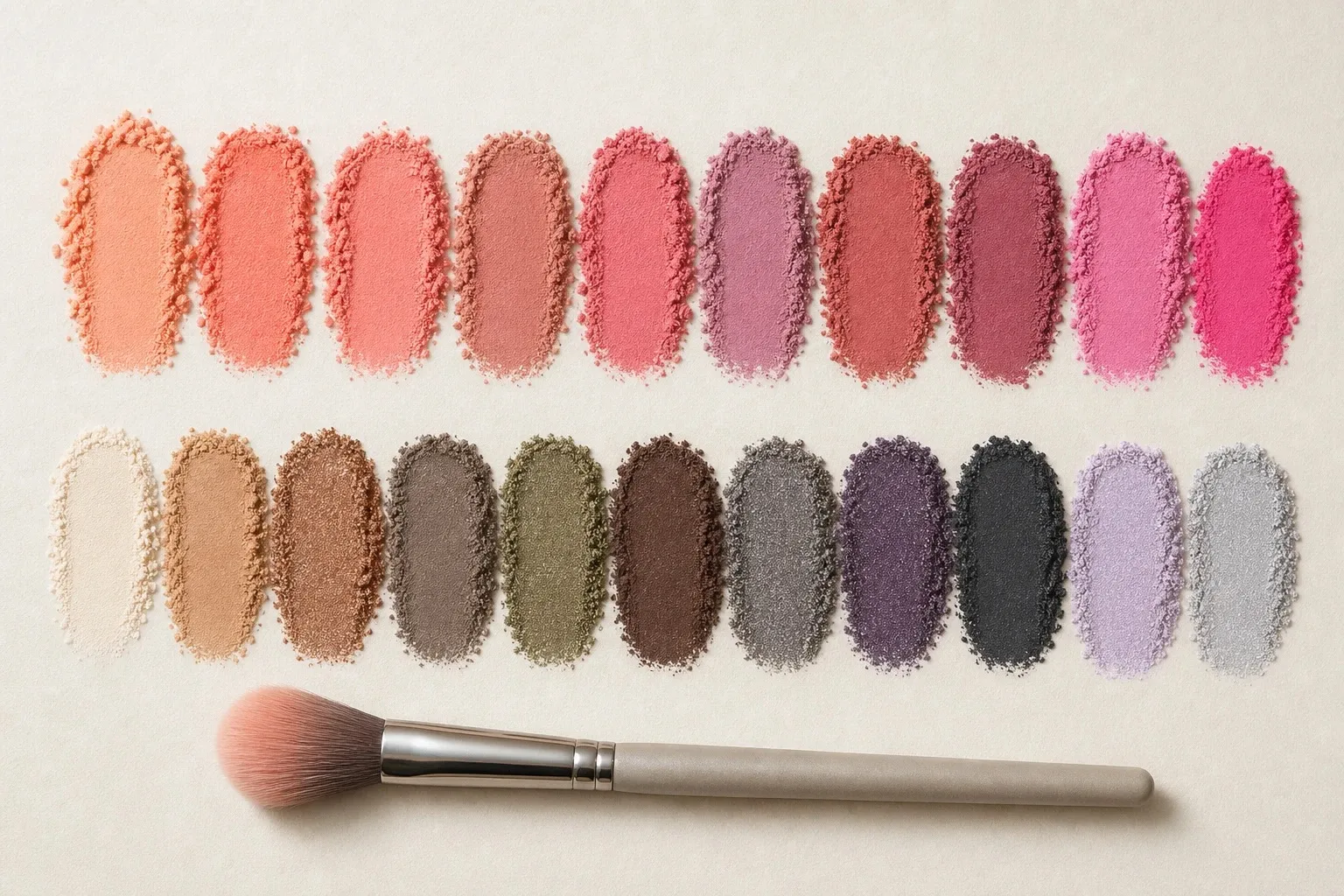
For the eyes, build on the palette’s grays: pewter on the lid, mauve as a soft color, and a taupe or gray-brown line smudged rather than sharp. A crisp black liner is the eye-sized version of a black sweater. Test a lipstick at a window from arm’s length; between two close shades, pick the one you notice less as lipstick and more as a healthy mouth.
Brushed silver, glasses, denim and prints
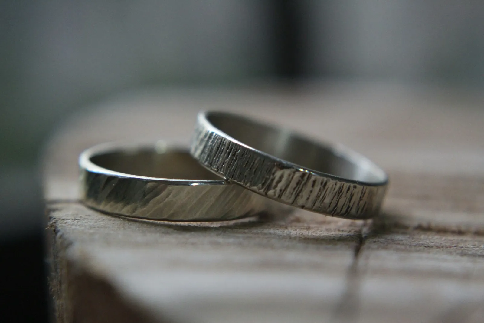
Metals. Brushed or matte silver and pewter. Their gray, low-shine surface repeats the palette’s muted quality; bright, polished metal can look sharp. Yellow gold is usually too warm and too bright. If you want a warmer metal, rose gold in a brushed finish is the closest compromise.
Glasses. Gray tortoiseshell, slate, mauve and smoky translucent acetate blend into a Soft Summer face. A matte finish helps, for the same reason as with lipstick. Glossy black frames and bright colors are the ones to skip. Shape and size follow the face rather than the palette, and what suits your face shape covers them.
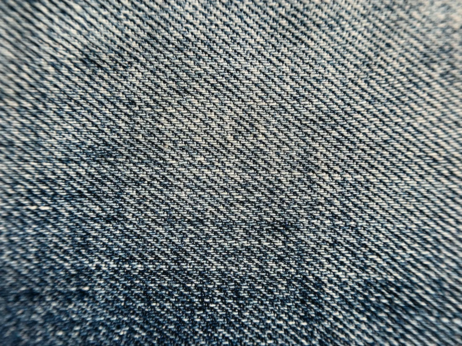
Denim. A faded gray-blue wash is the Soft Summer jean, with soft gray denim and ivory jeans as the other choices. Fading softens the indigo by letting more of the white weft show, which is why it suits this season, while a dark, crisp rinse looks harder than the face.
Prints. Low contrast, blurred edges, colors close in value. Watercolor florals, soft checks, heathered stripes in slate and ivory. A high-contrast graphic, especially black and white, is the print version of the colors to avoid.