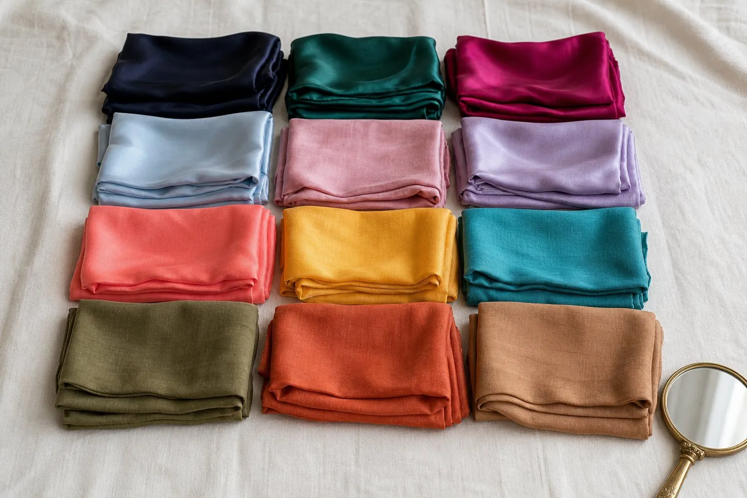
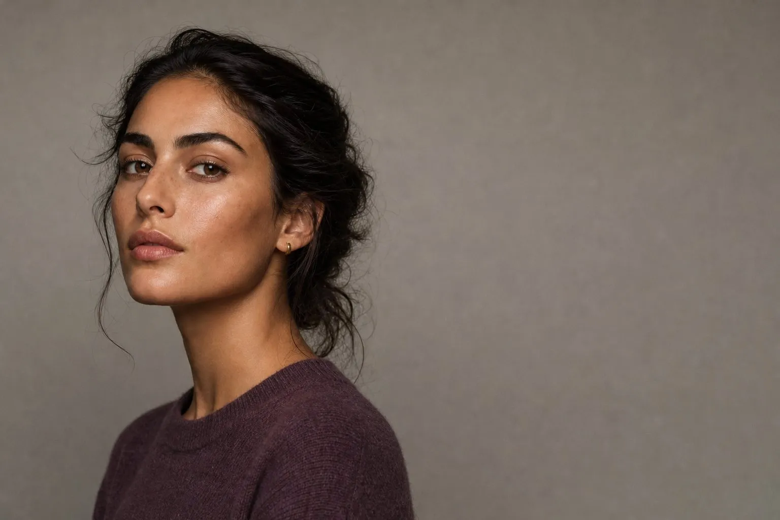
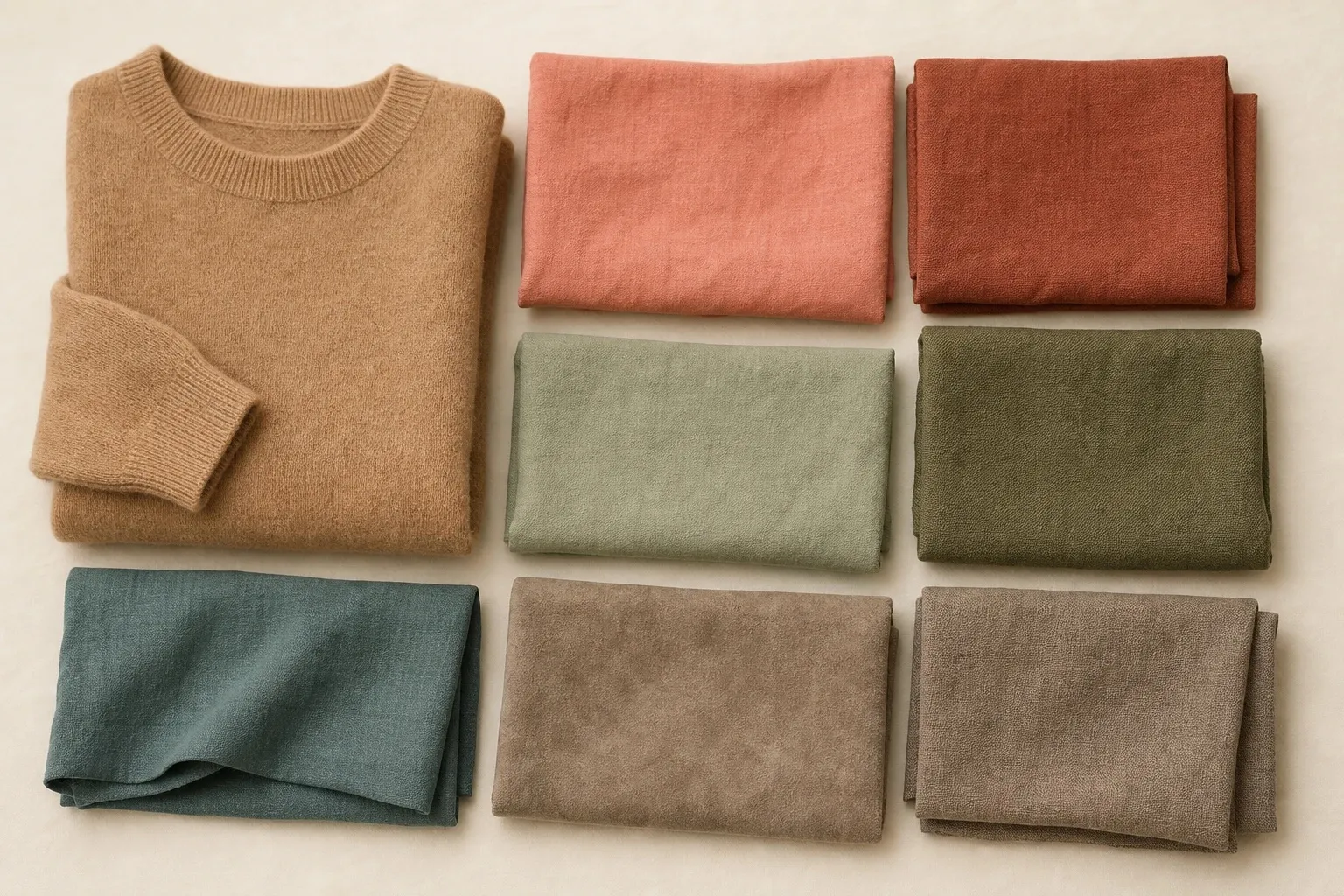
A skin tone chart sorts skin by two things at once, and most confusion starts when the two get mixed. Depth is how light or dark your skin is: fair, light, medium, tan or deep. Your skin undertone is the hue beneath the surface: cool, warm, neutral or olive. Your skin tone name is one of each, such as “medium olive” or “deep warm”. A black-and-white photo finds your row; gold against silver and pure white against cream find your column.
All you need is daylight, a phone, one gold and one silver piece, and a white and a cream cloth. The Color Season Quiz asks the same questions, then adds the third trait a skin chart cannot show.
The skin tone chart
| Depth (gray step) | Cool | Warm | Neutral | Olive |
|---|---|---|---|---|
| Fair (2) | Porcelain pink | Ivory peach | Fair beige | Fair olive |
| Light (3) | Light rose beige | Light golden | Light beige | Light olive |
| Medium (4 to 5) | Medium rose beige | Medium golden | Medium beige | Medium olive |
| Tan (6) | Rosy tan | Golden tan | Neutral tan | Olive tan |
| Deep (7 to 8) | Deep cool brown | Deep golden brown | Deep neutral brown | Deep olive brown |
Rows are depth, columns are undertone. The names are descriptive, not official: no standard chart of skin tone names exists, and five depths by four undertones is a convention of color analysts and makeup ranges. Skin varies continuously, so sitting between two rows is normal.
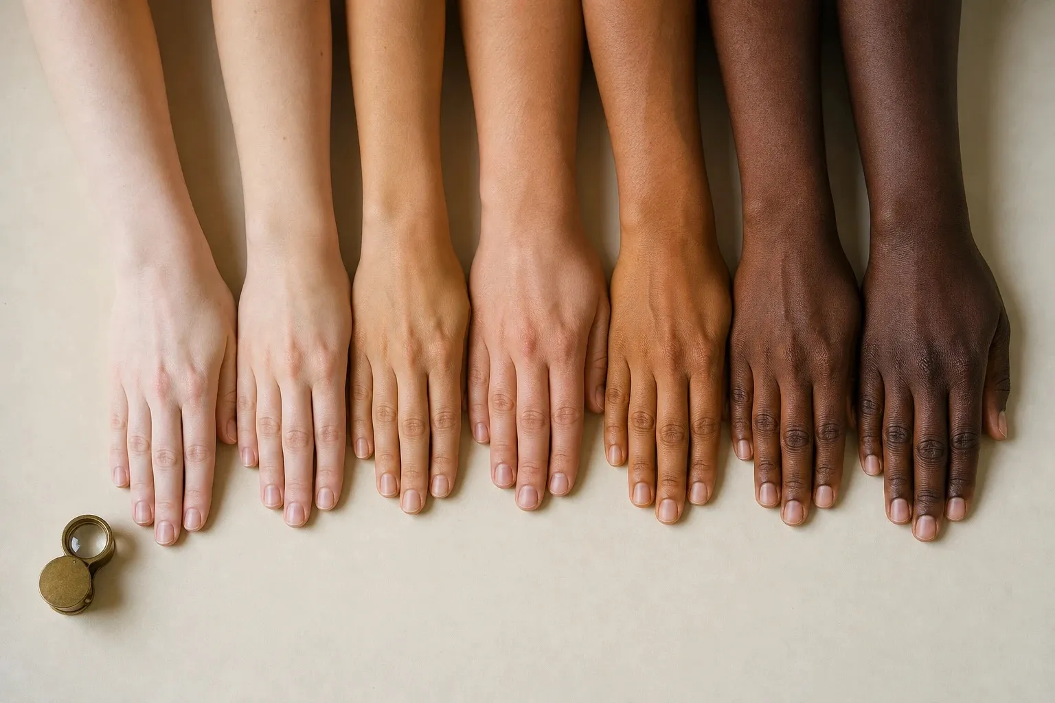
The chart needs both axes because each one decides something different. Depth sets the lightness of your foundation, nude lipstick and hair color. Undertone sets which way they lean: pink, golden, balanced or olive. Two people in the medium row can need opposite foundation lines.
These twenty cells are the chart’s answer to the types of skin tones. Name yours depth first, then undertone: light olive, deep neutral.
Depth: find your row
Depth is lightness alone, so judge it without color. Take a daylight photo of your face near a window, switch it to black and white, and look at the skin on your jaw and cheek. With hue gone, only lightness is left.
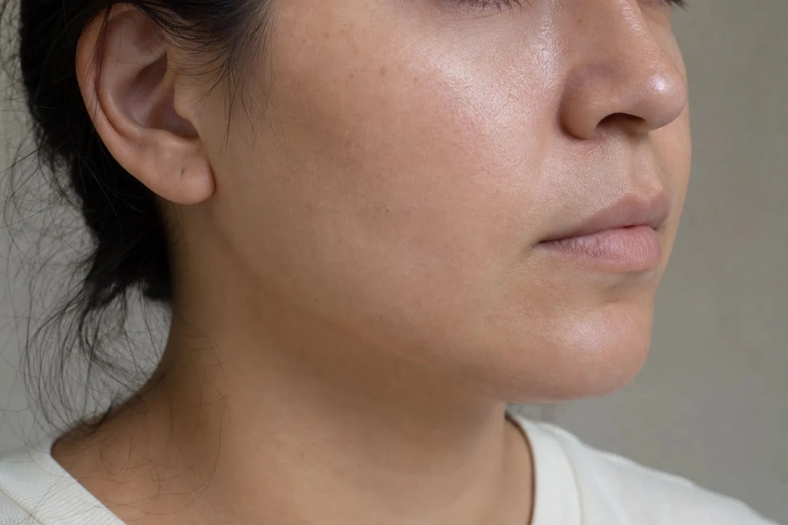
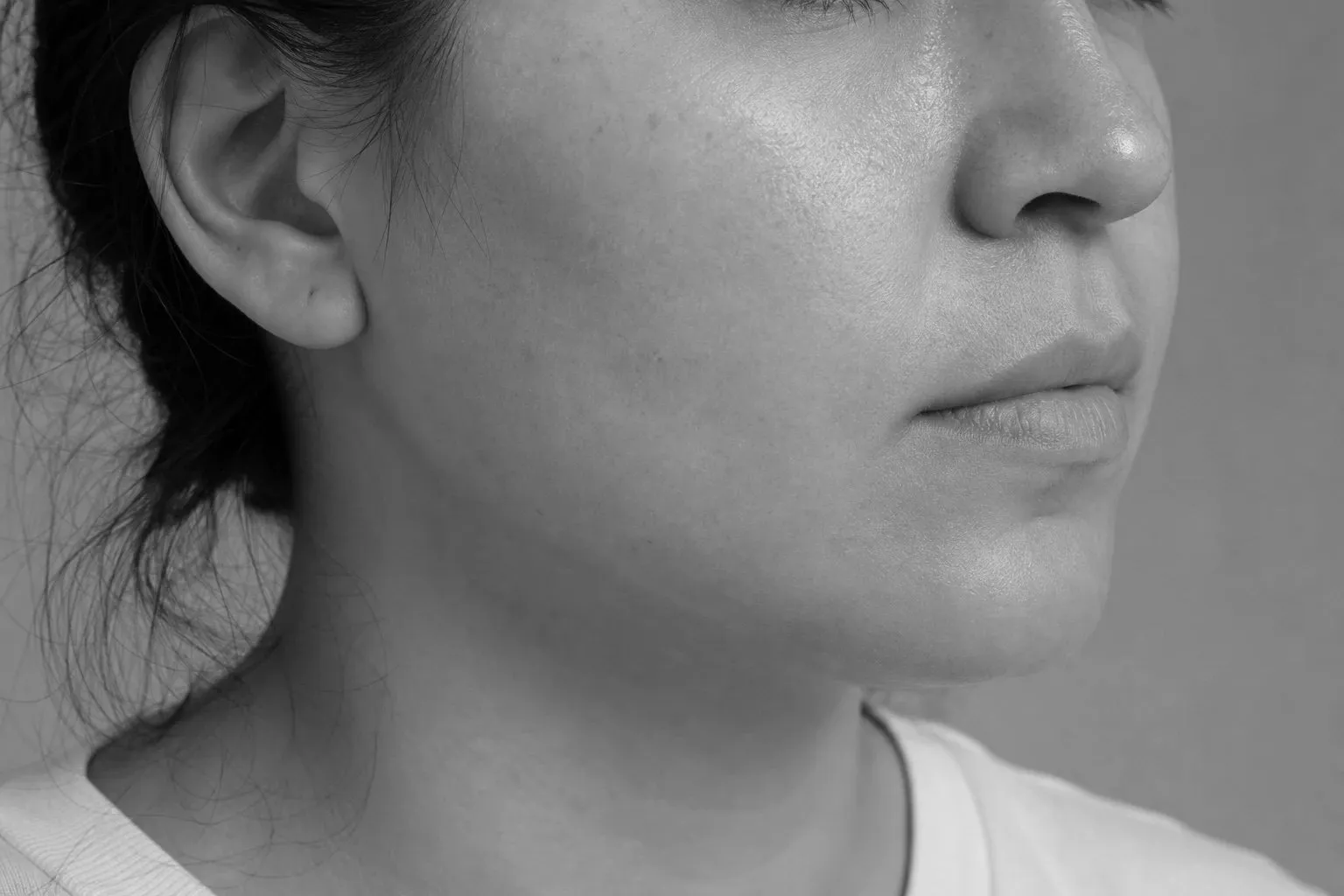
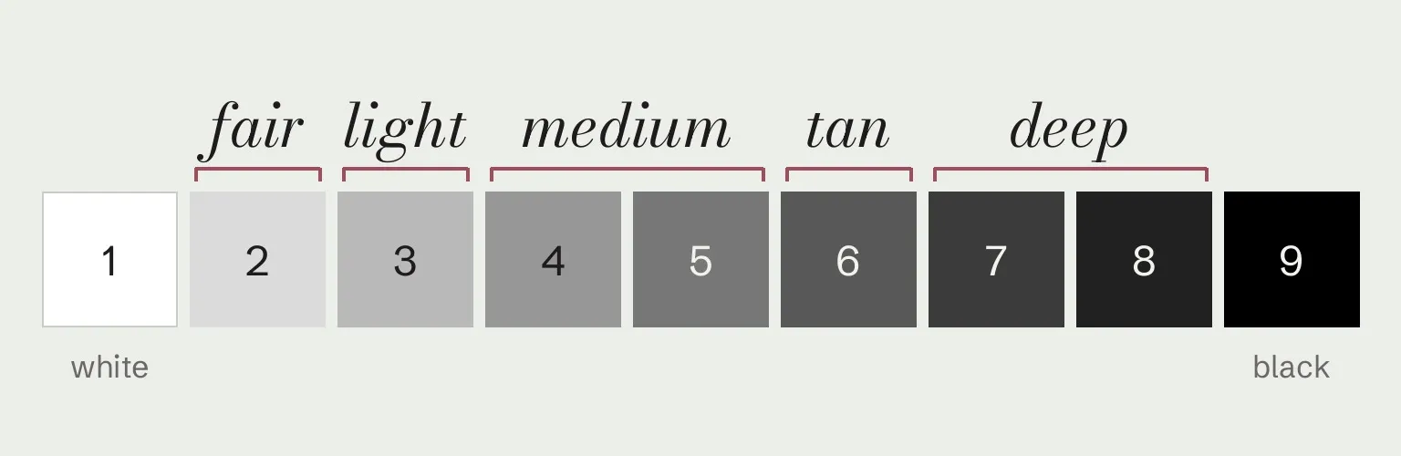
Compare that gray with the nine steps below, 1 white to 9 black, squinting a little so pores and freckles blur. Fair skin sits around step 2 and light skin at 3; a medium skin tone reads as middle gray, step 4 or 5; tan sits at 6 and deep skin at 7 to 8. The steps are a practical mapping, not a standard; they are the numbers in the chart’s first column.
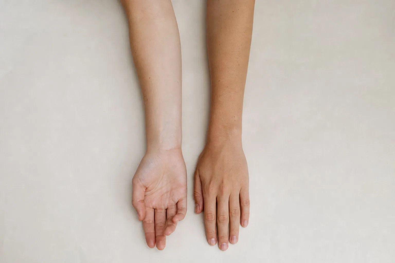
Tan skin tones on this chart are a natural depth between medium and deep, not a suntan, which changes only the surface (overtone vs undertone). If you are tanned now, judge your depth on your inner upper arm.
Your depth is also one end of your contrast, the gap in lightness between your skin and your hair, which seasonal color analysis measures from the same black-and-white photo.
Undertone: find your column
Undertone shows itself by comparison. A color held next to your face either makes the skin look clear and even or brings out gray, yellow or redness, and the direction of that change is your column. Undertones and color seasons are a styling framework, not a measurement of your skin. The tests here compare colors side by side, which anyone can repeat in daylight.
Cool undertone
Cool skin shows pink, red or blue. Its metals are silver, platinum and white gold, its white is pure white, and its easy colors are blue-based: blue-reds, berry, navy and emerald.
Warm undertone
Warm skin shows peach, golden or yellow. Gold, brass and copper make it look healthy, cream and ivory flatter it, and its easy colors are coral, rust, olive and camel.

Neutral undertone
A neutral undertone means the pink and golden tones in your skin are roughly balanced, so the classic tests disagree: both metals look fine, the veins are a mix, and neither cream nor pure white is clearly better. It does not mean every color suits you. It means temperature is not your strongest trait, so depth or chroma decides. A pale, soft-featured neutral still disappears in black; a dark, high-contrast neutral still looks faded in pastels.
Neutral skin still leans a little, and three gentler tests can find the lean:
- Brushed gold against brushed silver. Polished metal adds shine that can mask the effect; a brushed finish shows only the color.
- Cream, pure white and soft white. Pure white beating cream suggests a cool lean, cream beating pure white a warm one. If soft white beats both, your chroma is probably low, which points toward the Soft seasons.
- Salmon against rose. Two pinks of the same depth and softness, one with yellow in it, one with blue.
Look for the color that looks worse rather than the one that looks better. On neutral skin the wrong side shows as a faint gray or sallow cast, which is easier to spot than a small improvement.
Neutral skin tone colors are the ones near the middle of the temperature scale: soft white, taupe, medium gray, navy, jade, muted teal, dusty rose and a true red that leans neither orange nor blue. Adjust each to your depth and chroma: lighter or darker, softer or clearer.
Olive undertone
Olive combines a golden base with a muted green-gray cast that shows most at the jawline, the sides of the nose and around the mouth. If the tests leave you between neutral and olive, two signs point to olive: your skin looks slightly green or gray next to pure white, and both metals look almost right rather than fine. Olive is an undertone, not a depth, so its column runs from fair olive to deep olive. The olive skin tone guide covers the colors, makeup and hair that suit it.
Four undertone tests
Four tests separate warm from cool. Run them in daylight near a window, with a bare face and your hair pulled back, and watch your skin rather than the thing you hold.
| Test | How to read it | How far to trust it | When it fails |
|---|---|---|---|
| Metals | Gold, then silver, at your neck or inner wrist. Silver clearer: cool. Gold healthier: warm. Both fine: neutral. | Most reliable | Polished shine distracts from the skin |
| White vs cream | Pure white, then cream, under your chin. White wins: cool. Cream wins: warm. | Reliable | Warm indoor light makes both cloths look creamier |
| Veins | The inside of your wrist. Blue or purple: cool. Green or olive: warm. A mix: neutral. | Least reliable; tie-breaker only | Hard to see on deep skin; yellow in the skin turns veins greener |
| Natural coloring | Hair in sunlight, eyes in a mirror. Golden, copper or red glints and gold flecks: warm. Ashy hair, gray or icy blue eyes: cool. | Supporting only | Dye, sun-faded ends and gray hide the glints |
If two tests agree and two don’t, believe the metals and the white cloth.
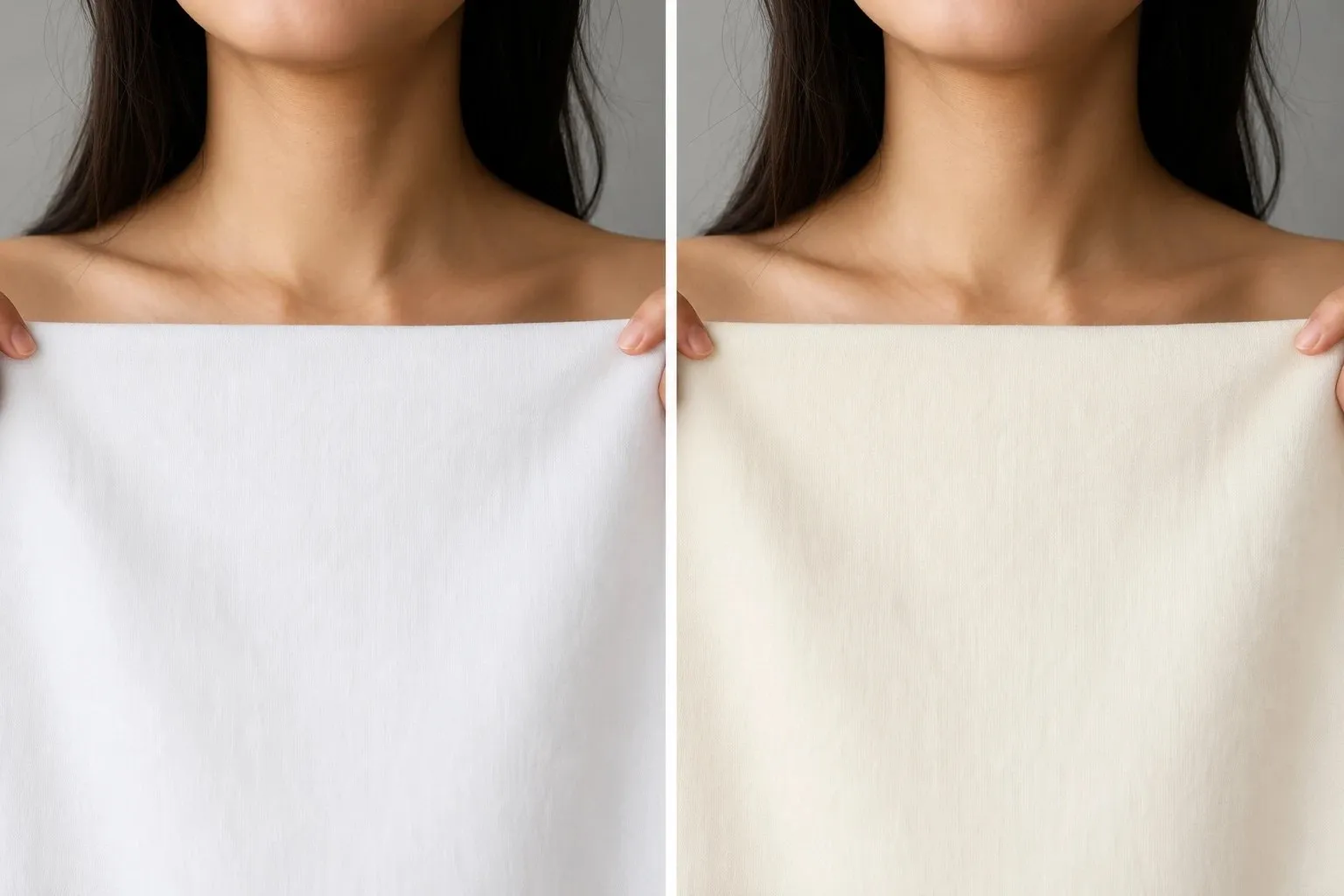
Veins are the best-known test and the weakest, because their color is mostly optics: they look blue from the way skin absorbs and scatters light, not from the color of the blood. Metals and cloth compare your skin with a known color instead, so they work on every skin tone.
“Do you burn or tan?” is missing on purpose. It mostly measures how much melanin your skin has, which is depth, and dermatologists sort it into the Fitzpatrick types under skin tone scales. The Color Season Quiz uses it for depth only. For temperature it asks the four tests above plus how your bare skin leans, with an olive option, and it calls you neutral when the warm and cool answers nearly cancel out.
Skin tone names
A skin complexion chart and a skin shades chart are this chart under other names: complexion, shade and skin tone all mean depth plus undertone. If a list of complexion types puts olive between medium and tan, it is mixing the two axes, because olive appears at every depth.
The in-between names people search for sit on the chart’s borders. The first four below are built from chart words; the rest are borrowed color words, placed only by what the word itself says, and brands use them differently.
| Name | Where it sits on the chart |
|---|---|
| Light medium | Between the light and medium rows, gray steps 3 and 4 |
| Medium beige | Medium row, neutral column |
| Medium golden, golden medium | Medium row, warm column |
| Warm beige | Light to medium, between the warm and neutral columns |
| Honey beige | Light to medium; honey says golden, so warm |
| Fawn | Light; the word says pale brown and nothing about undertone |
| Tawny, amber | Medium to tan; orange-brown and golden words, so warm |
| Umber | Deep; a dark brown earth pigment, undertone open |
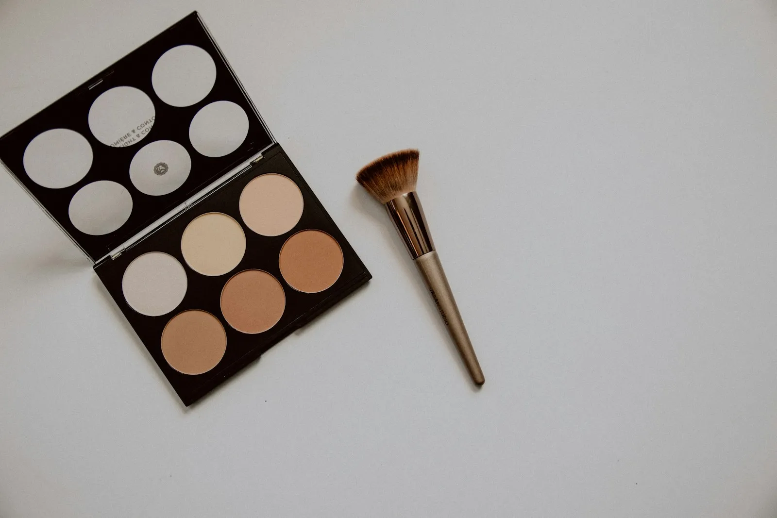
Foundation ranges add trade names such as porcelain, ivory, sand, honey, caramel, chestnut or espresso, each range with its own numbers, so one brand’s “honey” can be another’s medium warm. For a skin tone chart with numbers, use the gray step, which belongs to you, not to a brand. In words, “light olive” tells a colorist or makeup artist more than any trade name.
Overtone vs undertone
Your skin has two layers of color as far as styling is concerned. The overtone is the surface you see: your depth plus any tan, redness or sallowness of the moment. Beneath it sits the undertone.
Skin color itself comes from a few pigments: brown-black eumelanin and yellow-red pheomelanin, red oxygenated and blue reduced hemoglobin in the blood, and yellow carotenoids. Color analysis folds that mixture into two readings. Treating the undertone as fixed is a working assumption of the system rather than a laboratory finding, but it matches what you see when a tan fades.
A tan is extra melanin made in response to sun, and it fades as the outer skin renews. While it lasts, three things shift:
- Value. You are a few shades deeper, so very light colors look paler against you.
- Surface warmth. A golden cast can hide the pink in cool skin and make it look warmer than it is.
- Contrast. With dark hair, a tan narrows the gap between hair and skin; with light hair, it widens it.
Temperature does not shift, which is why your season usually survives a summer at the beach. The inner-arm check shows it: in daylight, compare the inside of your upper arm, which rarely sees sun, with the outside of your forearm:
- Same hue, different depth. The tan is only overtone.
- Golden forearm, pink inner arm. The tan is masking a cool undertone, so judge your colors from the inner arm.
- Both golden or peach. Your undertone is likely warm, tan or not.
While a deep tan lasts, a neighbor’s palette can work better: Light seasons often carry slightly deeper colors, and dark hair with tanned skin may prefer softer pairings to stark ones. Treat these as borrowings, and test your season itself when you are untanned.
Flushing, broken capillaries, tiredness and self-tanner change the overtone too. Self-tanner in particular adds a golden-brown surface that can make cool skin test warm, so run every test on bare, untreated skin.
Foundation and nude lipstick
Makeup splits along one line. Foundation has to disappear into your skin, so it follows the overtone. Lipstick, blush and eyeshadow are meant to be seen, so they work like a drape held near your face.
Foundation undertone vs color season
A foundation’s warm, cool or neutral label and your color season answer different questions, so they can disagree without either being wrong.
| Foundation label | Color season | |
|---|---|---|
| Question | Which shade disappears on my skin? | Which colors make my face look clear and rested? |
| Looks at | The skin’s surface | Skin, hair and eyes together |
| Measures | Pink, yellow or olive balance, and depth | Temperature, depth and chroma |
| Goal | A match | A harmony |
| Changes with a tan | Yes | Usually not |
Four things make the two labels disagree:
- A yellow surface over a cool undertone. Pink foundations look ashy, yet silver and blue-based colors still look best. The foundation follows the surface; the season follows the reaction.
- Redness. Flushing around the nose and cheeks makes skin look pinker than its undertone; a yellow foundation evens it out by neutralizing the red.
- Olive. The green-gray cast makes warm shades look orange and cool ones pink.
- A tan. It deepens and warms the surface, so you may need a darker, more golden shade for summer while your season stays put.
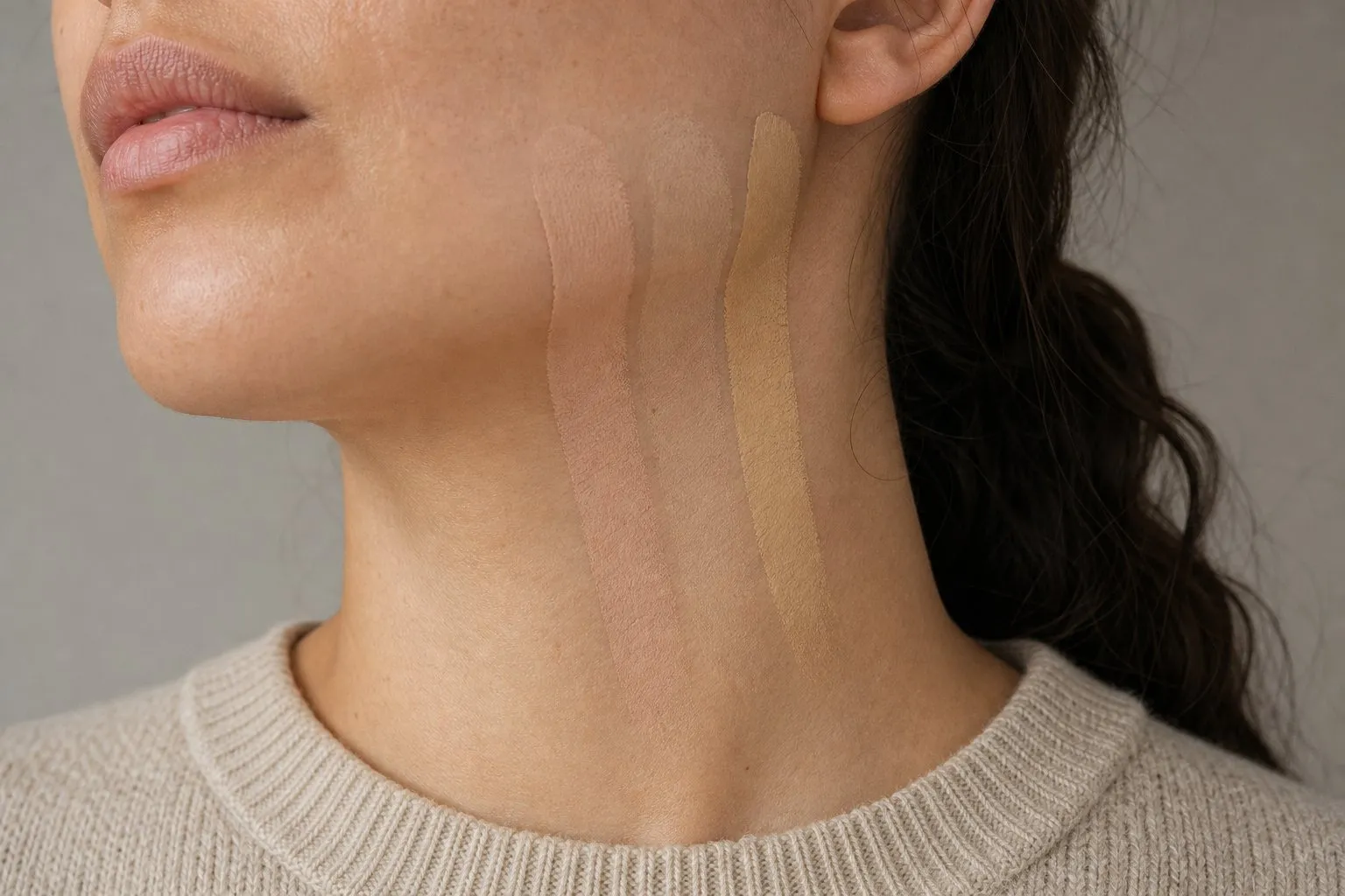
To choose a shade, swipe two or three candidates in stripes along your jaw, from cheek to neck, and check them in daylight after a few minutes. The one that disappears is your shade, whatever its label says. Match the jaw and neck rather than the cheek, which is often redder than the rest of your face.
Do not change your foundation because of your season, and do not change your season because of your foundation.
Nude lipstick by undertone
The right nude looks like your own lips on a good day: close to your natural lip color, about one step deeper, and in your undertone. Look at your bare lips at a window and hold the bullet next to them, not against your hand, whose skin is a different color from your face.
| Undertone | Nude family | Shades to try | Shades that usually fail |
|---|---|---|---|
| Cool | Rosy, mauve | Rose-beige, dusty pink, mauve-brown, berry-brown | Peach, orange-beige, golden caramel |
| Warm | Peachy, golden | Peach-beige, caramel, honey, terracotta-brown | Gray-mauve, lilac-pink |
| Neutral | Balanced | Rose-beige, soft pink-brown, muted rosewood | Very orange or very blue-pink nudes |
| Olive | Rose-brown, slightly warm | Rose-brown, muted terracotta, brick-rose | Yellow-beige, very pale beige |
Olive is the underserved case: pink-beige nudes look chalky on it, and yellow-beige ones bring out the green. Red-brown works, because red counters green and brown keeps the red from looking bright. Go a little deeper than you think, since olive skin often turns pale nudes gray.
Depth matters as much as undertone. A nude must be darker than the skin around your lips; at the same depth or lighter, the lip line disappears and the face looks flat. Fair skin can wear a pale rose-beige, medium skin a mid rose-brown or caramel, and deep skin a cocoa, chestnut or deep berry-brown, still nude because it sits close to the lips’ own color.
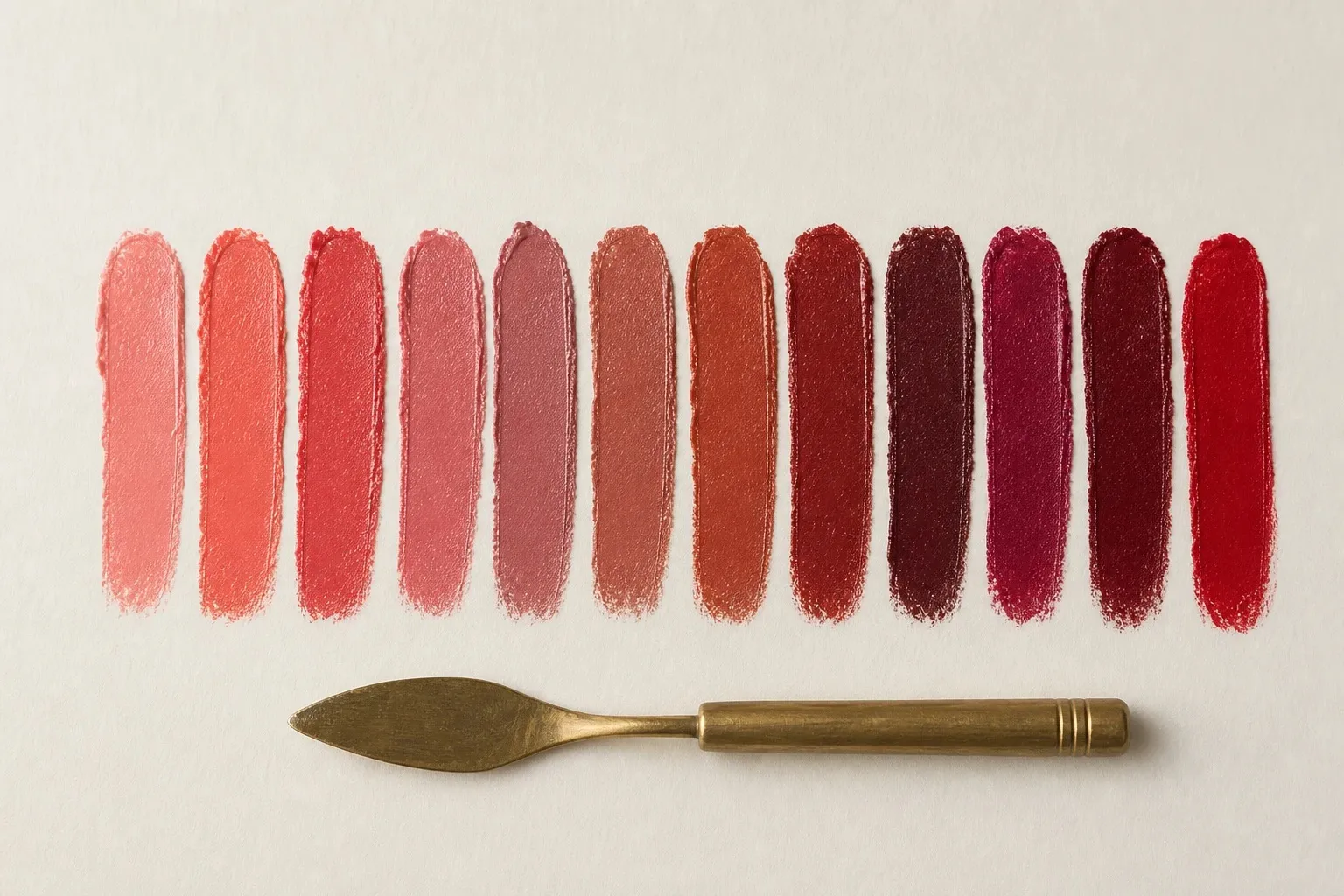
Check the shade at arm’s length in daylight: your mouth should still read as a mouth, and the skin around it should look even, without a yellow or gray cast. For color beyond nudes, your season decides: blue-based pinks and berries for the cool seasons, coral, peach and brick for the warm ones, muted versions for the Soft seasons and clearer ones for the Bright.
Gold or silver?
The metals test in four undertone tests picks the color of your metal. Jewelry sits against your skin near your face, so it acts like a small drape, and once the color is settled the finish decides the rest.
If both metals looked fine, three tie-breakers decide:
- Hair. Golden, copper or warm brown hair leans gold. Ash blonde, ash brown, black or gray hair leans silver.
- Eyes. Warm brown, amber and green-hazel eyes pick up gold. Gray, icy blue and cool green eyes pick up silver.
- Contrast. High contrast carries bright, polished metal. Low contrast looks best in brushed, matte or antique finishes.
Undertone picks the metal; contrast picks the finish.
| Finish | Best on |
|---|---|
| Bright polished yellow gold | Warm, clear coloring (the Spring seasons) |
| Brushed or antique gold, bronze | Warm or neutral, soft coloring (the Autumn seasons) |
| Rose gold | Cool and neutral coloring that finds yellow gold too warm |
| Bright polished silver, platinum | Cool, clear coloring (the Winter seasons) |
| Brushed silver, pewter | Cool, soft coloring (the Summer seasons) |
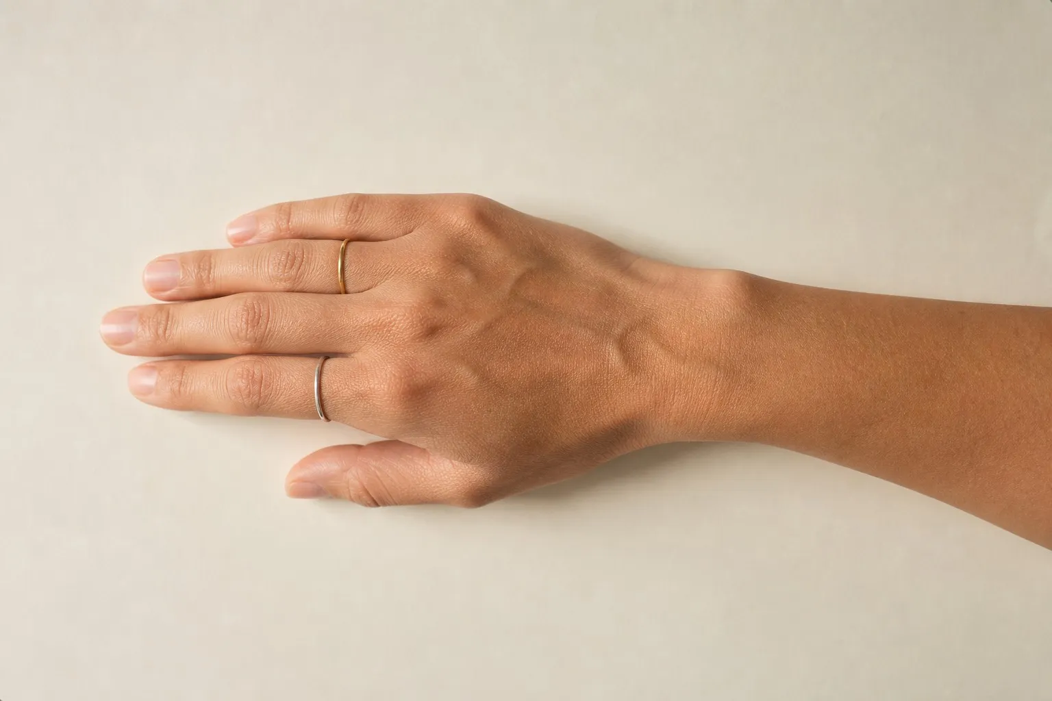
Olive skin usually suits gold in a softer finish, brushed, matte or antique. Bright polished silver can make it look gray, while brushed or oxidized silver often works. To mix metals, link them with one piece, such as a two-tone watch, or repeat each metal at least twice. How large the pieces should be is a question of scale, covered in the guide under the Body Shape Calculator.
Hair color by undertone
Hair color for a cool undertone runs ash, beige and cool brown; for a warm undertone, golden, honey, caramel and copper. Neutral and olive skin sit best with hair that does not push hard either way. Your undertone sets the tone of the color, and your contrast sets how light or dark to go.
The full table for all four undertones, three quick checks to run before a salon visit, and what eye color and face shape add are in the hair color chart. Hair color by season, and what dye does to a season, are in seasonal color analysis.
From undertone to color season
Each axis of the chart maps onto a trait of color analysis. Depth relates to value, and very light or very deep coloring can make value your strongest trait, which points to a Light or a Deep season. In the system, value means hair, skin and eyes together, not skin alone, so deep skin is not automatically a Winter.
Undertone relates to temperature: warm leans toward Spring and Autumn, cool toward Summer and Winter, and in the four True seasons temperature is the strongest trait. A neutral or olive undertone usually means it is not, so one of the eight seasons named after another trait fits better. Your strongest trait picks the row; your slight lean picks the column.
| Strongest trait | Leaning warm | Leaning cool |
|---|---|---|
| Light | Light Spring | Light Summer |
| Deep | Deep Autumn | Deep Winter |
| Soft | Soft Autumn | Soft Summer |
| Bright | Bright Spring | Bright Winter |
The quiz counts an olive answer as slightly warm and slightly soft, so on its own it nudges you toward Soft Autumn; your other answers decide.
The chart leaves out the third trait, chroma: how clear or soft your coloring is. Two people in one cell can need different colors, one carrying vivid emerald, the other looking best in muted teal. To test it, hold a vivid and a dusty version of one color under your chin. Seasonal color analysis shows how the three traits combine into twelve seasons, and the color hub has every palette.
Skin tone scales
Formal skin color scales exist, but none of them was made for choosing clothes or makeup.
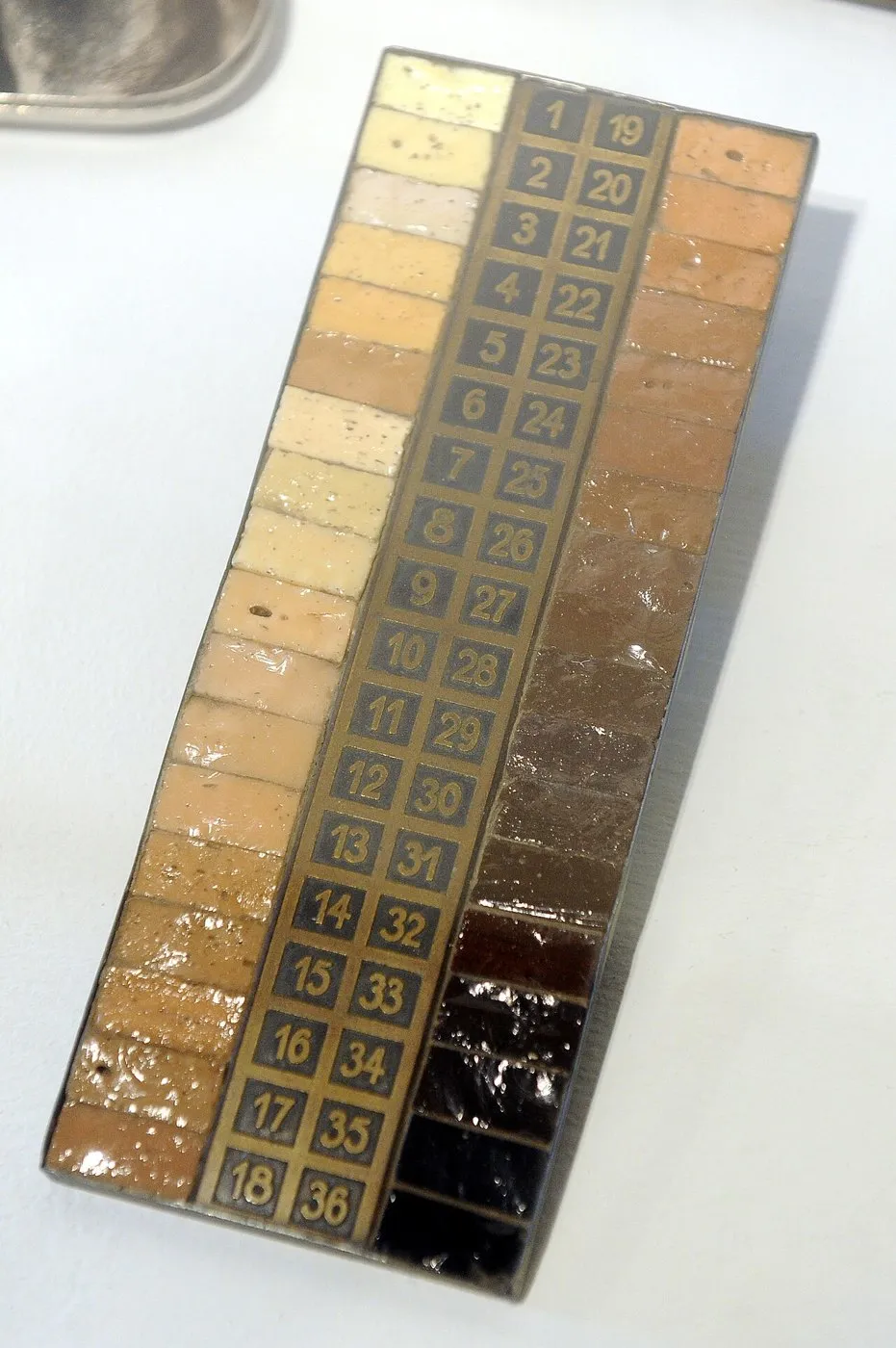
Von Luschan’s chromatic scale. Through the first half of the twentieth century, anthropologists compared skin with a set of 36 numbered glass tiles named after Felix von Luschan. The scale was used to sort populations into racial classifications, different observers often gave the same person different readings, and by the early 1950s it had largely been replaced by reflectance spectrophotometry.
Fitzpatrick skin types. Dermatologist Thomas Fitzpatrick’s six sun-reactive skin types (Fitzpatrick, 1988) sort skin by how it responds to sun, from type I, which always burns and never tans, to type VI, which never burns. They overlap with depth but describe neither color nor undertone.
The Monk Skin Tone Scale. Google released this ten-tone scale in 2022 with Harvard sociologist Ellis Monk and made it open for research and product development. It is used to check whether products and image tools, such as face detection, work across different skin tones. Its tones run in one row from light to dark, so it has no undertone axis.

| Scale | Steps | What it sorts | Undertone axis |
|---|---|---|---|
| Von Luschan | 36 glass tiles | Skin color, for racial classification | No |
| Fitzpatrick | Six types, I to VI | Reaction to sun | No |
| Monk | Ten tones | Depth, for testing products and AI | No |
| This chart | Five depths by four undertones | Depth and undertone, for styling | Yes |
The Munsell system describes every color by hue, value and chroma, and color analysis borrows all three. When dermatologists need numbers rather than categories, they use a colorimeter, which records skin as L* for lightness, a* for red to green and b* for yellow to blue.