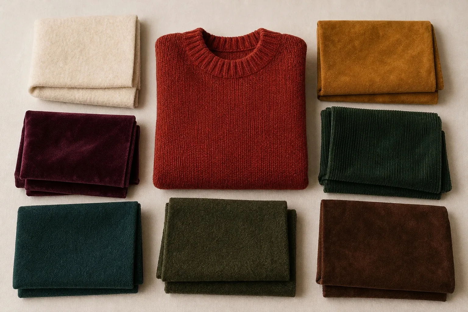
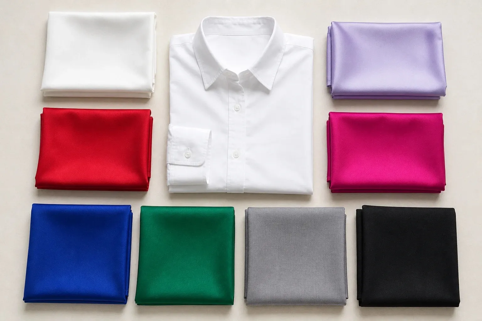
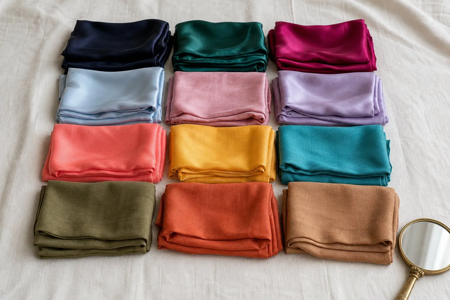
Deep Winter, also called Dark Winter, is deep first and cool second. Its palette sets dark, clear jewel tones (burgundy, deep plum, sapphire and emerald) against black, charcoal and pure white, with icy pink as the single pale accent. If black makes your face look sharper and chocolate brown makes it look muddy, start here. The colors that fail a Deep Winter are the warm ones, the muted ones and the pale ones.
- white
- icy pink
- burgundy
- deep plum
- sapphire
- emerald
- charcoal
- black
What Deep Winter coloring looks like
Depth is the first thing people see. Hair tends to be dark brown to black, cool or neutral rather than coppery, and brows are usually strong. Eyes are often dark brown or black-brown and look clear against the whites. Skin can be anything from porcelain to very deep, with a cool or neutral-cool undertone, because on a Deep Winter the depth sits in the features as much as in the skin.

On the three axes that seasonal color analysis uses, Deep Winter sits at the deep end of value, on the cool side of temperature and on the clear side of chroma, though it is less vivid than Bright Winter. Undertones and color seasons are a styling framework, not a measurement of your skin. Where we cite research, we say what it measured. Read the description above as tendencies and look for the evidence near your face: on a Deep Winter, black looks sharp rather than heavy, powder pastels look faded, and camel or orange leaves the skin sallow.
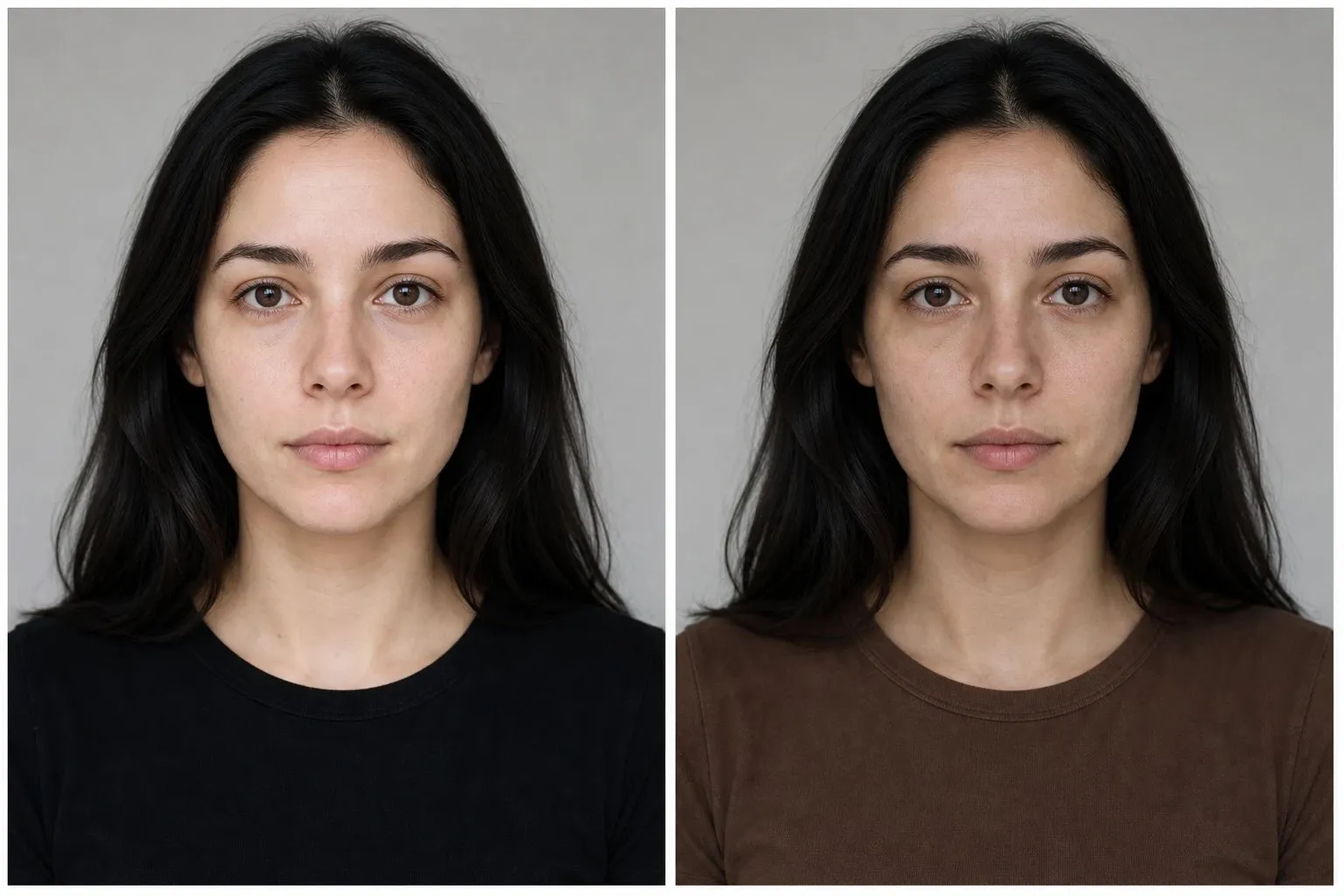
The quickest check takes two tops, one black and one chocolate brown. Stand at a window in daylight, bare-faced, and hold each under your chin. If black makes the jaw and eyes look more defined and chocolate makes the skin look slightly yellow or muddy, your depth comes with a cool undertone. If chocolate wins, go to the Deep Autumn section below before reading on.
The Deep Winter palette by role
The palette works as three neutrals, four accents and one color to repeat. Reading it by role is more useful than reading it as a list, because each role belongs to a different part of an outfit.
| Role | Deep Winter colors | Where it goes |
|---|---|---|
| Light neutral | White | Shirts and tops right under the face |
| Mid neutral | Charcoal | Knits, jackets, skirts |
| Dark neutral | Black | Coats, trousers, shoes, bags |
| Accents | Icy pink, deep plum, sapphire, emerald | Tops, knits and scarves near the face |
| Signature | Burgundy | The color you repeat most |
Deep does not mean muddy. Every accent here is saturated, and the depth comes from darkness rather than from gray or brown mixed in. That is what separates a Deep Winter emerald from an Autumn forest green, and a sapphire from a dusty slate. Value (how dark a color is) and chroma (how clear it is) are separate axes, and this palette is dark on the first and strong on the second.
Icy pink is the light end: a very pale pink that stays cool and clear, so it keeps the contrast that a dusty pastel would remove. Burgundy makes the natural signature, dark enough to behave like a neutral and colored enough to read as a choice.
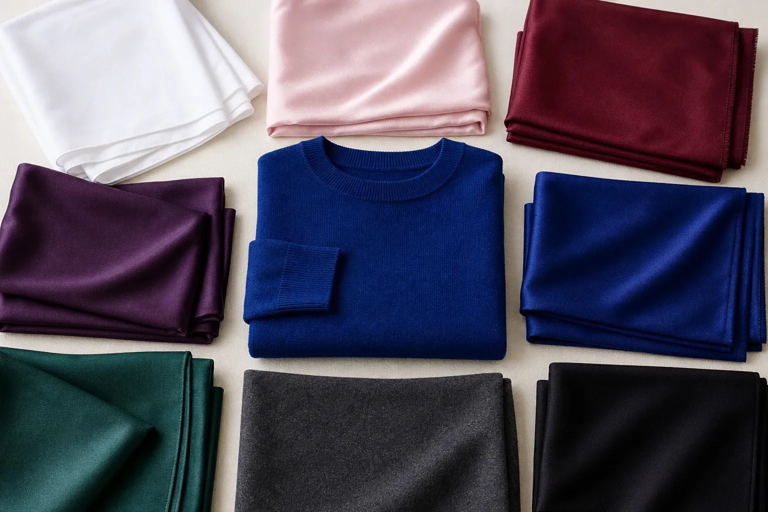
Neutrals: black, charcoal, white and brown
| Neutral | Verdict | How to wear it |
|---|---|---|
| Black | Yes, your everyday dark | Coats, trousers, knits, with a point of light near the face |
| Charcoal | Yes, the softer dark | Suits and knits on days when black feels severe |
| Pure white | Yes | Shirts, collars, T-shirts |
| Ivory, cream | Swap for pure white | Below the waist if you already own it |
| Navy | A clear, dark navy | Tailoring and coats |
| Espresso, black-brown | Yes, close enough to black | Coats, knits, boots |
| Chocolate | Away from the face | Trousers, shoes, belts |
| Camel, beige | Not near the face | A camel coat worn open over black or a jewel tone |
| Taupe | Dark, grayish taupe only | Trousers, bags |
Three of the twelve palettes include black, and of those, Deep Winter is the one that wears it as an everyday neutral rather than as a frame for color. Pure white does the opposite job: it is the point of light that keeps an all-dark outfit alive. Ivory and cream lean warm, so next to cool depth they look faintly dirty rather than fresh. The same logic holds for a bridal or occasion dress, where the Deep Winter white is pure white, with an icy pink blush as the softer option.
Brown is the hard one, because brown is a dark, muted orange: warm and grayed at once. The darker a brown gets, the less of its orange shows, which is why espresso and black-brown sit close enough to black to work as Deep Winter neutrals. Chocolate is borderline, fine in trousers and shoes and less so in a top, and camel misses on depth, temperature and clarity together. To judge any brown, hold it next to black under your chin. If it looks almost as clean as the black, keep it.
Of the three Winters, Deep Winter has the most room for brown, because it shares its depth with Deep Autumn, whose palette is built on chocolate. A Deep Winter in espresso is borrowing from the sister season along the trait they share.
Deep Winter colors by hue
Each hue has a Deep Winter version and a version to skip. Depth and clarity decide which is which more than the hue itself does.
Reds and pinks. Burgundy and cranberry are the reds: dark, blue-based and clear. So yes, red is a good color for a Deep Winter, as long as it leans toward wine rather than tomato. For pink, go to the two ends of the range: deep berry when you want strength, icy pink when you want light. The middle of the range, mauve and dusty rose, is where Deep Winter pinks go wrong.
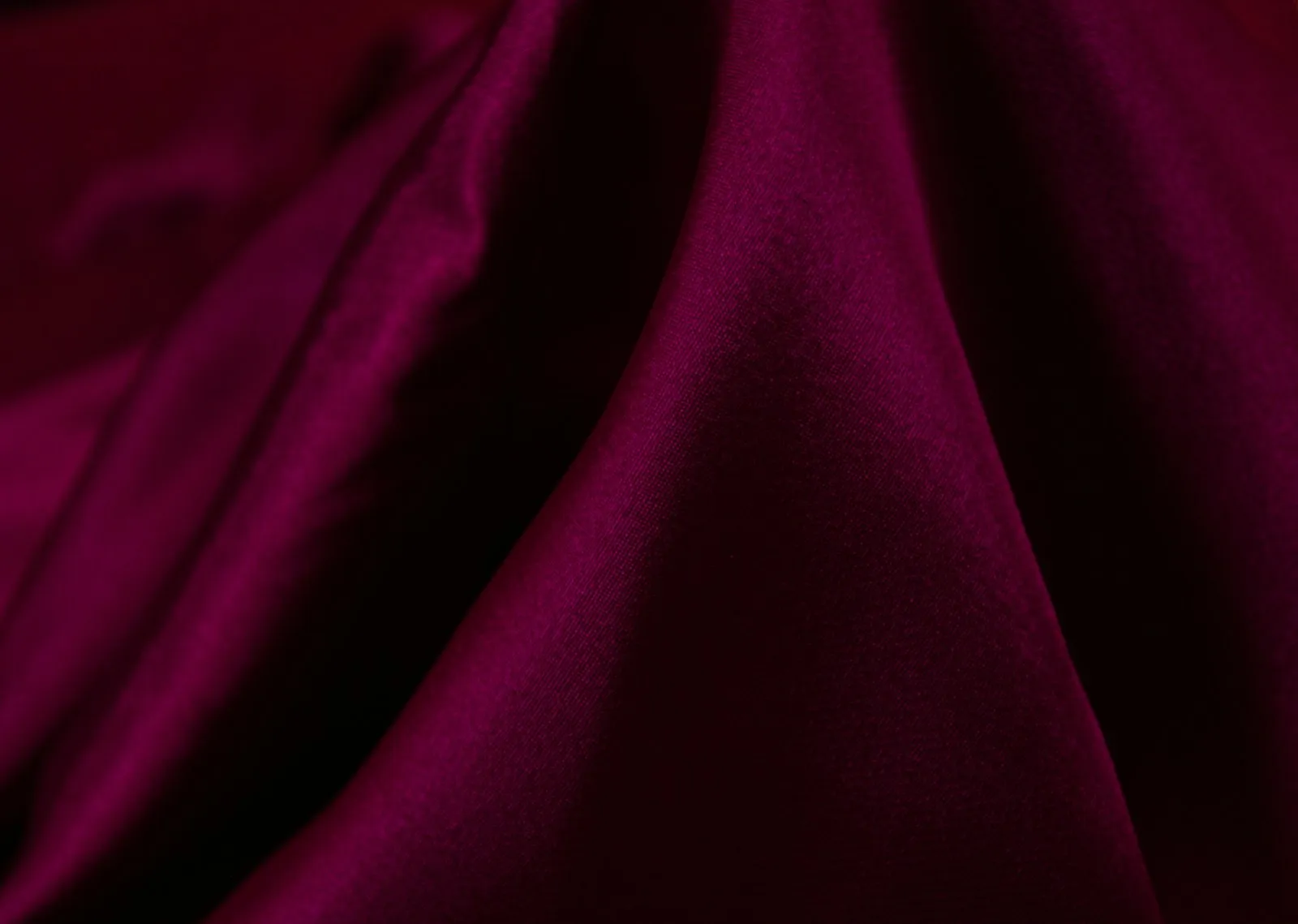
Blues and greens. Sapphire is the blue, and a clear dark navy, close to ink, is its quiet version. Emerald is the green. Dark teal sits on the temperature line between Deep Winter and Deep Autumn and suits both, which makes it a good color to own while you are unsure. Dusty blue, slate, sage and olive all fail on clarity, and olive on temperature too.
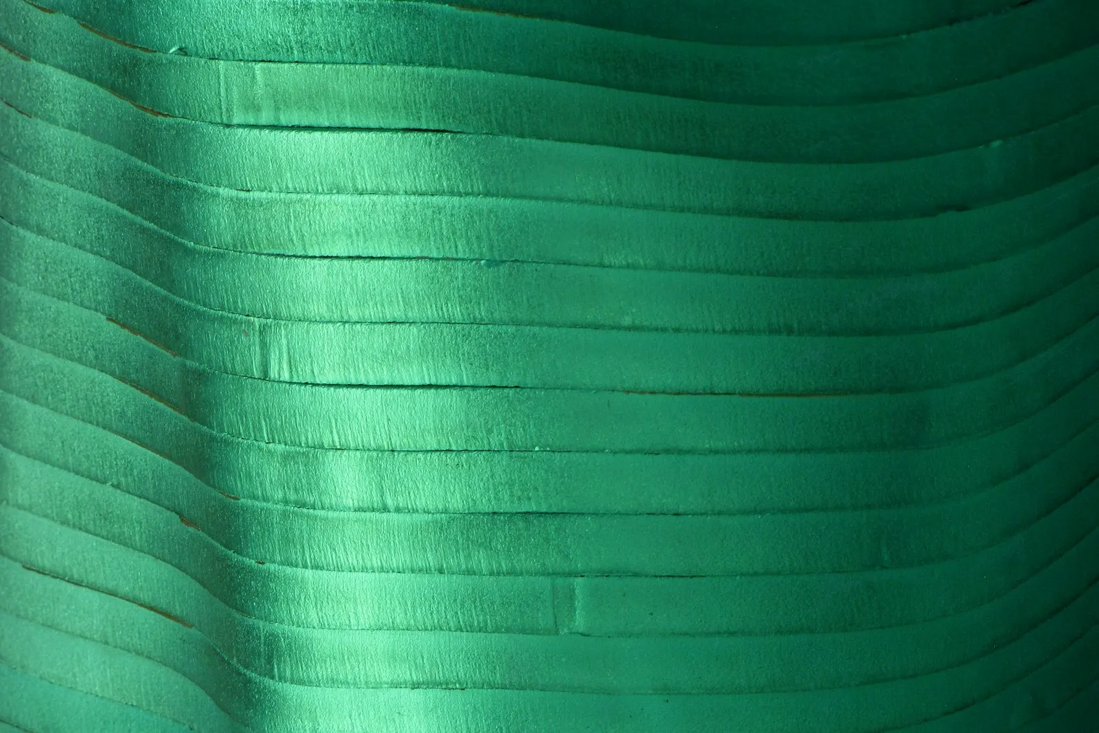
Purples. Deep plum at full depth, with aubergine and wine beside it. All three hold the darkness of the palette and pair with burgundy without any effort.
Yellows and oranges. The palette has none. Both hues are warm by nature, and their dark versions, mustard, rust and pumpkin, add muting on top. If you love them, keep them to bags, shoes and belts, where they do not reflect onto the skin.
Colors to avoid, and the swap for each
A color can miss Deep Winter coloring in three ways, one for each axis.
- Too warm. Orange, rust, mustard and golden brown fight the cool undertone. The skin picks up a sallow or yellowish cast, and any redness looks more obvious.
- Too soft. Muted shades have gray mixed in. Next to dark hair, dark eyes and strong contrast they look dull, and the face loses definition with them.
- Too light. Pale, soft colors near the face cannot match the depth of the hair and eyes. The face looks washed out, as if the features had been turned down.
Many problem colors miss on two axes at once, which is why camel, light, warm and muted together, is one of the worst.
| Avoid | Misses on | Wear instead |
|---|---|---|
| Orange, pumpkin | Temperature | Burgundy, clear blue-red |
| Rust, terracotta | Temperature, clarity | Burgundy, deep plum |
| Mustard, golden yellow | Temperature | Emerald, sapphire |
| Camel, beige, tan | Temperature, clarity, depth | Charcoal, or pure white for a light layer |
| Olive, khaki | Temperature, clarity | Emerald |
| Mauve, dusty rose | Clarity | Deep plum, icy pink |
| Sage, seafoam | Clarity, depth | Emerald |
| Dusty blue, slate | Clarity | Sapphire |
| Powder pink, baby blue, peach | Depth, clarity | Icy pink, pure white |
| Cream, ivory | Temperature | Pure white |
If a color would suit an Autumn or a Soft Summer, check it twice before wearing it near your face.
Not every light color is off limits. An icy color is very light but still clear and cool, like the palette’s icy pink; a pastel in the usual sense is light and soft, with a little gray or warmth in it. The icy version keeps the contrast Deep Winter needs, and the dusty pastel removes it. Use icy shades as a light accent next to black, charcoal or a jewel tone rather than head to toe.

The list is about what sits next to your face. A rust skirt, an olive bag or camel shoes do far less than a rust top, because the color right under your chin is the one that reflects onto your skin. Keep a loved color from the list, and move it further down.
Deep Winter or Deep Autumn?
Deep Autumn is your sister season: just as deep, but warm, with chocolate, brick and forest where you wear black, burgundy and emerald. From across a room the two can look identical, because depth is the strongest trait in both. Temperature is the only thing left to test.
The quiz cannot settle this pair on its own. Its runner-up is the season named by your second-strongest trait, so a Deep Winter result lists another Winter or a Summer as runner-up, never Deep Autumn. The sign to watch is the undertone line: when it reads neutral, you sit near this border. In one test run, answers with black hair, very dark eyes, strong contrast, a neutral undertone and pure white under the chin came out Deep Winter. Changing that single answer from pure white to cream turned the result into Deep Autumn.
Fabric settles what the quiz cannot. You need daylight, a bare face, your hair covered with a gray towel, and three pairs:
| Drape | Deep Winter side | Deep Autumn side | What to watch |
|---|---|---|---|
| Dark neutral | Black | Dark chocolate | Is the jaw defined, or does the skin look yellow? |
| Red | Burgundy or cranberry | Brick | Clean skin, or redness around the nose and mouth? |
| Light neutral | Pure white | Cream | Does the white look crisp, or does the skin look gray beside it? |
Read the pairs in that order and note each winner before moving on. Two of three on the cool side points to Deep Winter. Then repeat the red pair as lipstick: a cranberry and a brick red, applied in turn on bare lips and judged from arm’s length. On cool skin a brick lip looks brown and muddy; on warm skin a cranberry lip looks purple. When the lipstick agrees with two drapes, you have your answer.
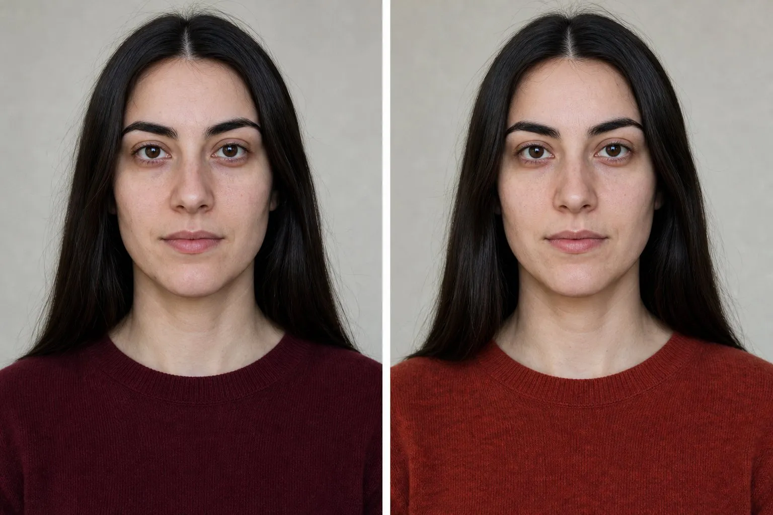
If the pairs split, wear what the two palettes share while you decide: aubergine, dark teal, wine and deep forest green all sit near the temperature line. The Deep Autumn color palette shows the warm side in full.
- cream
- dark mustard
- brick
- aubergine
- forest
- dark olive
- dark teal
- chocolate
Deep Winter or another Winter?
Inside the family, True Winter is cooler and sharper, and Bright Winter more vivid. Two drapes separate them: burgundy against true red for Deep against True, and sapphire against electric blue for Deep against Bright. If the darker cloth of each pair looks natural on you and the brighter one seems to arrive before your face does, you lead with depth.
This is also a border the quiz often reports. Dark, cool, high-contrast answers often return Deep Winter with Bright Winter as runner-up, because clarity comes second. In the same test set, swapping very dark eyes for clear bright blue ones moved the result to Bright Winter, with Deep Winter as runner-up. A Deep Winter can have blue eyes; it only means the sapphire pair matters more for you. The True Winter color palette compares all three Winters side by side, and the Bright Winter color palette shows the vivid end.
Outfits and a capsule wardrobe
Build on black or charcoal and put the contrast near your face. A reliable formula: a black coat, charcoal trousers and a sapphire or burgundy knit, with a white collar or an icy pink shirt showing at the neckline.
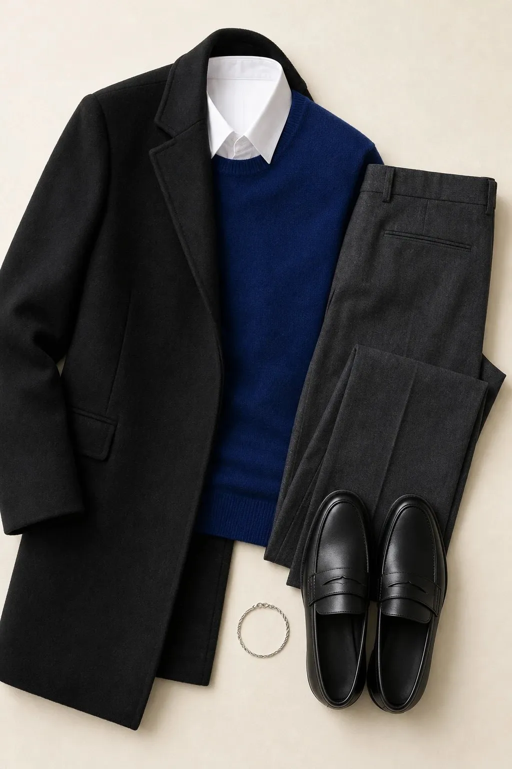
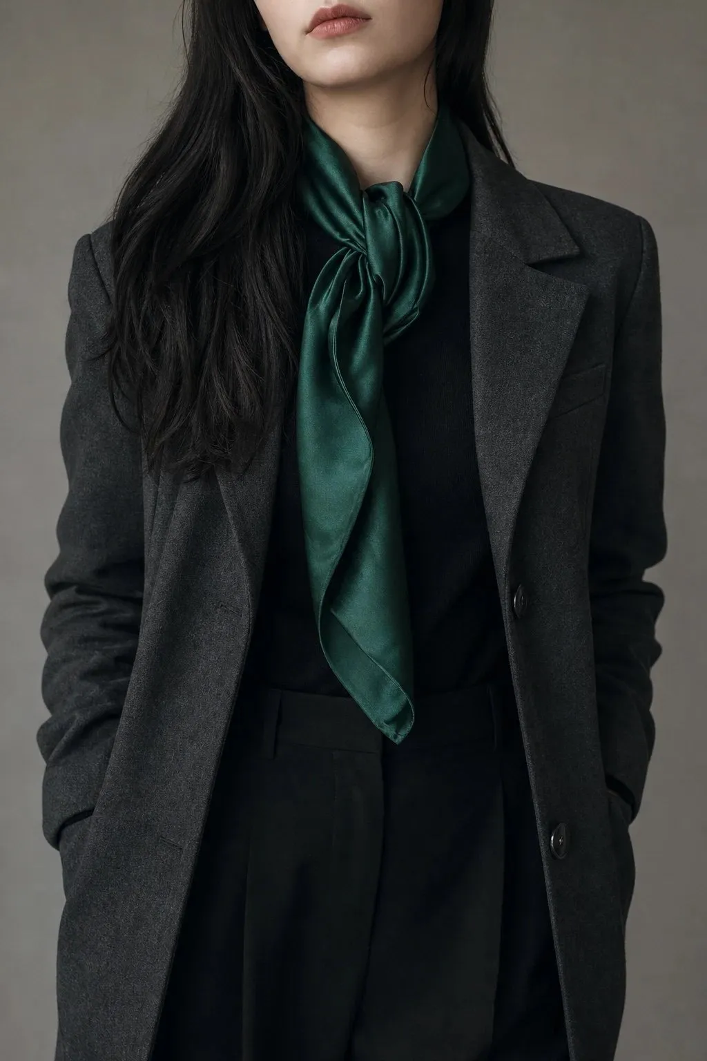
An all-dark outfit needs one clear point of light or color near the face. Head-to-toe black and charcoal can look heavy, while the same outfit with an emerald scarf or a white collar looks deliberate. Jewel tones pair well at full depth: sapphire with emerald, deep plum with burgundy. Matching their depth keeps the combination calm.
Smooth surfaces suit the palette: silk, satin, crisp cotton, smooth leather and fine-gauge wool. A little sheen keeps dark colors clear, the way a satin lipstick does. Nubby, faded or heathered fabrics dull them, even in the right color.
A twenty-piece capsule in Deep Winter colors puts about two thirds of the pieces in neutrals and nearly every colored piece near the face:
| Color | Pieces |
|---|---|
| Black | Coat, trousers, shoes, bag |
| Charcoal | Blazer, knit, skirt, cardigan, second pair of shoes |
| White | Shirt, T-shirt |
| Icy pink | T-shirt or blouse |
| Burgundy | Dress, top, scarf |
| Sapphire | Knit |
| Deep plum | Top |
| Emerald | Light layer or shell |
| Dark indigo | Jeans |
| Silver | Jewelry |
Because all eight colors share one temperature, one depth range and one level of clarity, almost any top goes with almost any bottom. Fill the list from what you own first, neutrals before accents.
Hair color for Deep Winter
| Safe | Stretch | Avoid |
|---|---|---|
| Cool dark brown, espresso, soft black | Deep burgundy-brown | Caramel, golden or copper highlights; muted mid-browns |
Hair is the largest dark area around your face, and on a Deep Winter it carries much of the contrast that black and white repeat in clothes. Keep the tone cool or neutral and the level within a step or two of your natural shade. Shine helps: a glossy soft black reads clearer than a flat one.
Blonde is the change most likely to fail. It moves the hair several steps lighter, which shrinks the contrast that defines the season, and golden or caramel blondes add a temperature problem on top. If you want something new, the burgundy-brown stretch changes the color without giving up the depth.
Graying lowers contrast too. As the frame lightens, check black under your chin again: the icy pink and pure white end of the palette, with sapphire and emerald, often works better near the face than a black neckline, and charcoal takes over as the deep neutral.
Makeup: lips, cheeks, eyes and nails
| Everyday | Stronger | Finish | |
|---|---|---|---|
| Lips | Plum-rose | Deep berry; burgundy or cranberry as the statement | Cream, satin |
| Blush | Plum-rose | Sheer deep berry | Satin |
| Eyes | Charcoal, deep plum | Black, sapphire or emerald liner | Satin, cream |
| Nails | Berry-brown | Burgundy or cranberry; deep plum or black | Cream |
Black mascara and a well-defined brow belong to this season more than to most, because they repeat the contrast already in your face. Brick, orange and brown-based lipsticks are the ones to skip; on cool skin they read muddy.
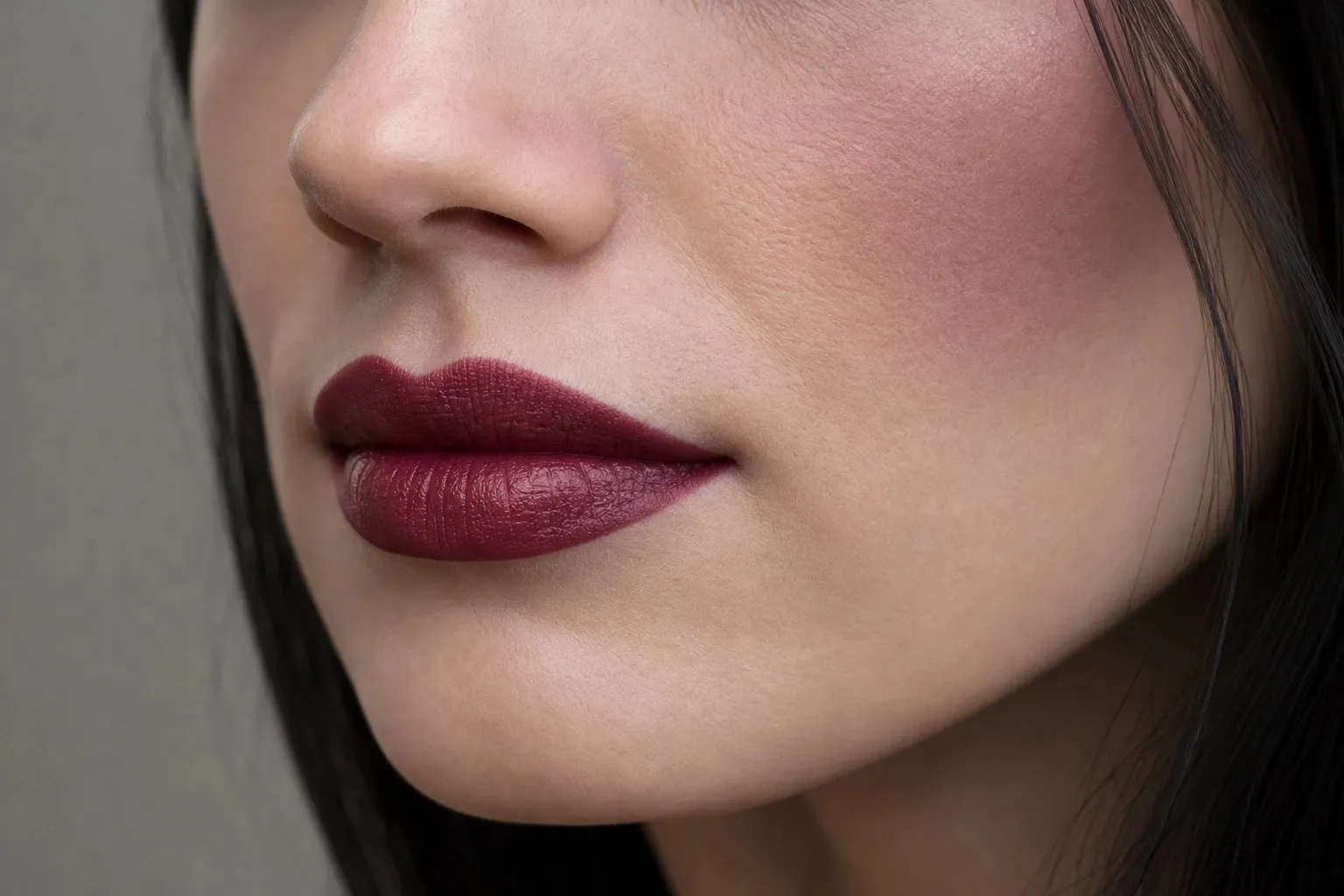
The shade family stays the same at every skin depth; only the strength changes. Deep Winter includes fair skin with near-black hair and deep skin with black hair, and the same plum-rose blush needs a sheer touch on the first and full pigment on the second. Test in daylight from arm’s length: the right shade looks as if it came from inside the skin, and the wrong one sits on top as a patch of color.
Metals, glasses, denim and prints
Silver, platinum, white gold and gunmetal suit Deep Winter: cool metals with a clean surface. Yellow gold tends to look brassy against cool depth, especially in earrings and necklaces, which sit closest to the face.
A glasses frame is a line across the middle of your face, so match its depth to your brows. Black, dark cool tortoiseshell, burgundy and deep plum hold the depth of the palette; camel and honey tortoiseshell bring in the warmth it leaves out. Frame shape is a separate question, answered by face shape in what suits your face shape.
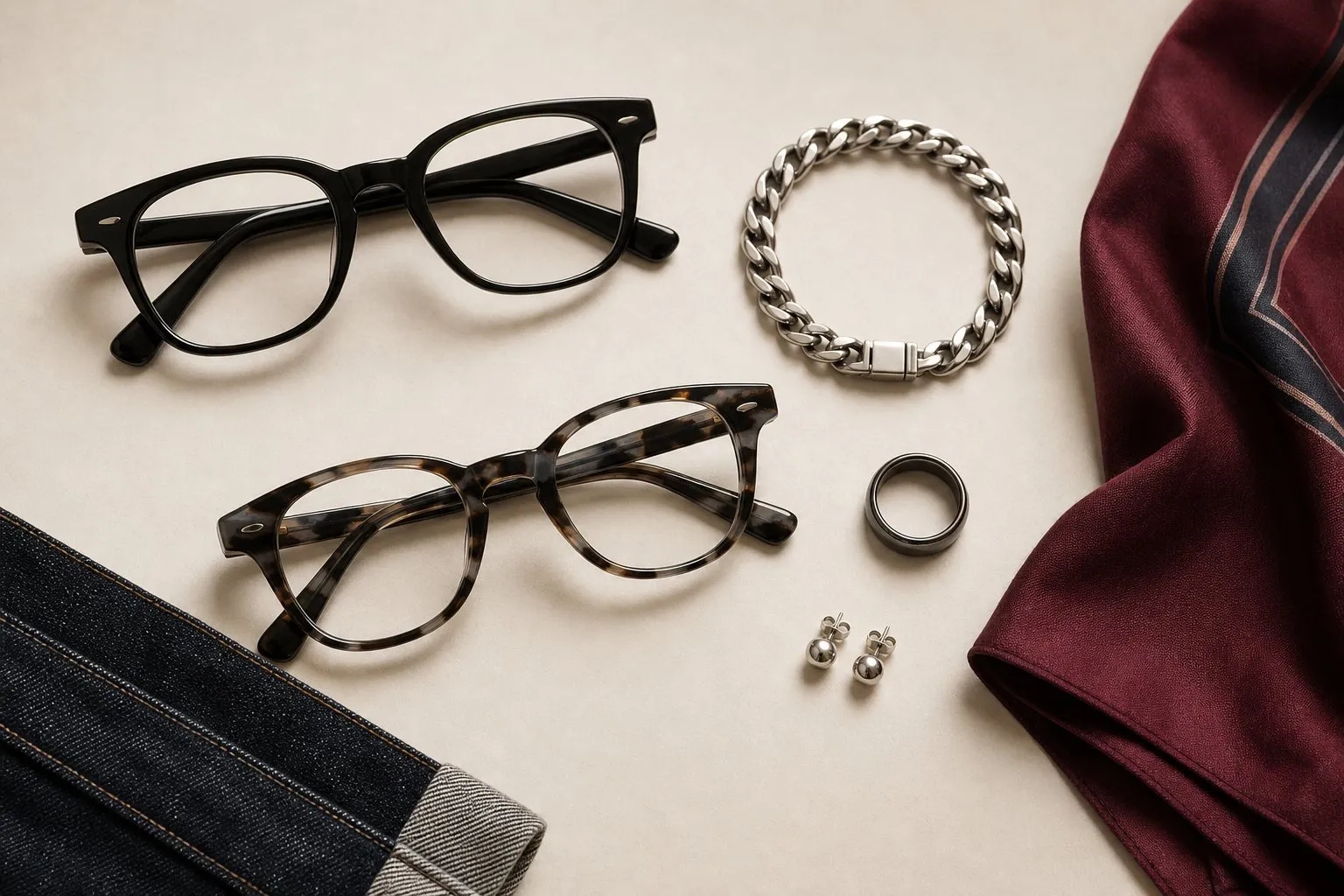
Dark indigo is the Deep Winter wash, with black, pure white and charcoal denim as the other options. Faded and vintage washes soften the blue toward gray, which pulls against the palette’s clarity.
Prints follow the same three axes. A dark ground with clear jewel-tone motifs keeps both depth and clarity, and black-and-white prints work as well. Faded florals, earthy paisleys and blurred watercolor prints miss on clarity even when their colors come close.