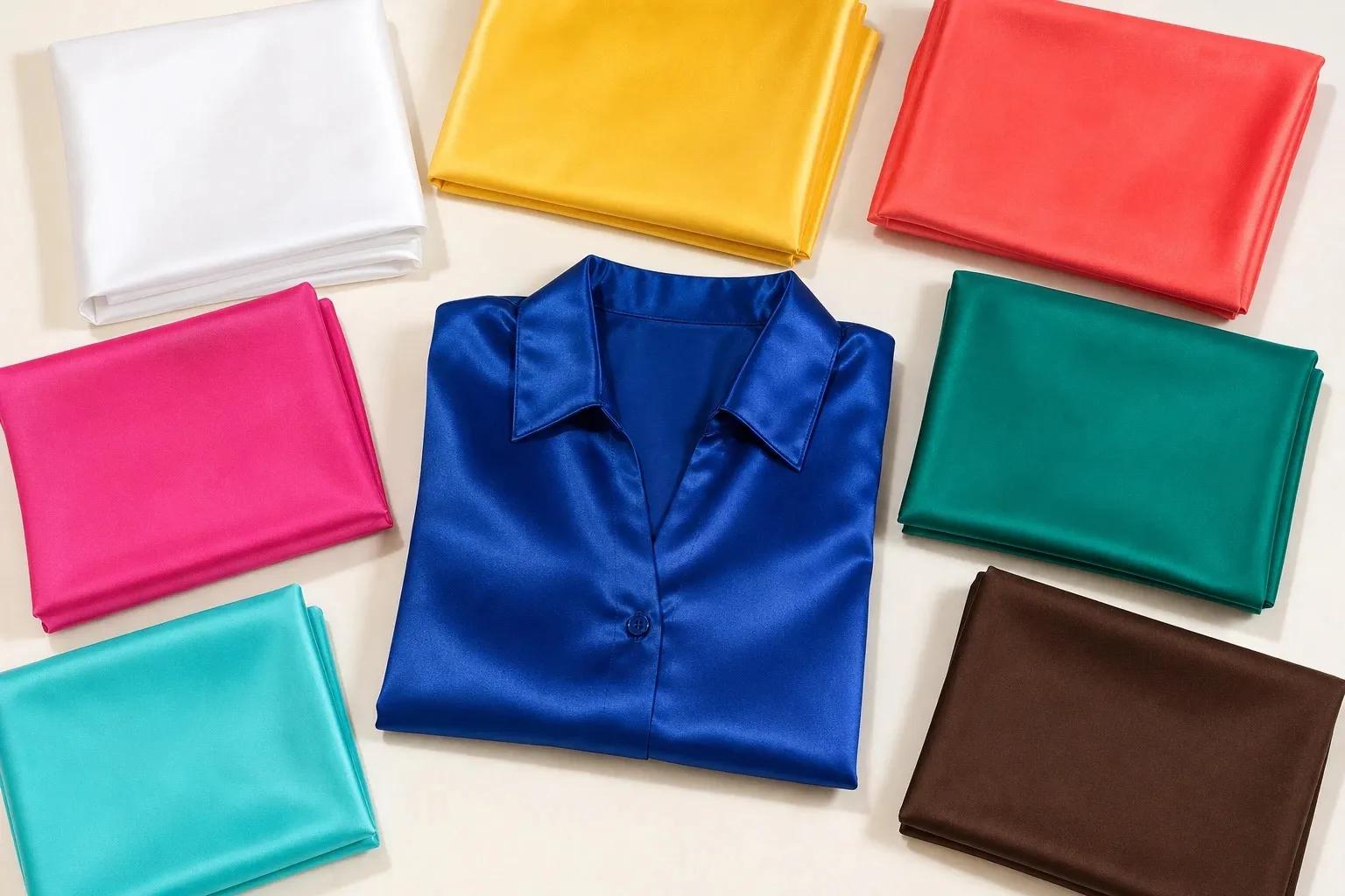
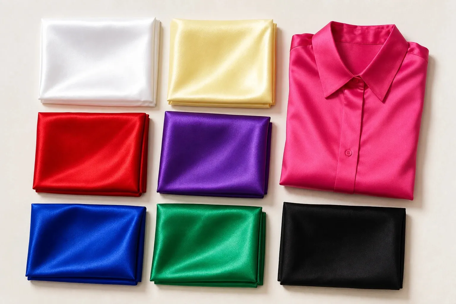
Bright Winter, also called Clear Winter, is bright first and cool second. Its colors are vivid, saturated and blue-based (hot pink, electric blue, vivid purple, bright emerald and true red), framed by black and pure white. Icy lemon is the single pale note. It suits coloring whose clarity shows first, usually in the eyes, and it fails in anything dusty, muted or earthy.
- white
- icy lemon
- hot pink
- true red
- vivid purple
- electric blue
- bright emerald
- black
What Bright Winter coloring looks like
Clarity is the first thing people notice, and it usually shows in the eyes: blue, green or light-catching brown irises set against very bright whites. Hair is often dark, from deep brown to black, yet from across a room the coloring reads as sparkling rather than dark: people tend to notice the eyes before the hair. Skin can be any depth. Its undertone is cool or neutral-cool, and since Bright Winter borders a warm season, it sits a little closer to neutral than True Winter does.
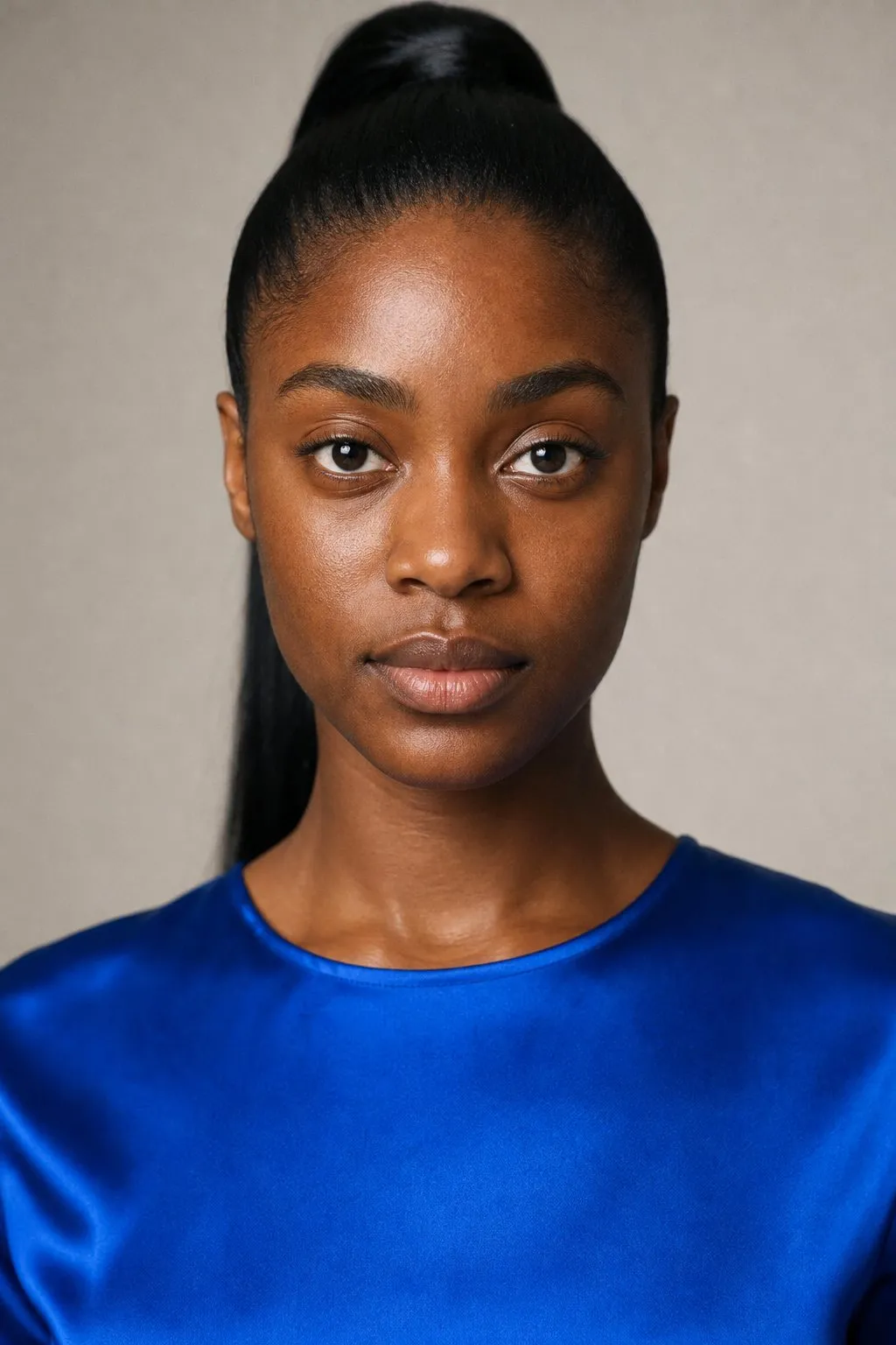
On the three axes, Bright Winter is led by chroma. It sits at the clear end, leans cool, and spans medium to deep value; its contrast is high but reads crisp rather than heavy. Undertones and color seasons are a styling framework, not a measurement of your skin. Where we cite research, we say what it measured. In a mirror, what marks a Bright Winter is the effect of color: vivid colors make the face look more alive, and dusty ones make it look tired, as if someone had turned the saturation down on the whole picture.
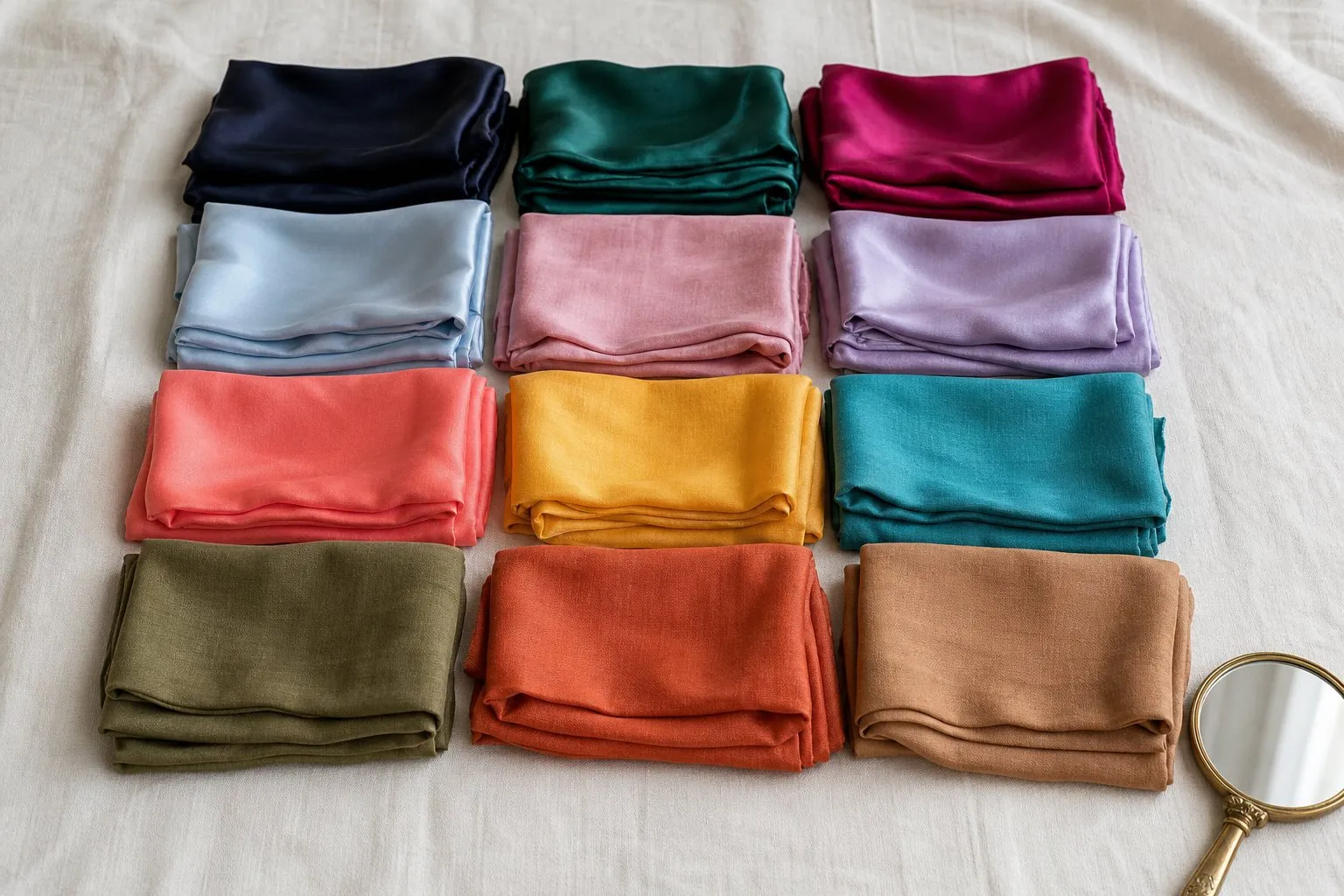
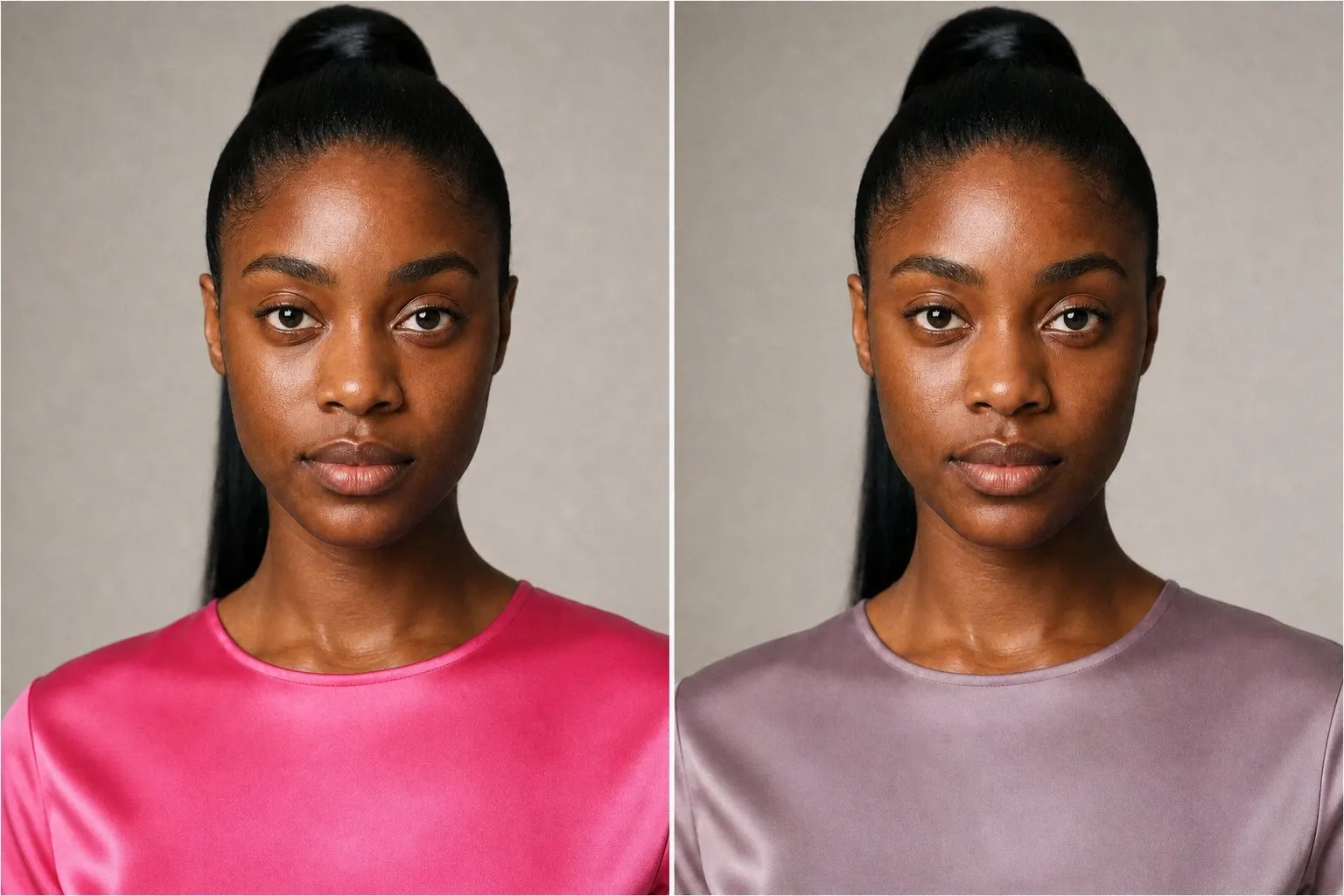
Two tops show it in a minute: a vivid hot pink and a dusty mauve. Hold each under your chin in daylight, bare-faced, and watch the eyes rather than the fabric. If the hot pink makes them look brighter and the mauve makes the skin look gray, you are bright. Bright emerald against sage is a second pair that should agree. If the mauve wins, your coloring is softer than this palette, and the seasonal color analysis guide helps you find where it sits.
The Bright Winter palette by role
| Role | Bright Winter colors | Where it goes |
|---|---|---|
| Light neutral | White | Tops and shirts under the face |
| Mid neutral | Cool mid gray (not in the strip above) | Knits and tailoring |
| Dark neutral | Black | Coats, trousers, shoes |
| Accents | Icy lemon, vivid purple, electric blue, bright emerald | Tops, jackets, scarves |
| Red | True red | Dresses, coats, lips |
| Signature | Hot pink | The color you repeat most |
Every accent sits at full saturation; none is grayed or browned. Inside the family, that is Bright Winter’s mark: Deep Winter’s jewel tones are darker and True Winter’s slightly calmer. Hot pink is the natural signature, and bright cherry, a red that leans pink, sits beside true red as a second red.
Icy lemon is the only yellow in any Winter palette: pale, but clear and cool rather than buttery. It plays the light accent, the role icy pink and icy lavender play for the other two Winters, and it looks best beside black or electric blue, where its clarity shows.
Neutrals: black, white, gray and brown
| Neutral | Verdict | How to wear it |
|---|---|---|
| Black | Yes, as a frame | With a vivid color near the face |
| Pure white | Yes | Tops, shirts, jeans |
| Cool mid gray | Yes, the quiet option | Knits, suits |
| Navy | A clear, dark navy, never grayish | Coats and tailoring |
| Espresso | As a base under color | A coat or trousers, with a vivid scarf |
| Ivory, champagne | Swap for pure white | Away from the face |
| Taupe, camel, beige | Leave out near the face | Too muted |
Black is in the palette, but on a Bright Winter it works best as a frame for vivid color rather than as the whole outfit. A black coat with an electric blue scarf, or a black dress under a bright emerald coat, uses the contrast; head-to-toe black with nothing vivid near the face uses only half of it.
Pure white is the light neutral and the color that makes every other color in the palette look its brightest. Champagne and beige, the softer whites, look dull beside clear coloring. In a wedding dress too, pure white wins, and icy tints are the alternative.
Cool mid gray is not in the swatch strip; it comes from the neutral chart. Choose a clean, mid-depth gray with no beige in it. It is the quiet option for knits and suits, and it lets one vivid accent stand out without the starkness of black.
Brown is a muted color by nature, and muting is the one quality this palette cannot use. Espresso, almost black, is the exception: an espresso coat with a hot pink or electric blue scarf looks deliberate, while a brown outfit on its own looks flat against Bright Winter clarity. Taupe, camel and beige stay off the list near the face.
Bright Winter colors by hue
Reds and pinks. Hot pink is the pink, and true red and bright cherry are the reds. Wear them at full strength. A sheer, washed or dusty version of the same hue loses the very quality you chose it for.
Blues and greens. Electric blue is the blue and bright emerald the green. Jewel tones suit you in their brightest versions: emerald rather than forest, electric blue rather than sapphire. Royal blue sits on ground shared with Bright Spring and suits both, and a clear dark navy is the quiet blue for tailoring. Blues pulled toward green, such as turquoise and aqua, lean warm; emerald-teal is where the two Bright seasons meet.
Purples. Vivid purple at full saturation. Lilac, lavender-gray and grayed plum are too soft for this coloring, and they read as a step down from it.
Yellows and oranges. Icy lemon is the only yellow; golden yellow, mustard and sunflower lean warm. Orange is not in the palette at all. When an outfit wants a hot, warm-looking note, hot pink or true red takes its place.
Colors to avoid, and the swap for each
Dusty, muted and earthy colors are the ones this palette leaves out. All three are low in clarity, and next to clear coloring a low-clarity color makes the skin look duller by comparison while the eyes lose their sparkle. Earthy colors miss on temperature as well. They do the most damage in a top or a scarf, right under the face.
| Avoid | Misses on | Wear instead |
|---|---|---|
| Sage | Clarity | Bright emerald |
| Olive, khaki | Clarity, temperature | Bright emerald |
| Mauve, dusty rose | Clarity | Hot pink |
| Dusty blue, slate | Clarity | Electric blue |
| Camel, beige | Clarity, temperature | Pure white or cool mid gray |
| Taupe | Clarity | Cool mid gray |
| Rust, terracotta | Clarity, temperature | True red |
| Mustard | Clarity, temperature | Icy lemon |
| Washed-out pastels | Clarity | Icy lemon, pure white |
One muted piece pulls a whole outfit down with it. A khaki jacket over a hot pink top makes the pink look like an accident; the same top under black or white looks chosen. If you love an earthy color, keep it far from the face, in trousers, shoes or a bag, and put a clear color between it and your chin.
Bright Winter or Bright Spring?
Bright Spring is your sister season, and it shares the trait that defines you: chroma. Both seasons look most alive in clear, saturated color and dull in dusty shades. Temperature is the difference. Bright Spring leans warm, toward hot coral and sunflower; Bright Winter leans cool, toward hot pink and icy lemon. Some systems call the pair Clear Spring and Clear Winter, and the seasons are the same.

Test chroma before temperature. If the hot pink won the check near the top of this page, you are bright and only temperature is left to settle. If the mauve won, temperature tests between these two will give confusing answers, because the question belongs to another pair of seasons.
The quiz will not name Bright Spring as your runner-up, since the two share their leading trait. The sign that you sit close to this line is a Bright Winter result with the undertone reading neutral.
Use the same conditions as before: window light, no makeup, hair hidden under a towel, each color held under your chin.
| Pair | Bright Winter side | Bright Spring side | What it shows |
|---|---|---|---|
| Pinks | Hot pink | Hot coral | Temperature at its clearest |
| Blues | Electric blue | Bright aqua | Violet-blue against green-blue |
| Yellows | Icy lemon | Sunflower | Cool yellow against golden |
On the wrong side, warm color makes cool skin look ruddy, and cool color makes warm skin look gray or pale. Two wins out of three decide it, and earthy, dusty colors stay away from your face whichever side you land on. A worked reading: hot pink clearly beats coral, electric blue beats aqua, and sunflower looks better than icy lemon. That is two cool wins against one warm, so Bright Winter, with a warm-leaning yellow. Keep the cool pinks and blues near your face and treat sunflower as an accent you can borrow.
The dark neutral gives one more check: black looks right on a Bright Winter, espresso on a Bright Spring. Where the two palettes meet, the shared colors are pure white, royal blue, an emerald-teal and a clear medium pink, so build on those while you decide. The Bright Spring color palette has the warm half in full.
- white
- sunflower
- hot coral
- bright pink
- emerald teal
- bright aqua
- royal blue
- espresso
| Bright Winter | Bright Spring | |
|---|---|---|
| Undertone | Neutral to cool | Neutral to warm |
| Light neutral | Pure white | Pure white |
| Dark neutral | Black | Espresso |
| Reds and pinks | True red, hot pink | Hot coral, bright pink |
| Blues | Electric blue | Bright aqua, royal blue |
| Yellow | Icy lemon | Sunflower |
| Metal | Polished silver | Polished gold |
Bright Winter or another Winter?
Your two family neighbors each lead with something else: True Winter with coolness, Deep Winter with depth. They are also the seasons the quiz usually offers as runner-up, because its second choice always comes from your second-strongest trait: depth points to Deep Winter, strong coolness to True Winter.
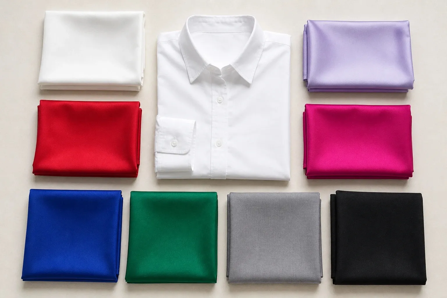
Two drapes settle it. True red against hot pink separates True from Bright: if hot pink looks natural and true red looks slightly flat, you lead with brightness. Sapphire against electric blue separates Deep from Bright: the darker blue suits a face that leads with depth, and the electric one a face that leads with clarity.
- white
- icy lavender
- true red
- fuchsia
- royal blue
- emerald
- silver gray
- black
- white
- icy pink
- burgundy
- deep plum
- sapphire
- emerald
- charcoal
- black
With True Winter you share true red, black and pure white; with Deep Winter, black, white and an emerald green. Electric blue, hot pink, vivid purple and icy lemon are yours alone within the family. The True Winter color palette puts all three Winters in one table, with a six-question tally, and the Deep Winter color palette covers the dark end.
Outfits and a capsule wardrobe
Use the neutrals as a frame and put the color near your face. A white T-shirt and black trousers under an electric blue blazer is one formula; a black dress under a bright emerald coat is another. The black and white hold the contrast, and the vivid color supplies the clarity.
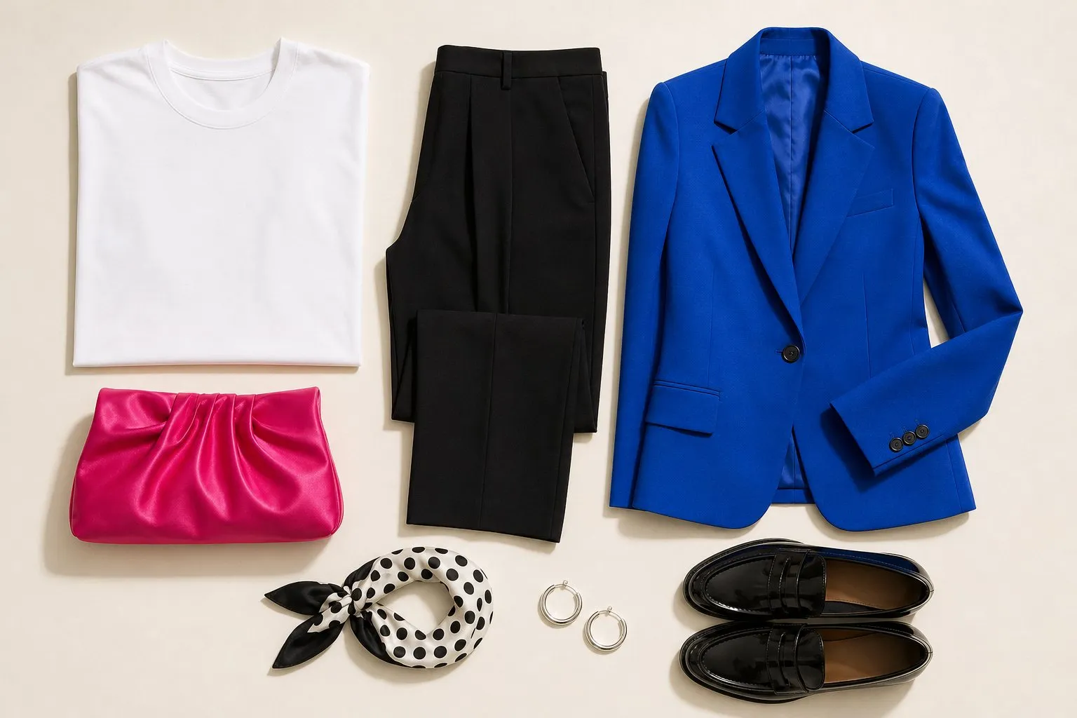
Bright Winter can wear two vivid colors together, which the softer seasons cannot: hot pink with electric blue, or vivid purple with bright emerald. Keep everything else plain, in black or white, so the pair reads as a choice.
For evening, the palette is at its strongest in satin and silk: a hot pink or vivid purple dress with polished silver needs nothing else.
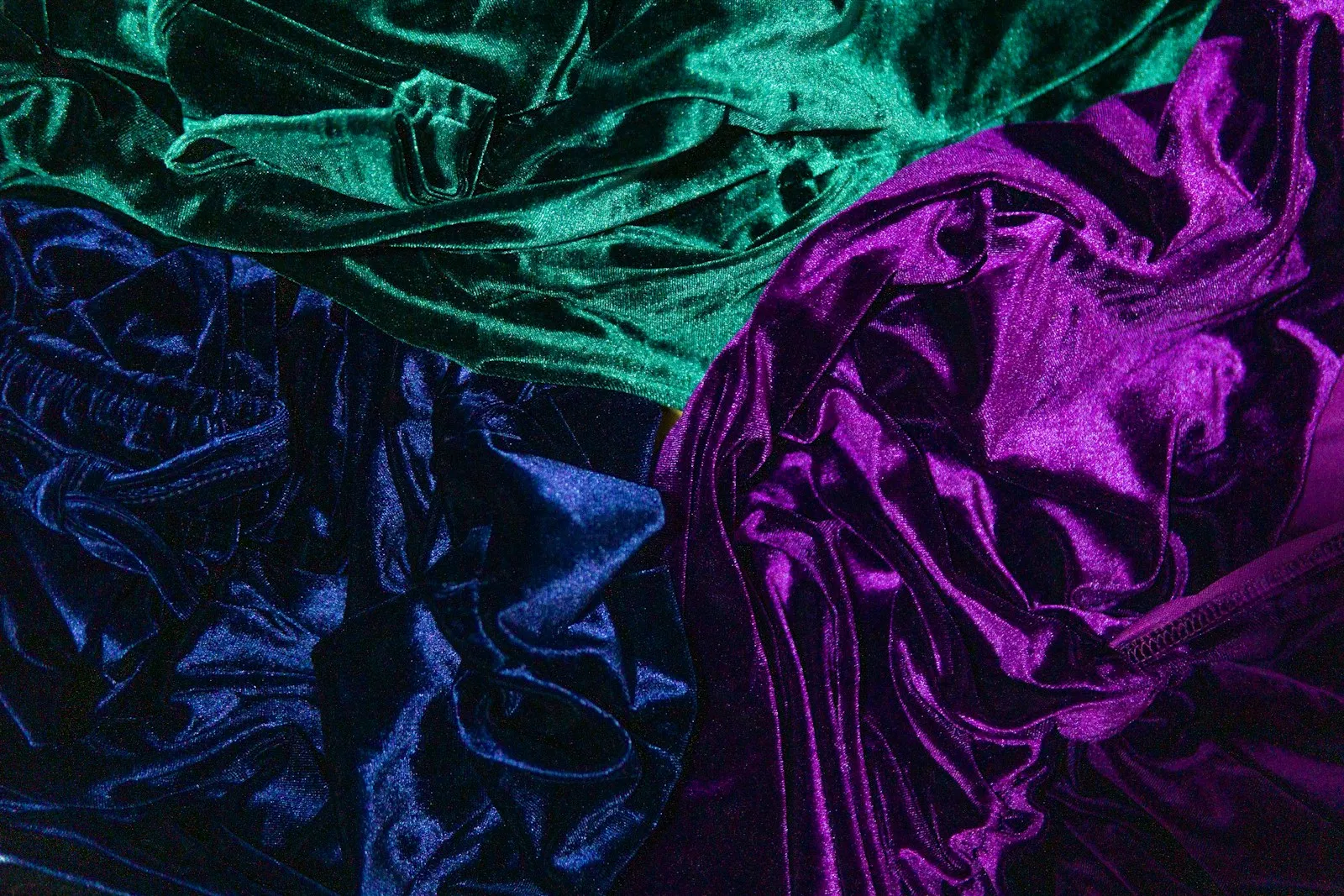
Shine suits the palette, because shine adds clarity. Satin, silk, patent leather, glossy cotton and metallic accents all sit easily with it. Heathered knits, washed linen and suede soften color, so keep them for accessories in black or white.
| Base | Near the face | Second color |
|---|---|---|
| Black coat, black trousers | Hot pink knit | Electric blue scarf |
| White shirt, cool mid gray trousers | Electric blue blazer | None |
| Black dress | Bright emerald coat | None |
| White T-shirt, dark rinse jeans | Vivid purple jacket | Bright emerald bag |
| White top, black trousers | True red coat | None |
For a twenty-piece capsule, most of the pieces go to black, white and cool mid gray, with icy lemon, vivid purple, electric blue and bright emerald as the four accents and hot pink repeated most.
Hair color for Bright Winter
| Safe | Stretch | Avoid |
|---|---|---|
| Black, cool dark brown, with high shine | Cool burgundy or berry | Mousy or dusty shades, warm caramel |
Clarity applies to hair as well. A single, clear tone with shine suits Bright Winter better than blended, smoky color, and a flat, ashy mid-brown makes the whole face look duller, the hair version of a dusty sweater.
Cool burgundy or berry is the playful stretch: a dark base with a clear tint of color. It suits the palette better than caramel highlights, which add warmth and muting at once.
When gray comes in, the contrast that dark hair supplied drops. Steely silver keeps the coolness and, kept glossy, much of the clarity; let the vivid colors near your face do more of the work, and check whether black at the neckline still looks crisp or now looks heavy.

Icy platinum is possible only as a deliberate, high-shine look, because it lowers the contrast that dark hair gives. Golden and honey blondes would bring in warmth as well.
Makeup: lips, cheeks, eyes and nails
| Everyday | Stronger | Finish | |
|---|---|---|---|
| Lips | Sheer hot pink | Hot pink; true red or bright cherry as the statement | Gloss, high shine |
| Blush | Bright cool pink, applied sheer | Satin | |
| Eyes | Silver, cool gray | Black, electric blue or vivid purple liner | Satin, high shimmer |
| Nails | Sheer cool pink | True red or bright cherry; black or vivid purple | High gloss |
Shine is a form of clarity. A glossy lip throws bright highlights and reads crisp, while a matte one absorbs light and reads softer, so high shine is part of the Bright Winter look rather than a texture preference. A hot pink in a dry matte finish loses half of what makes it right.
A lipstick check takes two minutes. Put on the glossy hot pink, step back to arm’s length at a window, then switch to a dusty rose. On a Bright Winter the dusty shade looks pasted on and the skin around the mouth turns grayer, while the hot pink looks like part of the face.
Blush is the place to hold back. A bright cool pink applied sheer looks like a flush; at full strength it competes with the lips and eyes. Color on the eyes works best as a line, an electric blue or vivid purple liner along the lashes over a silver or cool gray lid.
Metals, glasses, denim and prints
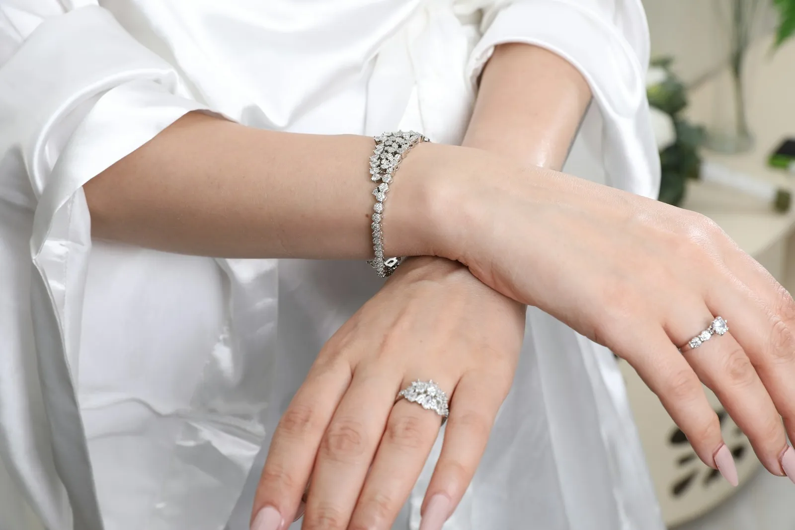
Silver, platinum and white gold, polished as bright as you like: the brighter the finish, the better it echoes clear eyes. Yellow gold usually reads too warm; if you want a warmer-looking metal, rose gold is the softer step.
Glossy, solid acetate reads clear, which suits the season: black, electric blue, vivid purple or hot pink frames, or polished silver metal. Muted tortoiseshell and matte earth tones look dull. A colored frame sits at eye level all day, which makes it a natural place for your signature hot pink or electric blue.
Denim should be a dark rinse or black, with no fade. The clearest seasons need denim that keeps its dye, because fading softens exactly the clarity they depend on. Pure white jeans work as well.
Polka dots, bold stripes and clean-edged geometrics in palette colors suit Bright Winter, and black and white with one vivid color is the easiest print to wear well. Watercolor, blurred or faded prints look washed out next to this coloring.