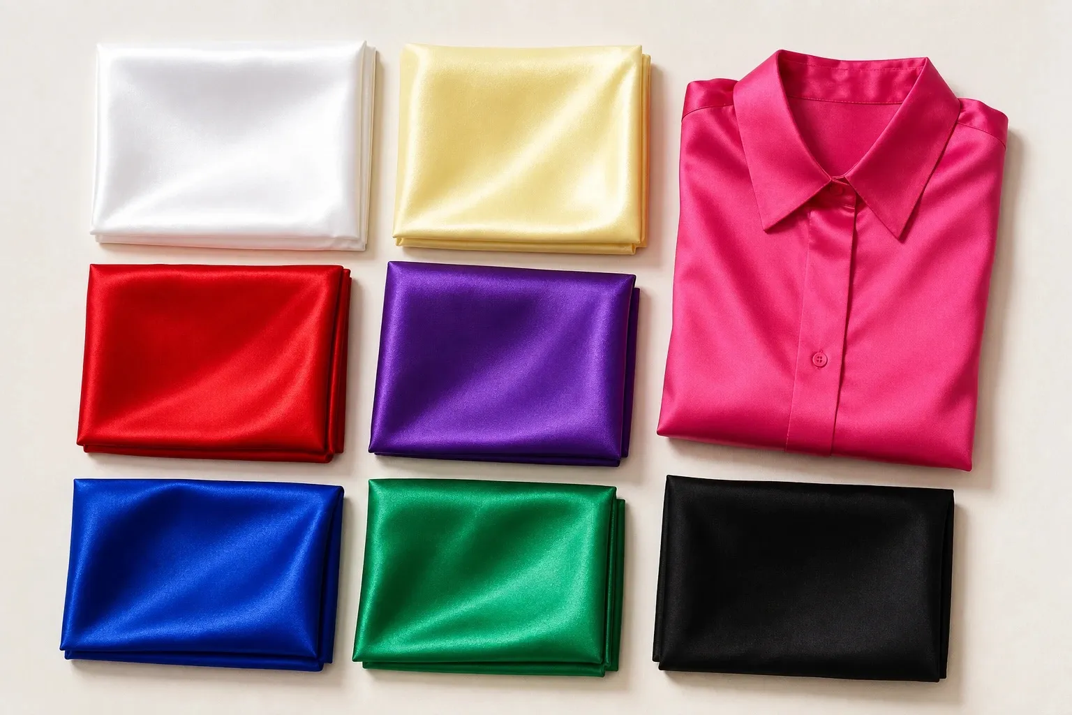
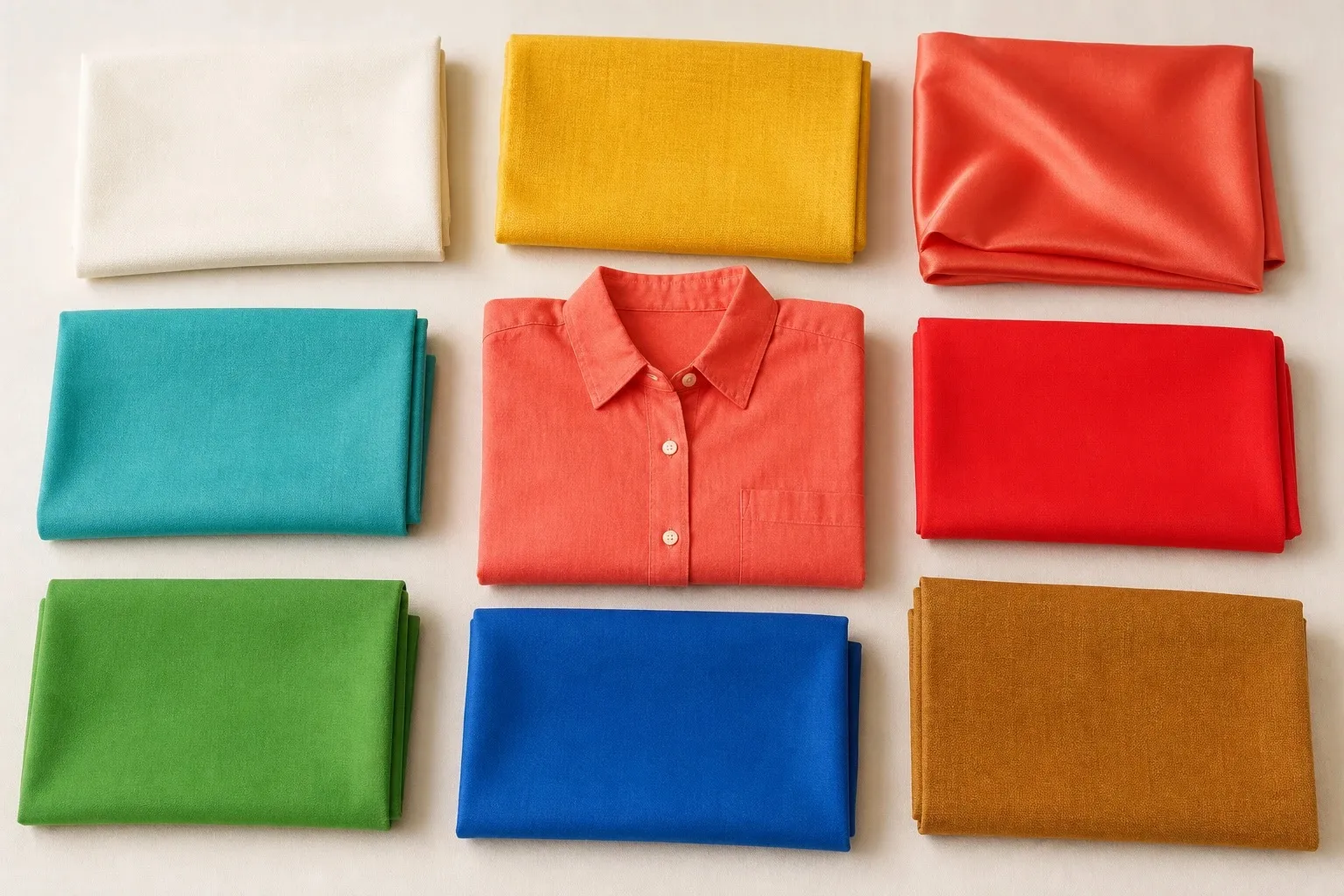
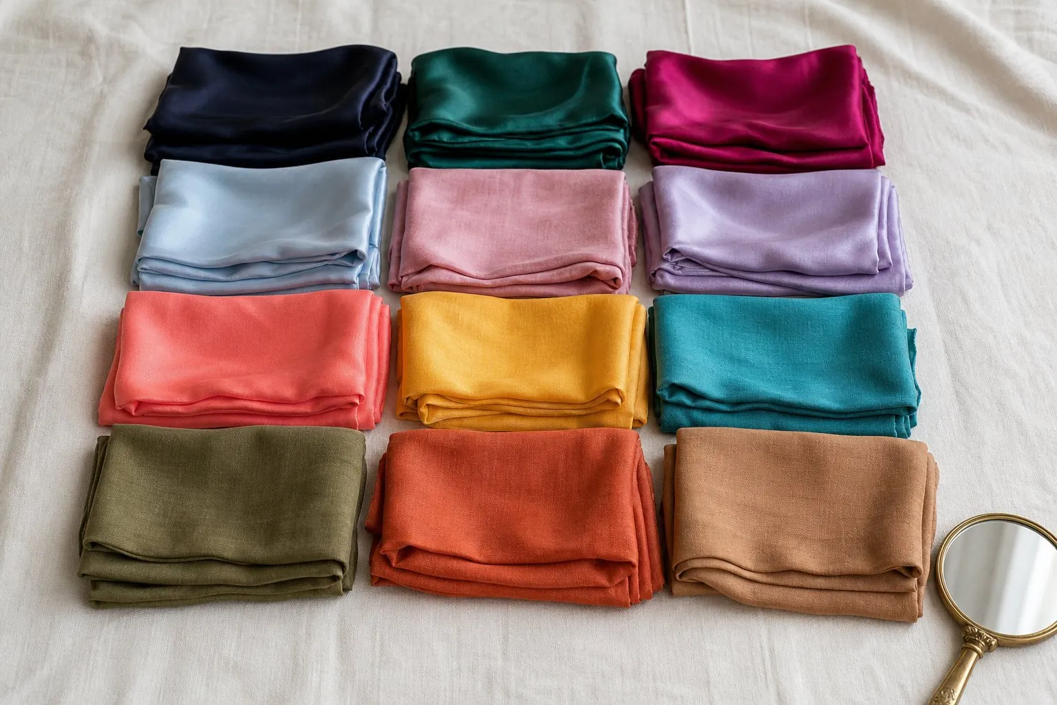
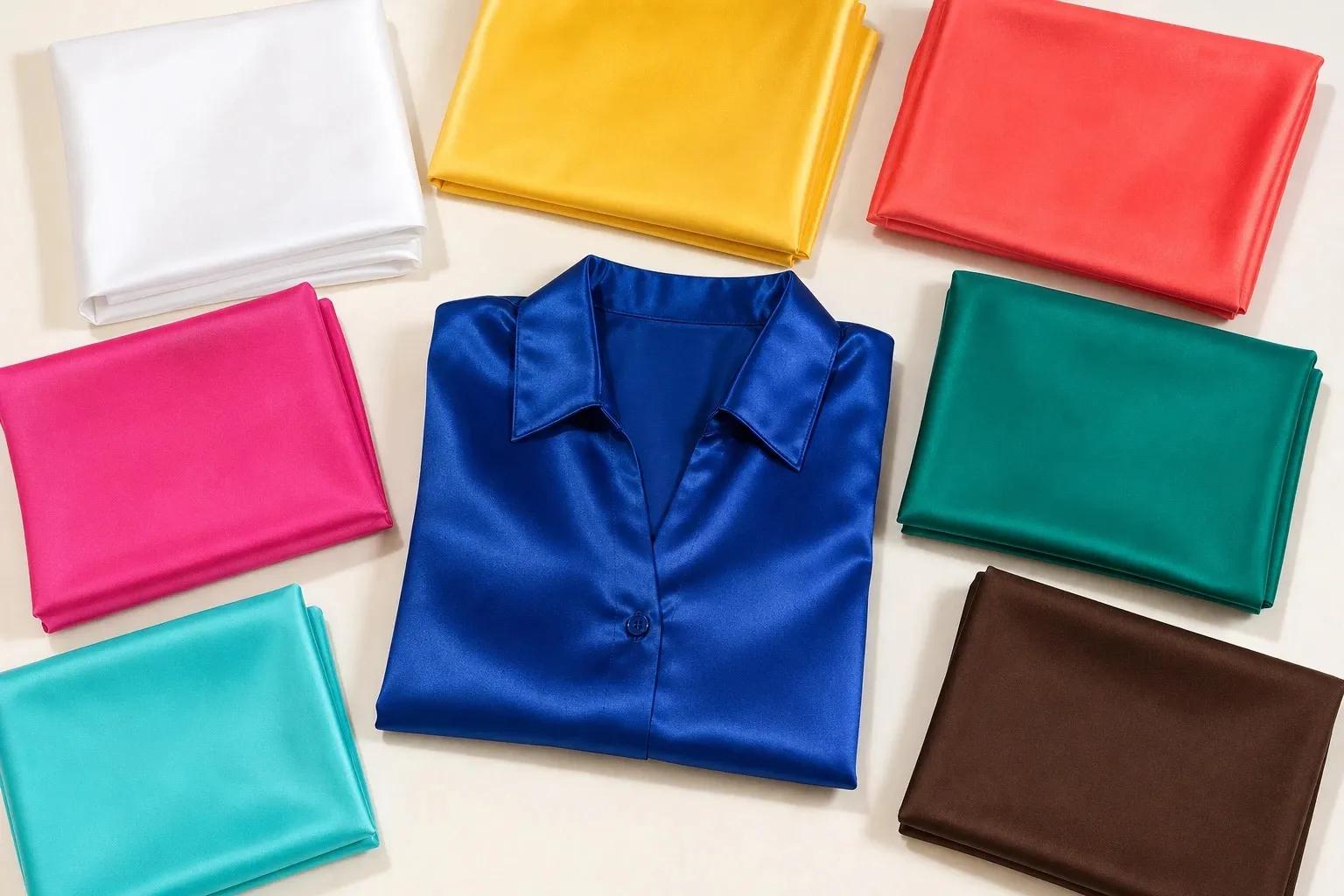
Bright Spring, also called Clear Spring, is bright first and warm second. The Bright Spring color palette is clear and saturated with no gray in it: sunflower, hot coral, bright pink, emerald teal, bright aqua and royal blue, anchored by pure white and espresso. It is the only Spring that wears pure white and the only one with real contrast, so it carries pairings that would overwhelm Light and True Spring. Its sister is Bright Winter, the same clarity turned cool; its less obvious neighbors are True Spring and Deep Autumn.
What Bright Spring coloring looks like
Clarity and contrast stand out first. Hair is noticeably darker than the skin, from clear golden brown and chestnut to dark brown. Eyes tend to be vivid, the iris sharp against the white of the eye: bright blue, clear green, topaz or a bright warm brown. Skin is neutral to warm, often with a peach or golden glow, and Bright Spring appears across a wide range of skin depths.
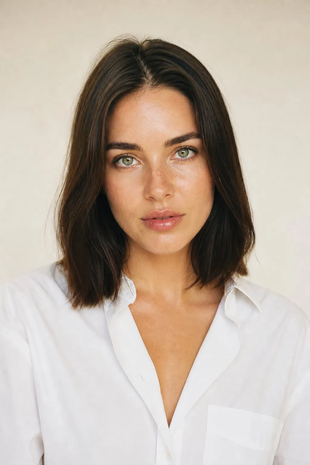
The shared thread is how color behaves near the face. Vivid color looks as if it belongs there, and dusty color makes the skin look flat by comparison. Chroma is the Munsell word for how far a color sits from gray, and on a Bright Spring it is the trait that outranks warmth. Undertones and color seasons are a styling framework, not a measurement of your skin. The tests here compare colors side by side, which anyone can repeat in daylight.
| Axis | Bright Spring | In practice |
|---|---|---|
| Chroma (clarity) | Bright, the leading trait | Clean, saturated color; nothing dusty or heathered |
| Temperature | Warm-leaning, the second trait | Coral over fuchsia, gold over silver |
| Value (lightness) | Medium, with both ends in the palette | Pure white and espresso in one outfit |
| Contrast | High | Pairings at the extremes of the scale |
Contrast is where Bright Spring parts from the rest of its family. On that scale it sits with the Winters, which is why a white shirt under an espresso jacket looks natural on it and harsh on the paler Springs.
The Bright Spring color palette
- white
- sunflower
- hot coral
- bright pink
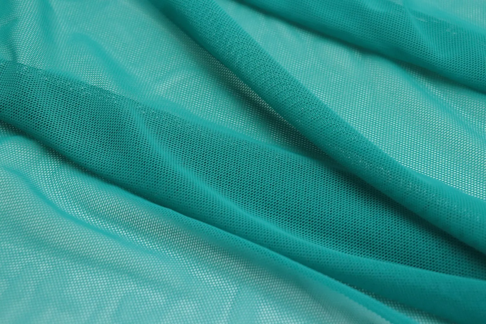
- emerald teal
- bright aqua
- royal blue
- espresso
Every color is clean, with no gray mixed in, and most lean warm. The range is what sets the palette apart. It runs from pure white to espresso, a brown so dark it sits close to black, so it spans almost the whole lightness scale; Light Spring keeps to the light end and True Spring to the upper half. Between the two ends, every color sits at full strength.
| Role | Colors | Where it goes |
|---|---|---|
| Light | Pure white, sunflower | Shirts, tees, a summer jacket |
| Middle | Hot coral, bright pink, emerald teal, bright aqua | Tops, dresses, knits |
| Deep | Royal blue, espresso | Coats, trousers, tailoring |
| Middle neutral | Light warm gray (not in the strip) | Knits, a blazer |
| Second dark neutral | Bright navy (not in the strip) | Coats, suits |
| Metal | Bright polished gold | Jewelry, frames, hardware |
Espresso reads almost black but has warmth in it, which is why it can stand in for black. Bright navy does the same job in blue. Pure white is the one stark color the palette shares with the Winters, and here it is the light neutral rather than an accent: wear it as freely as other seasons wear cream.
Neutrals, and when black works
| Neutral | On a Bright Spring | Instead |
|---|---|---|
| Black | Not in the palette; small doses away from the face | Espresso, bright navy |
| Pure white | Yes: the light neutral | |
| Ivory, cream | Softer than the coloring | Pure white |
| Navy | Bright, clean navy, yes; dusty navy, no | Bright navy |
| Brown | Espresso, yes; mushroom and taupe, no | Espresso |
| Gray | Light warm gray, yes; heathered or dusty gray, no | Light warm gray |
| Denim | Dark clean rinse | Pure white jeans |
Black is the question Bright Spring hears most, and the answer is more generous than for any other Spring. The coloring has real contrast, so black does not swallow the face the way it does on a Light or True Spring. What black lacks is warmth, and right under the chin it can look hard. In small doses and below the neckline it works: black trousers under a white or coral top, black shoes, a black belt. Near the face, espresso and royal blue are still the better darks.
Pure white is the opposite case, since no other Spring wears it as well. Optical white reflects the most light of any color, so it suits only coloring clear and contrasting enough to match it. If cream makes your face look slightly dull and white makes it look crisp, count that as one more vote for this season.
Gray divides the Springs. Bright Spring’s middle neutral is a light warm gray, clean and even, the kind you find in smooth wool or cotton. Heathered, mottled grays look dusty, the one quality this palette avoids, and mushroom and taupe fail for the same reason.
Bright Spring colors by hue
| Hue | Best | Skip |
|---|---|---|
| Red | Clear poppy, hot coral | Brick, rust, burgundy |
| Pink | Bright pink, warm pink | Mauve, dusty rose, powder pink |
| Orange | Hot coral | Terracotta, burnt orange |
| Yellow | Sunflower | Mustard, ochre |
| Green | Emerald teal, bright aqua | Sage, olive, khaki |
| Blue | Royal blue, bright aqua, bright navy | Dusty blue, slate, powder blue |
| Purple | Not in the strip; a saturated, clear violet borrows well | Mauve, lavender, plum |
Reds and pinks. For a Bright Spring, red is a strength: hot coral and clear poppy are among its best colors, worn at full saturation. The red has to lean orange and stay clean. Brick and rust have the warmth but carry brown, and burgundy is deep and cool. Bright pink is the pink, saturated with warmth in it, and warm pink is its everyday version. Mauve and dusty rose are the same hue with gray added, and on this coloring the gray is what people see.
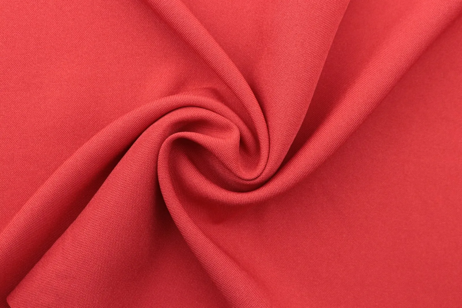
Blues and greens. Bright Spring owns the strongest blue of any Spring, royal blue, a clear blue it shares with Bright Winter. Bright aqua and emerald teal carry the green side, both clean blue-greens rather than the muted teals of the Autumns. Dusty blue, slate and sage are the same hues with gray mixed in.
Yellows and oranges. Sunflower is the brightest color in the palette, a full, clean yellow, and a quick test of the season: on Bright Spring coloring it looks sunny, on soft coloring it takes over the face. Hot coral is the orange. Mustard, ochre and terracotta are their muted relatives and belong to the Autumns.
Purples. No purple is in the palette, but Bright Spring borrows one more easily than the other Springs, because what it needs most is clarity, and a clear, saturated violet has plenty. Keep the violet bright rather than dusty, with pure white or hot coral nearer the face. The purples to pass on are the grayed and the icy ones, mauve and lavender, and plum, which is too dark to stay clear.
Colors to avoid, and the swaps
The avoid line is short: dusty, muted and grayed colors. Next to clear eyes and contrasting features they look tired, and they make the skin look dull by comparison. Earthy, heavily browned colors do the same, because brown mutes a color as surely as gray does.
| Color | Why it fails | Swap |
|---|---|---|
| Mauve, dusty rose | Gray mixed into pink | Bright pink |
| Sage, khaki, olive | Muted, earthy greens | Emerald teal |
| Dusty blue, slate | Grayed blues | Royal blue, bright aqua |
| Mushroom, taupe, heathered gray | Flat neutrals | Light warm gray |
| Rust, terracotta, mustard | Browned warm colors | Hot coral, sunflower |
| Faded, vintage denim | Washed-out blue | Dark clean rinse |
A dusty color can still earn its place below the waist or inside a print full of clear colors. A heathered gray sweater with a white collar showing, khaki trousers under a royal blue knit: the clear color sits nearest the face and does the work.
Bright Spring or Bright Winter?
Bright Winter is the sister season, the same clarity turned cool. Both palettes include pure white, a strong royal or electric blue, a bright emerald and a hot pink, and where they meet they are hard to tell apart. Clarity is the shared trait, so confirm it before anything else; if you are not clearly bright, the temperature question belongs to a different pair of seasons.
Step 1: confirm the clarity. Hold a vivid color against a dusty version of the same hue: emerald teal against sage, or bright pink against mauve. If the vivid one makes your face look sharper and the dusty one makes it look tired, you are in the right pair.
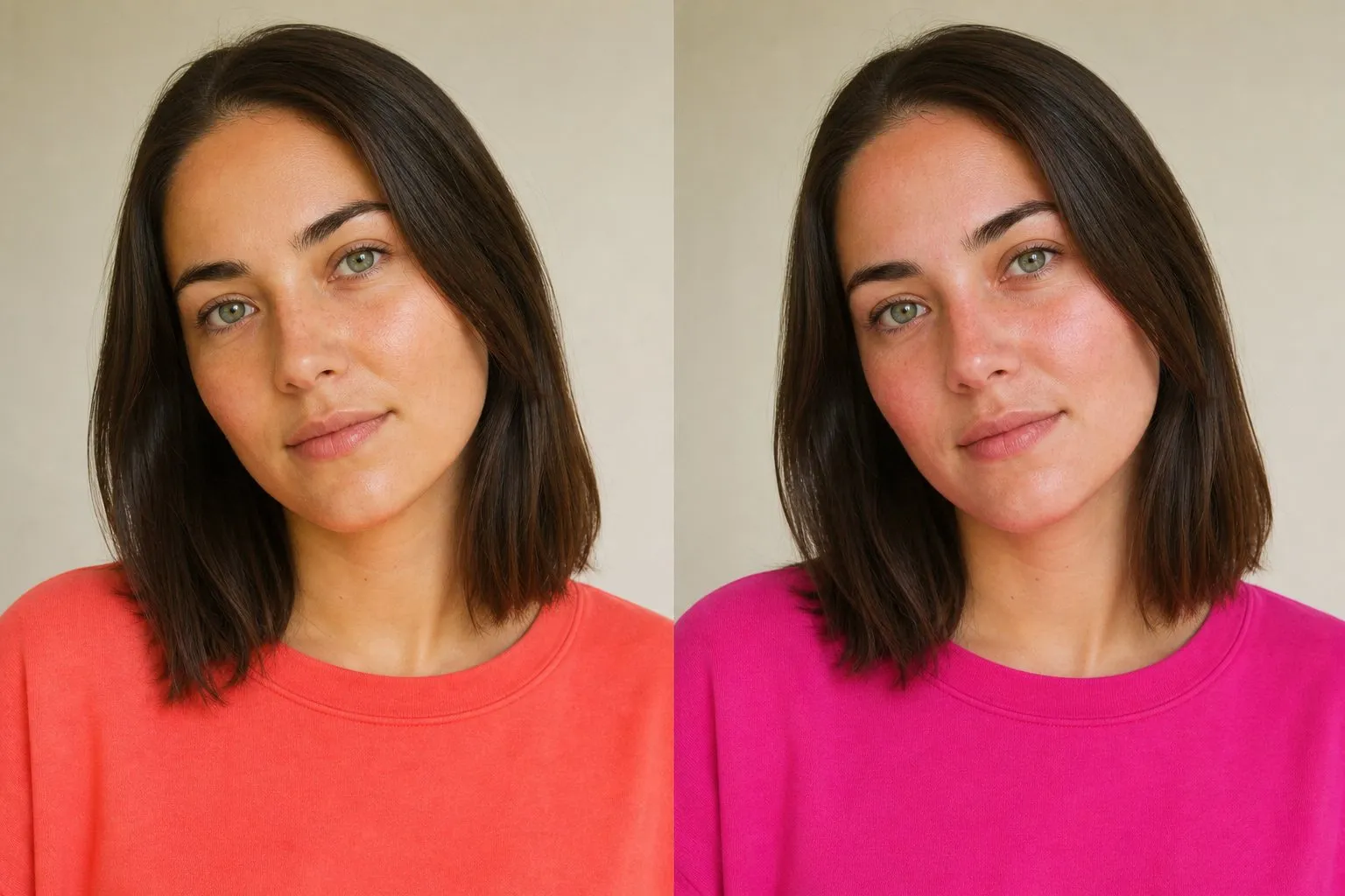
Step 2: find the temperature. Three drapes in window light, makeup off, hair tucked under a towel:
- Hot coral vs fuchsia. Temperature at its clearest. On the wrong side, warm color makes cool skin look ruddy, and cool color makes warm skin look gray or pale.
- Bright aqua vs electric blue. A green-blue against a violet-blue.
- Sunflower vs icy lemon. A golden yellow against a cool one.
Two out of three decide it. A check of the darks adds a fourth vote: espresso and polished gold against black and polished silver.
- white
- icy lemon
- hot pink
- true red
- vivid purple
- electric blue
- bright emerald
- black
When both sides look good, you sit near the line, and the colors the two palettes share are your base: pure white, royal blue, an emerald teal and a clear medium pink. Keep earthy and dusty colors away from your face whichever side you choose. You will not see this border named on a quiz result: Bright Winter shares your leading trait, so it never shows up as a Bright Spring’s runner-up. Watch the undertone line instead, where “neutral” on a Bright Spring result means your temperature sat close to the middle. The Bright Winter color palette covers the cool half of the pair.
Bright Spring, True Spring or Deep Autumn?
Bright Spring’s other borders show up as the quiz runner-up, and each names the trait that came second.
| Runner-up on the quiz | Trait in second place | Drape |
|---|---|---|
| True Spring | Warmth | Coral vs hot coral |
| Deep Autumn | Depth | Emerald teal vs dark teal |
| Light Spring | Lightness | Pure white vs ivory |
True Spring shares the warmth and part of the palette, but its contrast is medium and its darkest color is golden brown. If hot coral looks loud on you while coral looks right, or white with espresso looks harsh rather than sharp, read the True Spring color palette. Light Spring as runner-up means lightness came second; if ivory beats pure white under your chin, your contrast may be lower than you think.
Deep Autumn is the neighbor people ask about. Dark hair, dark eyes and warm skin can fit either season, and what separates them is clarity: Deep Autumn colors are dark and muted, such as brick, dark teal, forest and dark olive, while Bright Spring colors stay clean even at their darkest. Test emerald teal against dark teal, hot coral against brick, and pure white against cream. Clear winners point here; deep, muted winners point to the Deep Autumn color palette.
- cream
- dark mustard
- brick
- aubergine
- forest
- dark olive
- dark teal
- chocolate
A worked example shows how close the two can sit. Answer as a warm, high-contrast reader might: veins hard to tell, gold over silver, pure white over cream, skin that leans peach or golden, a burn before the tan, medium to dark brown hair with golden glints, clear bright eyes, strong contrast, a black top that looks fine, pastels that wash you out, and vivid colors that bring your face to life. The result is Bright Spring, with the chroma marker far toward bright and True Spring as runner-up. Now change five answers: you tan easily, your hair is black or near-black with no particular glints, your eyes are very dark brown, and a black top looks striking. The value marker jumps to the deep end, and the result becomes Deep Autumn with Bright Spring as runner-up. The clarity is still there; depth has overtaken it, and only the drapes can tell you which of the two really leads on your face.
Outfits and a Bright Spring capsule
The formula: one vivid color, one clean neutral and enough distance between them to look sharp. A hot coral top with white trousers works, and so do a royal blue sweater over a white shirt and an emerald teal dress under an espresso coat.
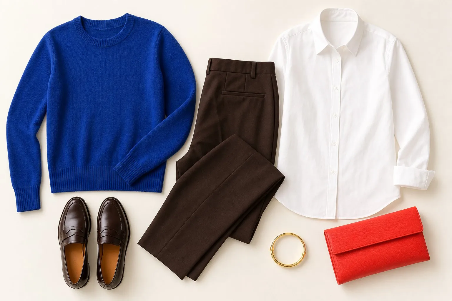
Match the high contrast in your face. Pairings at the extremes of the value scale, white with espresso or sunflower with royal blue, look natural on Bright Spring, while an outfit in one middle value can make the face look flat. Color-blocking, two or three saturated colors in large, clean areas, is the Bright Spring answer to a print.
| Role | Bright Spring color | Pieces |
|---|---|---|
| Dark neutral | Espresso | Coat, trousers, boots |
| Second dark neutral | Bright navy | Blazer, a second pair of trousers |
| Middle neutral | Light warm gray | A knit, a jacket |
| Light neutral | Pure white | Shirts, tees, white jeans |
| Four accents | Sunflower, bright aqua, emerald teal, royal blue | Knits, tops, a dress |
| Signature | Hot coral | A top, the bag, a scarf |
| Denim | Dark clean rinse | Jeans |
| Metal | Bright polished gold | Jewelry |
Twenty-odd pieces in these colors mix without planning, and the contrast comes built in: any accent against pure white or espresso already makes a high-contrast outfit.
Shine reads as clarity, so Bright Spring is the Spring that can wear it: satin, glossy cotton, patent leather, polished metal. Matte, heathered or washed-out fabrics dull the colors. If you love a soft knit, choose it in one of the cleanest colors in the palette.
Hair color for Bright Spring
| Shades | |
|---|---|
| Safe | Clear golden brown, chestnut, warm espresso |
| Stretch | Bright copper |
| Avoid | Ashy, mousy or flat shades |
Bright Spring can wear the darkest hair of any Spring, as long as the brown stays clear rather than ashy. Dark hair is part of the season’s contrast, so a big move lighter costs more here than on the other Springs: a pale blonde lowers the very contrast that makes pure white and royal blue look right on you.
Clarity is the second rule. Clear, single-tone color with shine suits this season better than heavy, high-contrast highlights or a flat, smoky shade. Ashy, mousy and flat browns take away the clarity the palette is built on, even when their depth is right. Bright copper is the stretch: vivid and warm, and the furthest from the dark browns most Bright Springs start with.
Bright Spring makeup: lips, blush, eyes and nails
| Shade | Finish | |
|---|---|---|
| Everyday lip | Warm pink | Gloss |
| Pink lip | Bright pink | Gloss or high shine |
| Statement lip | Hot coral, clear poppy | High shine |
| Blush | Warm pink, sheer hot coral | Satin |
| Eyeshadow base | Light warm gray, camel | Clean shimmer |
| Liner | Espresso; a thin emerald teal line for color | |
| Nails | Peach-beige or sheer warm pink, hot coral or clear poppy, espresso or royal blue |
Lipstick should be clear and can be glossy. Gloss and high shine look natural rather than overdone on this coloring, because shine adds clarity, the season’s leading trait. A defined brow and an espresso liner hold their own against strong colors.
Blush is the place to hold back. A warm pink or a sheer wash of hot coral is enough; the strength already sits in the lip and the clothes, and a heavy cheek on top of both looks painted.
Nails can carry the palette at full strength: hot coral, clear poppy, royal blue or espresso, all in high gloss. For a nude, choose a peach-beige or a sheer warm pink matched to the skin of your fingers.
Metals, glasses, denim and prints
Metals. Bright, high-polish gold is the Bright Spring metal. A mirror finish matches clear coloring better than brushed or antique gold, and polished silver is the Bright Winter side of the line.
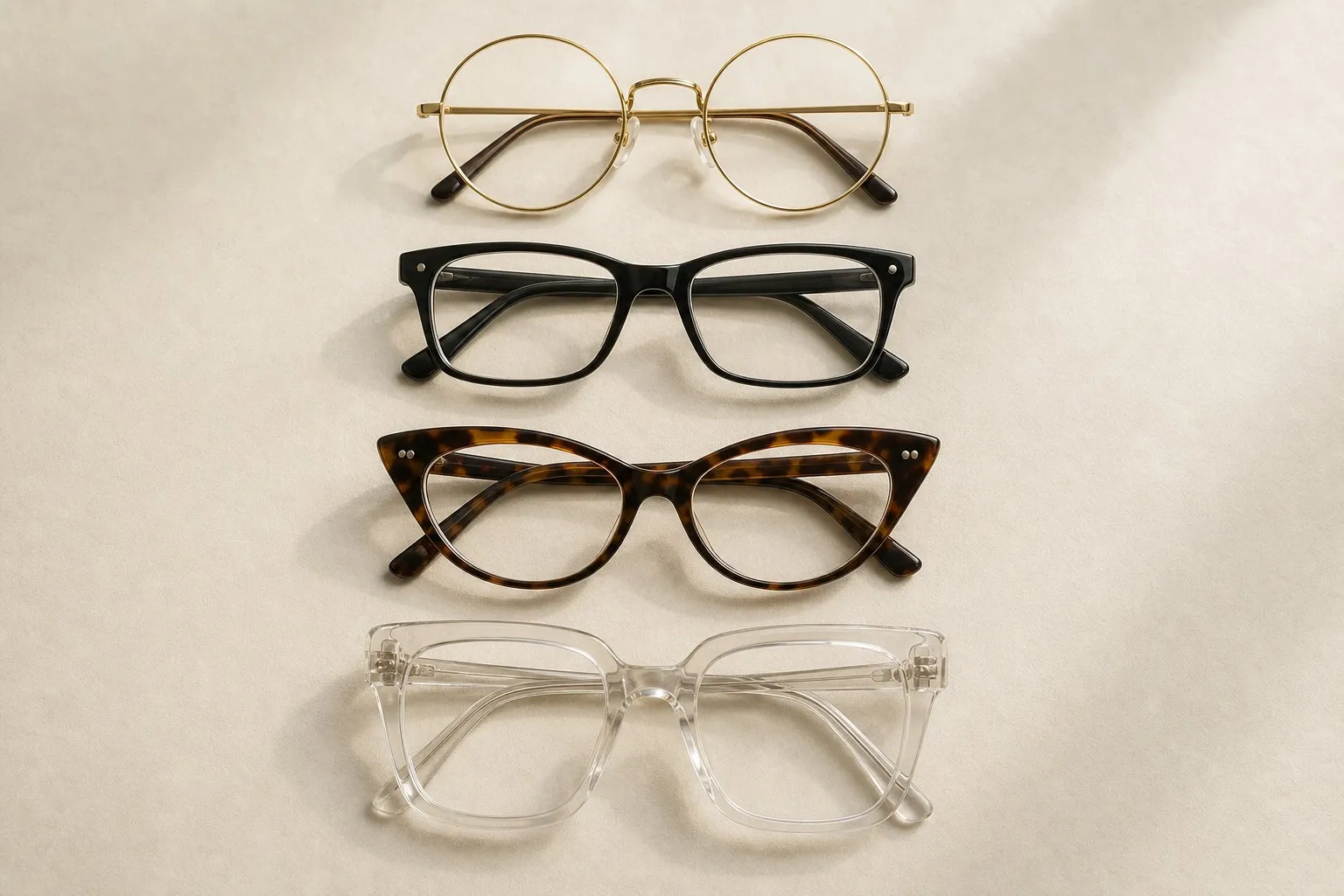
Glasses. Glossy warm tortoise, hot coral, royal blue and espresso acetate suit Bright Spring, with polished gold for metal frames. Matte, dusty or muted frames look dull against clear features. Black frames can work on dark brows, though espresso does the same job with warmth in it. For shape, see what suits your face shape.
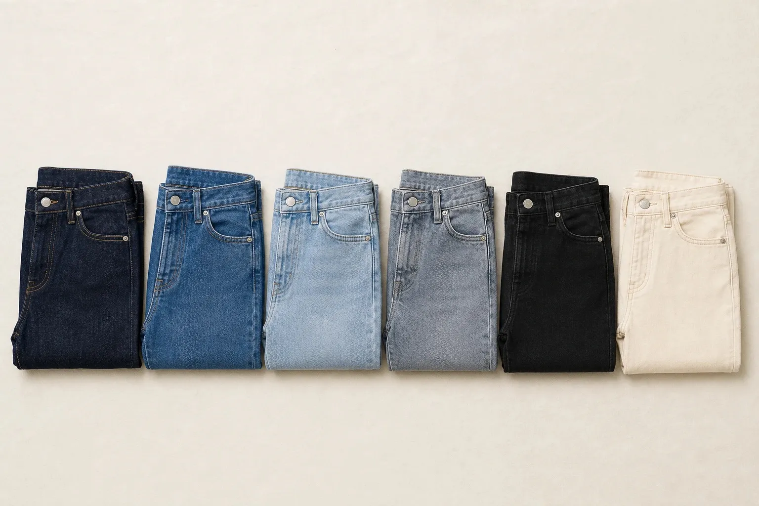
Denim. The clearest seasons want denim with no fade at all, because fading mixes the white weft into the blue and softens exactly the clarity they need. A dark, clean rinse is the Bright Spring jean. Pure white jeans are the light alternative, and black jeans work in small doses, the way black does elsewhere.
Prints. Prints can go bold: crisp royal blue and white stripes, clean hot coral and emerald teal florals on white, graphic blocks of color. What matters is that the colors stay clean and the gap between the lightest and darkest stays wide. Faded, blurred or washed-out prints look tired on this coloring even in the right hues.