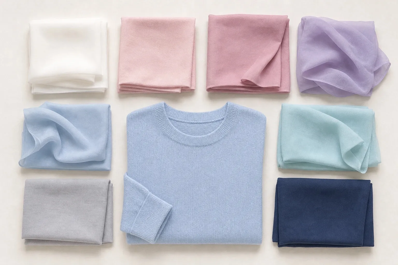
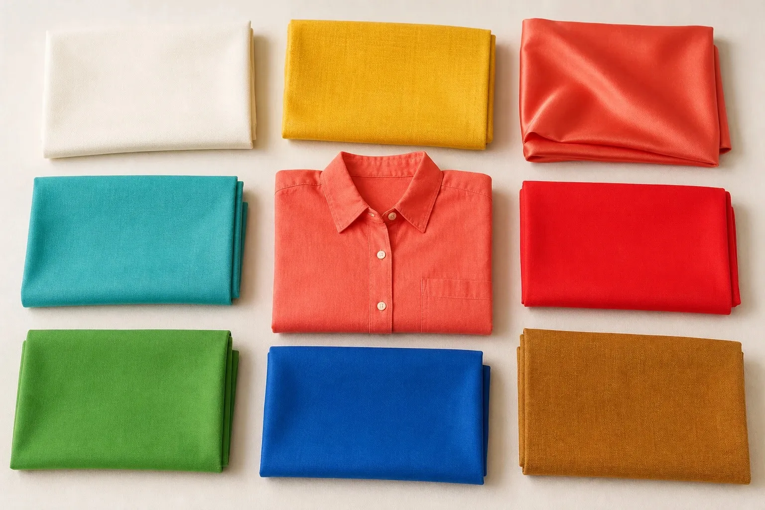
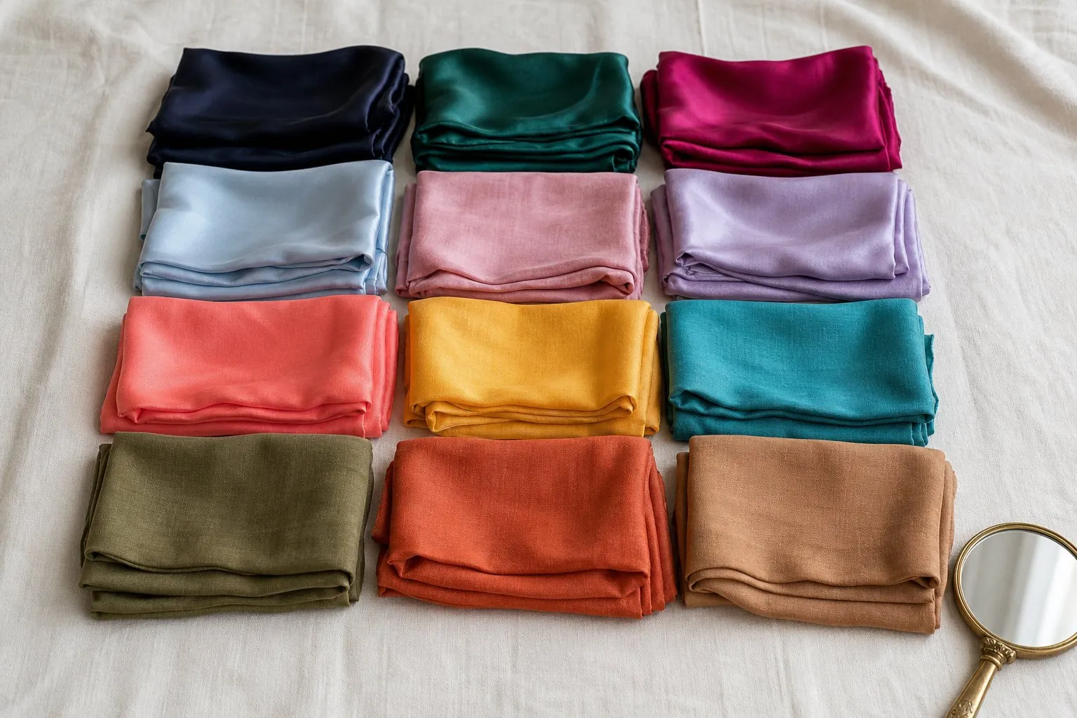
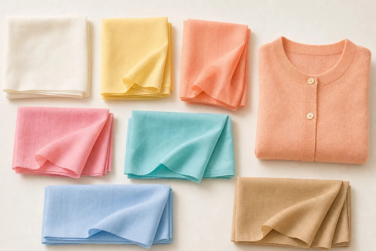
Light Spring is light first and warm second. The Light Spring color palette is pale, clear and touched with yellow: ivory, butter, peach, light coral, warm pink, aqua and clear sky, with light camel as its neutral. Nothing in it is dark, which is why black is the color this season handles worst and why light camel or a warm gray-brown takes its place. If you are torn between Light Spring and Light Summer, three pastel drapes decide it.
What Light Spring coloring looks like
Light Spring coloring is light overall, with a warmth that looks sunny rather than earthy. Hair tends toward golden, honey or strawberry blonde, or a light golden brown that shows gold at the roots in sunlight. Eyes are usually light and clear: blue, aqua or light green. Skin often shows peach or golden tones, and no feature is dark.

That last point matters most. Take a black-and-white photo of your face in daylight: on a Light Spring, hair, skin and eyes land close together in the light grays, and that small gap explains almost every rule below. Skin depth alone never settles a season, and plenty of Light Springs have no freckles or blue eyes at all. Undertones and color seasons are a styling framework, not a measurement of your skin. The tests here compare colors side by side, which anyone can repeat in daylight.
| Axis | Light Spring | What it means for your clothes |
|---|---|---|
| Value (lightness) | Light, the leading trait | Every color stays pale to medium; nothing dark near the face |
| Temperature | Warm, the second trait | Yellow in every color: peach over pink, ivory over white |
| Chroma (clarity) | Slightly clear | Fresh rather than dusty, but never neon |
| Contrast | Low | Outfits built from colors close in lightness |
Value is the Munsell word for lightness, and on a Light Spring it outweighs everything else, warmth included. A color can have exactly the right temperature and still fail because it is too deep: a tomato red, a golden brown, a pine green.
The Light Spring color palette
- ivory
- butter
- peach
- light coral
- warm pink
- aqua
- clear sky
- light camel
The eight colors share three things. Each has some yellow in it, none is grayed or icy, and all of them sit in a narrow band near the light end of the scale. Measured from their color values, the darkest of the eight, light coral, is still lighter than a middle gray, and light camel and warm pink are barely deeper than aqua. That band is the season: a Light Spring wardrobe changes hue freely and changes lightness very little.
| Role | Colors | Where it goes |
|---|---|---|
| Light | Ivory, butter, peach | Shirts, tees, anything at the neckline |
| Middle | Warm pink, aqua, clear sky, light camel | Knits, dresses, jackets |
| Strongest accent | Light coral | The red: a statement top, a scarf, a lip |
| Deepest neutral | Medium warm gray-brown (not in the strip) | Coats, trousers, shoes |
| Metal | Polished light gold | Jewelry, frames, buttons |
Light camel is the workhorse: knitwear, a trench, a bag. For coats and trousers that need more weight, a medium warm gray-brown is the deepest neutral worth owning. It is not one of the eight, but it follows their rules, warm and soft-edged, and it stops well short of black.
Neutrals, and what replaces black
| Neutral | On a Light Spring | Wear instead |
|---|---|---|
| Black | Avoid near the face | Light camel; medium warm gray-brown for coats and trousers |
| Pure white | Too stark | Ivory |
| Ivory | Yes: the light neutral | |
| Navy | Not in the palette; behaves like black | Clear sky for the blue, warm gray-brown for the depth |
| Brown | Light camel, yes; chocolate and espresso, no | Light camel, warm gray-brown |
| Gray | Light, beige-leaning gray, yes; charcoal and blue-gray, no | Light gray-beige |
| Denim | Light wash | Ivory or ecru jeans |
Black is the darkest thing you can wear, and Light Spring has the least depth of the three Springs, so the gap is as wide as it gets. Near the face, black reads as a block of shadow with a face above it: the eye goes to the edge between the two, and the skin looks paler by comparison. That is why black heads the avoid list. Lower down it costs far less, so black shoes or a black bag can stay.
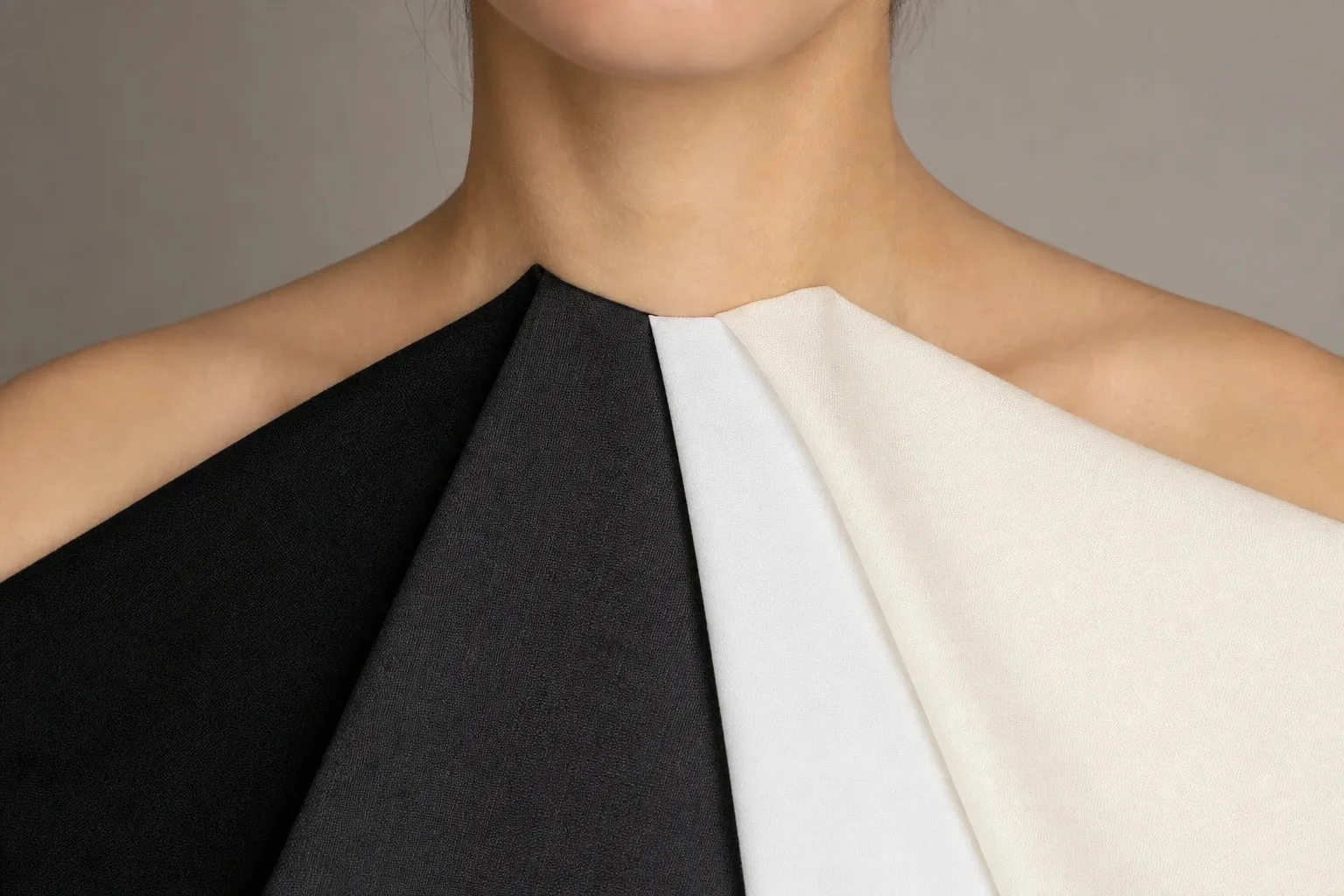
Optical white is brighter than anything in the face and can make warm skin look yellow beside it. Ivory gives the same clean line with a little warmth; hold the two under your chin and the difference shows within seconds.
Navy is the usual escape from black, but for a Light Spring it is only one step better, because a dark navy is still far deeper than the coloring. If you want a blue outfit, put clear sky or aqua on top and let a warm gray-brown carry the depth below. Brown works the same way. Light camel is yours; chocolate and espresso are not, and the lighter and warmer a brown gets, the closer it comes to the palette. Gray is possible only when it is light and leans beige. Charcoal and blue-gray belong to the cool seasons.
Light Spring colors by hue
Every hue has a Light Spring version. Lighten it, warm it and keep it clear, and it belongs.
| Hue | Wear | Skip |
|---|---|---|
| Red | Light coral | Deeper reds: tomato, cherry, burgundy |
| Pink | Warm pink, peach-pink | Powder pink, fuchsia, mauve |
| Orange | Peach, light coral | Rust, pumpkin |
| Yellow | Butter | Mustard, icy lemon |
| Green | Aqua; light, yellow-leaning greens | Olive, forest, gray-sage |
| Blue | Clear sky, aqua | Navy, royal blue, dusty blue |
| Purple | Not in the palette; borrow a light, clear violet | Plum, aubergine, mauve |
Reds and pinks. Your red is light coral: warm, light and clear. A full tomato red has the right temperature but too much weight, and burgundy has neither the temperature nor the lightness. Pink is where temperature shows fastest, because skin carries its own pink or peach and a pink near the face either repeats that tone or fights it. Warm pink and peach-pink repeat it. Powder pink, which leans blue, tends to make Light Spring skin look chalky.
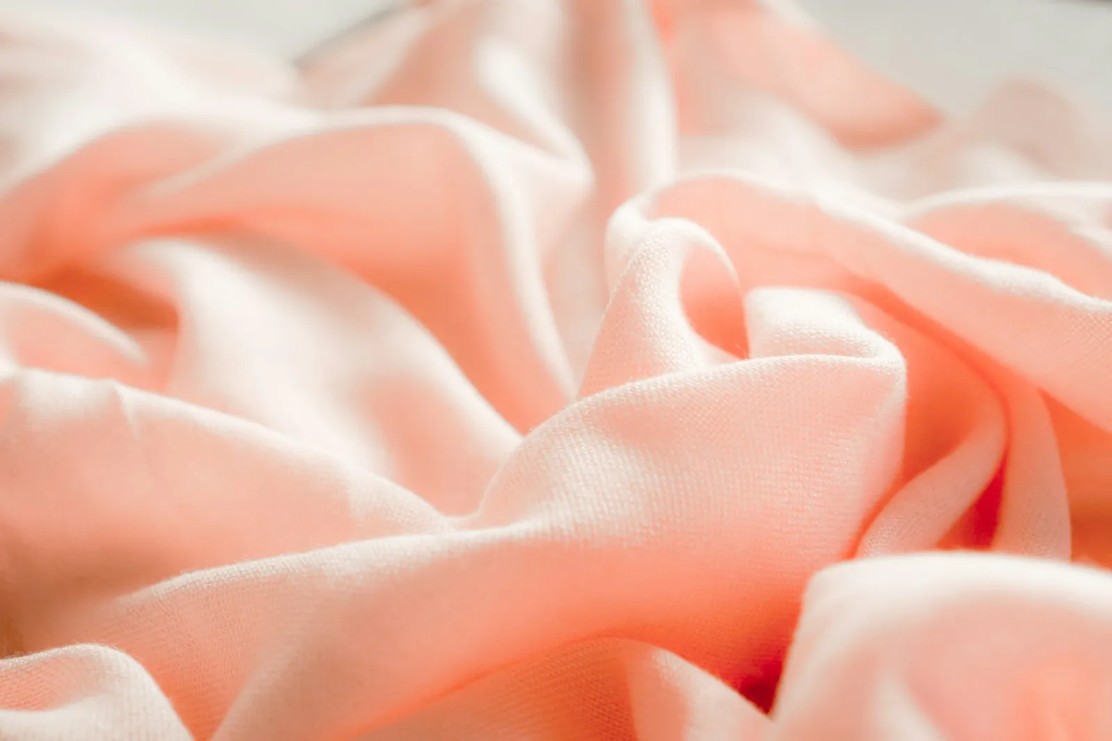
Blues and greens. Light Spring blues lean toward green. Aqua is a blue-green, and clear sky is a clean, light blue with no gray in it. The palette’s only green is that aqua; if you want a true green, keep it light and yellow-leaning, closer to a new leaf than to a pine. Navy and royal blue fail on depth, dusty blue and gray-sage on clarity.
Yellows and oranges. Butter is the one yellow, and it is easier to wear than it sounds: it sits close to ivory in lightness, so in summer it can stand in for a light neutral. Peach and light coral are the oranges. Mustard and pumpkin have the right warmth but too much depth and too much brown in them.
Purples. There is no purple in the palette. Purple mixes red with blue, and the blue half pulls it to the cool side of the color wheel, so any purple is a borrow. If you want one, choose a light, clear violet that leans toward red rather than blue, and keep ivory or peach between it and your face. Plum and aubergine fail the lightness rule; mauve fails the clarity one.
Colors to avoid, and the swaps
The palette’s avoid line names black, very dark and very dusty shades. Add the cool pastels from the Light Summer side and you have the four ways a color goes wrong on this coloring: too dark, too muted, too cool or too stark.
| Color | Why it fails | Swap |
|---|---|---|
| Black, charcoal | Far darker than the face; reads as shadow | Light camel, medium warm gray-brown |
| Navy, chocolate, burgundy | Too deep, even the warm ones | Clear sky, light camel, light coral |
| Mauve, gray-sage, khaki | Gray mixed in dulls the skin | Warm pink, aqua, butter |
| Powder pink, icy blue | Too cool: a gray cast on warm skin | Peach, clear sky |
| Optical white | Too stark: warm skin looks yellow beside it | Ivory |
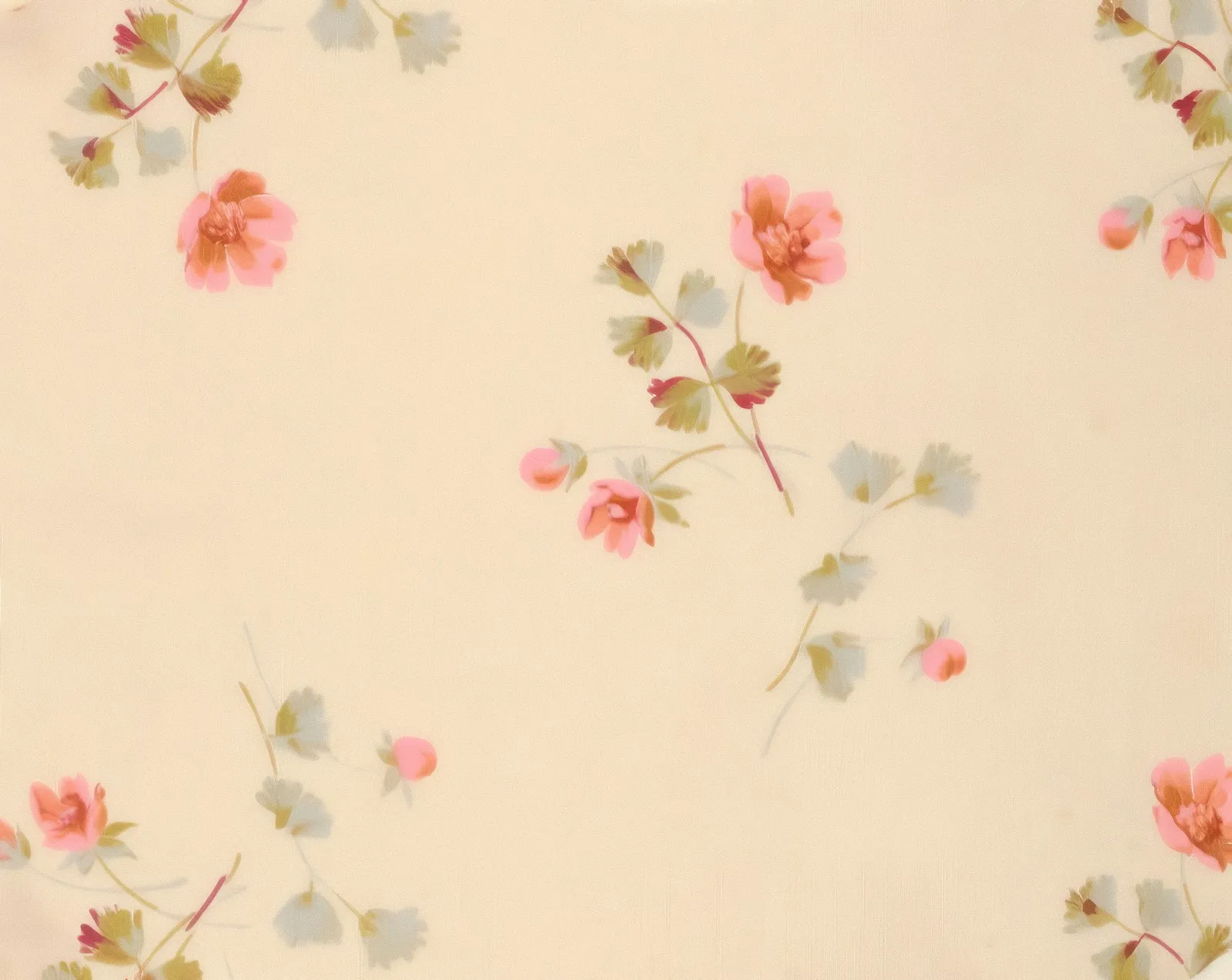
None of these has to leave the wardrobe. Wear them below the waist, in shoes and bags, or with a palette color between them and your face: an ivory collar over a navy sweater, a peach scarf on a charcoal coat. A print can carry one of them too, as long as two or three of your colors share the fabric with it.
Light Spring or Light Summer?
Light Summer is the sister season: just as light, but cool. Both are light first, so hair, skin and eyes sit close together in value; both avoid black near the face; the darkest colors in both palettes are mid-tones; and both include an aqua. The difference is temperature. Light Spring adds yellow and a little clarity, Light Summer adds blue and a little softness, and peach against powder pink puts the whole question into one pair.
Your natural coloring can hint at the side. Golden or strawberry tones at the roots and warm flecks in the eyes point to Spring; ash roots and gray-blue eyes point to Summer. Treat these as hints only. The skin decides, and fabric is how you read it.
Work in daylight from a window, with a bare face and your hair under a gray towel. Hold each color under your chin for a few seconds and watch your skin, not the fabric.
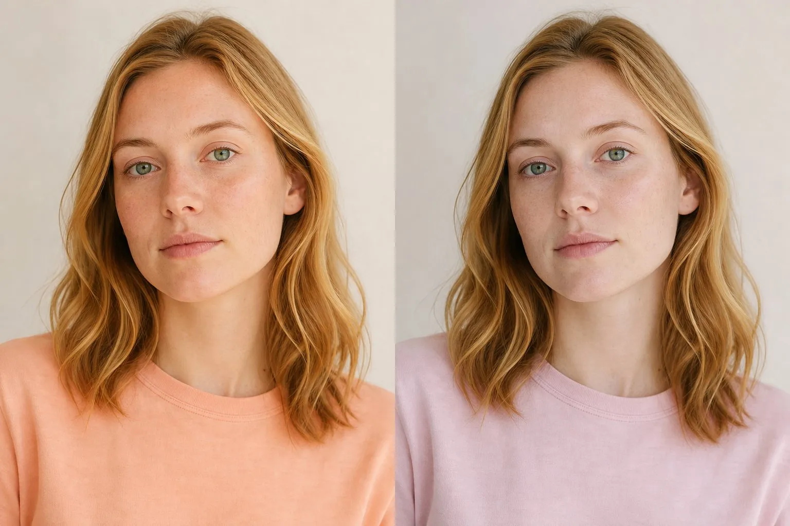
- Peach vs powder pink. On a Light Spring, powder pink looks chalky and the skin a little gray; on a Light Summer, peach turns the skin yellow or sallow.
- Ivory vs soft white. The white you wear most should match your undertone. Ivory warms a Light Spring face and looks dingy against cool skin.
- Aqua vs powder blue. A warm, slightly green aqua against a gray-tinged powder blue. Whichever makes the area under your eyes look lighter is yours.
Two out of three is an answer. Three out of three and you can stop testing.
- soft white
- powder pink
- light rose
- lavender
- powder blue
- light aqua
- light gray
- soft navy
| Light Spring | Light Summer | |
|---|---|---|
| Undertone | Warm to neutral-warm | Cool to neutral-cool |
| Clarity | Fresh, slightly clear | Soft, slightly muted |
| White | Ivory | Soft white |
| Pinks | Peach, warm pink, light coral | Powder pink, light rose |
| Blues | Aqua, clear sky | Powder blue, lavender |
| Deepest neutral | Light camel, warm gray-brown | Soft navy |
| Metal | Polished light gold | Silver, white gold |
| Avoid | Black, very dark and very dusty shades | Black, orange, heavy earth tones |
If the drapes split, you probably sit on the line, and colors from the middle serve you best: aqua, an off-white between ivory and soft white, a clear medium pink that is neither peach nor powder, and a light gray-beige. For metal, rose gold sits between yellow gold and silver and often suits skin that finds yellow gold a shade too warm.
The quiz will not name this border for you. Its runner-up comes from your second-strongest trait, and Light Summer shares your strongest one, lightness, so it never appears as a Light Spring’s runner-up. Read the undertone line instead: “Undertone: neutral” on a Light Spring result means your temperature reading sat close to the middle, which is where Light Summer begins. The Light Summer color palette shows the cool side in full.
Light Spring or another neighbor?
The runner-up the quiz does name tells you which trait came second, and each one points to a different test.
| Quiz runner-up | What came second | The drape to try |
|---|---|---|
| True Spring | Warmth, with clear color | Peach vs coral |
| Bright Spring | Clarity | Ivory vs pure white |
| Soft Autumn | Softness | Aqua vs muted teal |
| True Autumn | Warmth, with soft color | Light coral vs rust |
True Spring is warmer and more saturated, and its palette reaches down to golden brown. If coral looks better on you than peach, and golden brown looks rich rather than heavy, warmth may be your leading trait after all; the True Spring color palette compares all three Springs. Bright Spring has the contrast a Light Spring lacks: pure white, espresso, hot coral. If pure white makes your face look sharper instead of washed out, and your brows or eyes are darker than the rest of your coloring, test the Bright Spring color palette.
Soft Autumn is the neighbor people do not expect. Both seasons can have light to medium hair and low contrast; the difference is clarity. Soft Autumn colors have gray and brown mixed in, such as salmon, sage and mushroom, and Light Spring colors do not. If muted teal looks calm on you and aqua looks loud, the softness is real. Soft Summer gets confused with Light Spring for the same reason, low contrast, although it differs on two traits at once, cool and muted; peach against dusty rose settles that one quickly.
Here is how a borderline result reads. Answer the twelve questions like this: veins hard to tell, both metals look fine, cream beats white, skin neutral beige, burns quickly, dark blonde hair with no particular glints, cool light blue eyes, low contrast, black drains you, pastels freshen you, vivid and dusty colors look about the same. The quiz returns Light Spring with Soft Autumn as runner-up. The value marker sits near the light end, the chroma marker a little toward soft, and the temperature marker exactly in the middle, so the undertone line reads neutral. Nothing on the screen says Light Summer, yet a dead-center temperature is precisely the Light Summer border. The next step is the three temperature drapes above, then aqua against muted teal for the Soft Autumn question.
Outfits and a Light Spring capsule
The formula that works most often: ivory or one light accent at the neckline, a second accent in a knit or jacket, and light camel or warm gray-brown below the waist. An ivory shirt under a peach cardigan with light camel trousers works; so does a butter tee with an aqua cardigan and light-wash jeans.
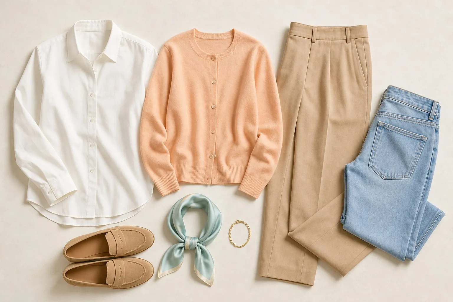
Keep the contrast inside the outfit as low as the contrast in your face. Two light colors together, such as aqua with butter or warm pink with ivory, look more like you than one light color against a dark base. When you want a stronger accent, reach for light coral, the palette’s red, rather than for a darker neutral.
| Role | Light Spring color | Pieces |
|---|---|---|
| Dark neutral | Medium warm gray-brown | Coat, trousers, one pair of shoes |
| Middle neutral | Light camel | Trench or jacket, a knit, a bag, a second pair of shoes |
| Light neutral | Ivory | Shirts, tees, a cardigan |
| Four accents | Peach, butter, aqua, clear sky | Knits, tops, a light layer |
| Signature | Light coral | A top, a dress or the scarf |
| Denim | Light wash | Jeans |
| Metal | Polished light gold | Jewelry |
Spread over about twenty pieces, those eight colors combine with each other because they share one temperature and one narrow band of lightness. Put the neutrals into the structural pieces and the accents near your face, where the palette does its work.
Winter is the hard part, because most coats come in black, charcoal and navy. Look for a light camel or warm gray-brown wool coat, wear ivory knits under it, and add a peach or light coral scarf at the neck. A dark coat you already own keeps working with that scarf between it and your face.
Smooth fabrics with a soft sheen look fresh on this coloring: cotton poplin, fine-gauge knits, light silk. Heavy, matte textures add a weight the coloring does not have, especially in the deeper neutrals.
Hair color for Light Spring
| Shades | |
|---|---|
| Safe | Golden, honey and strawberry blonde; light golden brown |
| Stretch | Light caramel pieces on light brown |
| Avoid | Black, dark brown, ashy or smoky shades |
Hair is the largest block of color near your face, so it follows the palette’s rules: a warm tone, a light level and a finish that catches light. Black and dark brown add depth the coloring does not have. Ash and smoky shades add coolness and grayness at the same time, which makes them the two directions most likely to leave a Light Spring looking tired.
Your natural shade is the best evidence you have. If it has gone mousy, move one or two steps in the same direction: a dull light brown can become honey blonde or a light golden brown without leaving the season. Lightening tends to bring up warmth, which is a problem for the Summers and a help for you, since golden and honey tones are the ones you want to keep.
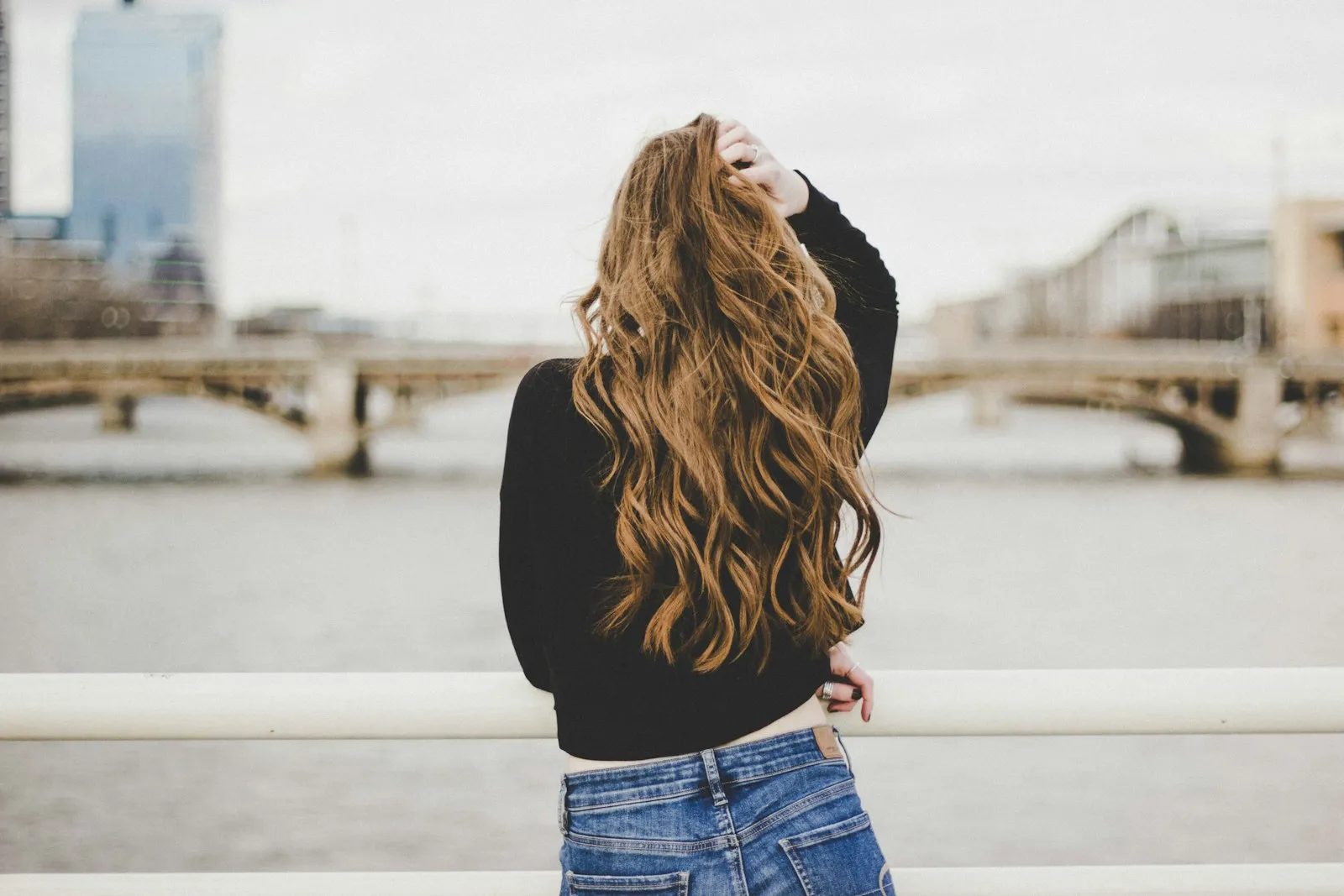
Keep highlights fine and blended, a shade or two lighter than the base. Chunky stripes add contrast your face does not have, and a deep copper, lovely on a True Spring, can look heavy against very light skin.
Light Spring makeup: lips, blush, eyes and nails
| Shade | Finish | |
|---|---|---|
| Everyday lip | Peach-pink | Sheer or gloss |
| Pink lip | Warm pink | Sheer or gloss |
| Statement lip | Light coral | Gloss |
| Blush | Peach, light coral | Sheer |
| Eyeshadow base | Ivory, light camel | Soft shimmer |
| Liner | Soft brown, soft bronze | |
| Nails | Light peach-beige, light coral, light camel |
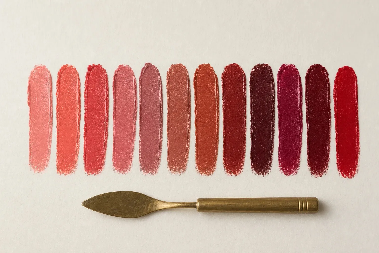
Sheer color suits a light season because it lets the lip show through: the result looks like your mouth, slightly brighter. A fully pigmented deep shade sits on top of the face the way a black top does. Light coral is as strong as a Light Spring lip needs to get.
Blush should look like your own flush, so take it from the lip family: a sheer peach for every day, light coral for more color. On the eyes, ivory and light camel make the base, and a soft brown or soft bronze liner defines the lash line without the hard edge of black.
Nails follow looser rules, because hands sit away from the face. A light peach-beige nude, light coral as the red and light camel as the darkest shade cover most days. For a darker manicure, borrow True Spring’s golden brown, which keeps the warmth.
Metals, glasses, denim and prints
Metals. Polished light gold is the Light Spring metal. Yellow gold repeats the warmth and the polish repeats the slight clarity, while silver looks cool and heavy antique gold looks too dark. Near the Light Summer line, rose gold is the bridge.
Glasses. A frame is a line across the middle of your face, so its depth matters as much as its color: aim close to your brows, which on a Light Spring are usually light. Honey, light warm tortoise, translucent peach and light camel acetate all work, with polished light gold for metal frames. Black and heavy dark frames become the darkest thing on the face. Warm tortoise is the amber, honey and golden-brown kind; the smoky, gray-brown kind belongs to cool coloring. Frame shape is a separate question, covered in what suits your face shape.
Denim. A light wash matches your depth; a dark rinse is a dark neutral in disguise and behaves like navy. In summer, ivory or ecru jeans are the alternative. Ecru is the color of undyed cotton, cream with a slight warmth, which makes it the natural white jean for a Spring.
Prints. The gap between the lightest and the darkest color in a print is its contrast, and yours should be small: butter and aqua on ivory, peach and light coral florals on cream, a fine clear-sky stripe. A crisp black-and-white stripe has the largest gap clothing can produce, the opposite of a Light Spring face.