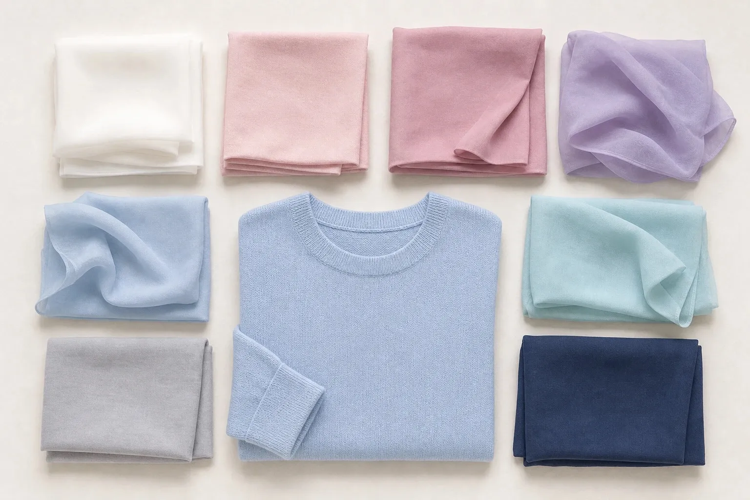
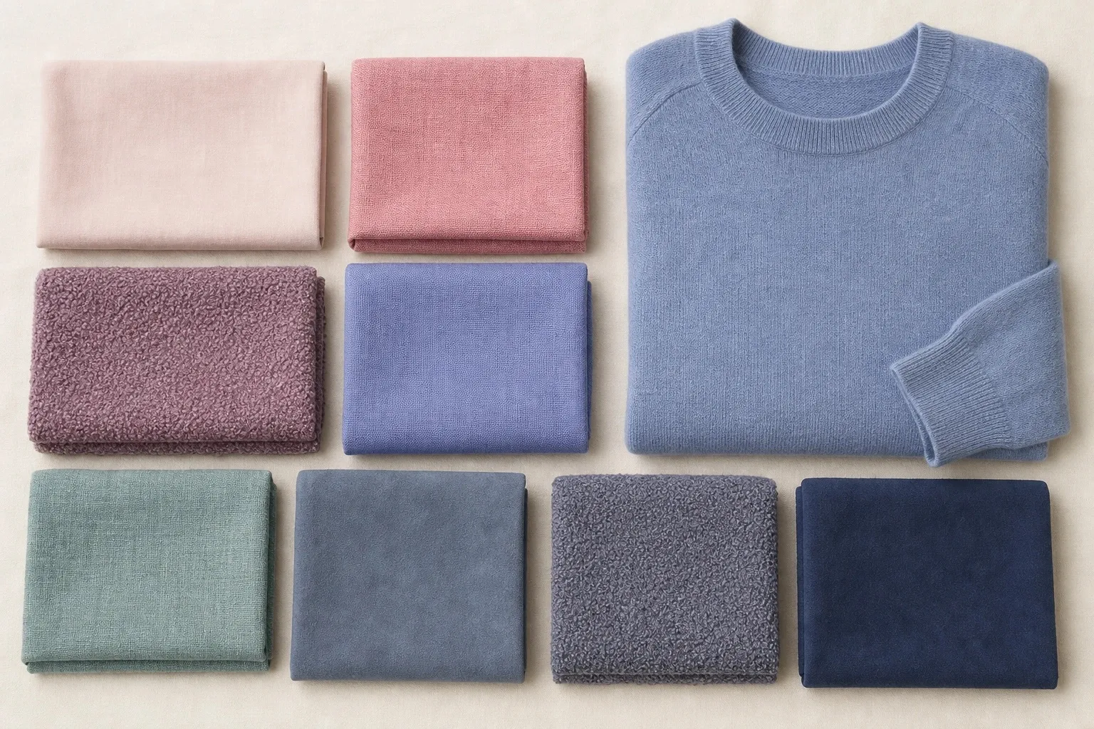
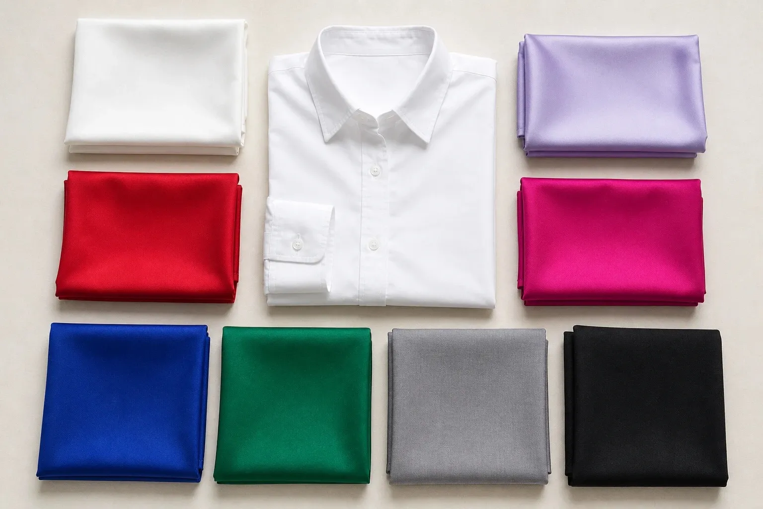
True Summer is cool first and softened second. Every color in the True Summer color palette is blue-based and calm, from rose and raspberry to cornflower, slate blue and navy, and nothing in it is golden. Some twelve-season charts call it Cool Summer. If cool colors suit you but pure black and true red feel too sharp, this is your likely season, and this page also sorts out the two questions that follow: which of the three Summers you are, and whether you might be a True Winter instead.
What True Summer coloring looks like
Coolness is the strongest note. Natural hair tends to sit between dark blonde and medium brown, with ash rather than golden glints in sunlight. Eyes are often cool blue, gray-blue or a soft cool brown. Skin shows pink or rose rather than peach, and warm colors make it look ruddy or sallow. True Summer appears from fair to deep skin; what marks it is a coolness that looks soft rather than crisp.
Contrast is medium. In a black-and-white photo, the hair is clearly darker than the skin, but without the dramatic jump that suits a Winter. That middle gap is what a True Summer outfit should copy, and it is also the quickest way to separate True Summer from True Winter, so take the photo now: daylight, bare face, hair loose, then switch the picture to black and white.


In the Color Season Quiz, temperature is the axis that decides a True Summer, and it reads cool; chroma lands on the softened side and value near the middle. That makes True Summer the center of the family and the season closest to the original four-season Summer of Carole Jackson’s Color Me Beautiful (1980), where Summer simply meant cool and soft. The other two Summers lean away from that center, one toward light and one toward gray.
Undertones and color seasons are a styling framework, not a measurement of your skin. The tests here compare colors side by side, which anyone can repeat in daylight.
The True Summer color palette
- rose
- raspberry
- soft violet
- cornflower
- slate blue
- soft teal
- blue gray
- navy
Look at the strip and two things stand out. There is no white and nothing pale: the lightest swatch is blue gray, and everything else sits in the middle or deeper. And these are the most saturated colors of the three Summers. Raspberry, cornflower and rose all carry real color, softened by a little gray rather than drained by it, which is the difference between True Summer’s rose and the dusty rose of Soft Summer.
| Role | Colors | Where they go |
|---|---|---|
| Dark neutral | Navy | Coats, trousers, shoes, bags |
| Mid neutral | Blue gray | Knits, trousers, layers |
| Light neutral (outside the strip) | Soft white | Shirts and tees near the face |
| Pinks and red | Rose, raspberry | Tops, dresses, lips |
| Blues | Cornflower, slate blue | Shirts, knits, dresses |
| Purple and blue-green | Soft violet, soft teal | Knits, scarves, prints |
| Metals (outside the strip) | Silver, pewter | Jewelry, frames |
Navy is the anchor: a clean dark blue, deeper than Light Summer’s soft navy and less gray than Soft Summer’s. It goes wherever other seasons wear black. Blue gray does the mid-neutral work in knits and trousers, and it is genuinely blue, a step cooler than the plainer grays of the other Summers. Soft white comes from outside the strip, borrowed from Light Summer’s palette, because True Summer has no light color of its own.
Soft teal is the palette’s only blue-green and the easiest way into green for a True Summer, since yellow-greens such as olive and moss lean the wrong way. Raspberry is the signature red and the deepest color after navy.
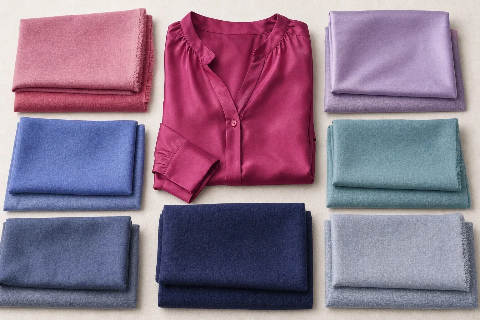
Neutrals: navy is the black
Three neutrals carry a True Summer wardrobe. The white is the same soft white Light Summer wears; the gray and the navy are a step deeper and bluer.
| Neutral | True Summer choice | Instead of |
|---|---|---|
| Light | Soft white | Optical white, cream |
| Mid | Blue gray, cool medium gray | Camel, khaki, taupe |
| Dark | Navy | Black, chocolate |
| Denim | Mid blue wash | Black, ecru |
| Brown, if you want one | Cool cocoa or rose-brown | Camel, rust, golden brown |
Black. Black is not in the True Summer palette. It is harder and darker than medium-contrast coloring, so it sits under the face like a shadow and makes softened features look less distinct. Navy is the True Summer black, dark enough to ground an outfit and soft enough to sit beside the face. Black shoes or trousers are a much smaller issue than a black top, because the effect is strongest right under the chin.
Navy. True Summer’s navy is the clearest of the Summer navies: deeper than Light Summer’s, bluer than Soft Summer’s. If a navy looks almost black indoors and makes you look tired, it is too dark; if it looks gray and dusty, it is Soft Summer’s. Choose the one that still reads as blue in daylight.
White. Soft white, never optical white. Pure white is brighter and sharper than True Summer coloring and pushes the outfit toward Winter. Cream and ivory lean yellow and fight rosy skin.
Brown. Brown is the neutral True Summers ask about most, because it is everywhere in shops. Brown is a darkened orange or red, so most browns are warm, and rust, camel and golden brown sit on the avoid list. A brown that works has rose or gray in it: cool cocoa, a grayed rose-brown, a taupe with no yellow. Wear it below the face, and keep navy for the coat.
Navy with soft white is the True Summer answer to black and white: still crisp, with a gap the face can carry.
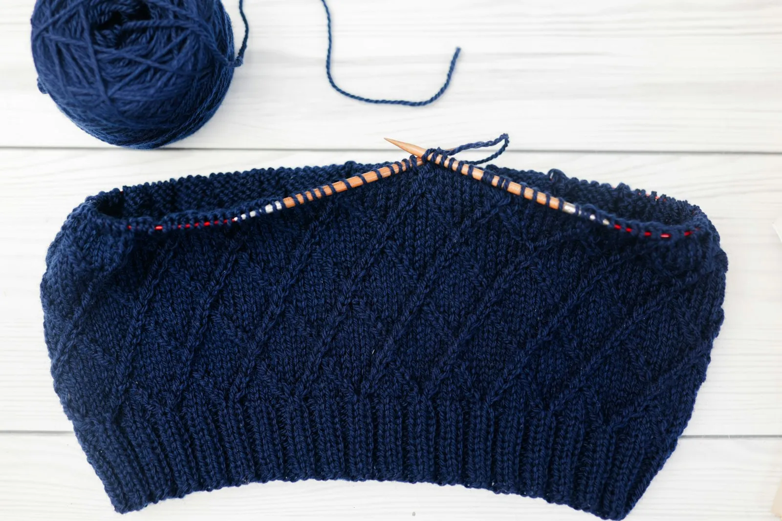
True Summer colors, hue by hue
Read the table as a shopping filter. For each hue, the True Summer member is the one that is cool, of medium depth and only slightly grayed; the right-hand column lists the members that fail one of those tests.
| Hue | True Summer version | Skip |
|---|---|---|
| Red | Raspberry | Tomato, true red |
| Pink | Rose, soft berry | Coral, hot pink |
| Blue | Cornflower, slate blue, navy | Royal blue, turquoise |
| Green | Soft teal, blue-green | Olive, moss, emerald |
| Purple | Soft violet | Deep plum, vivid purple |
| Wine | Raspberry or soft berry | Burgundy near the face |
| Yellow | None in the palette | Mustard, golden yellow |
| Orange | None | All of it, near the face |
Red is fine, as long as it is the cool, softened one. Raspberry is the True Summer red: blue-based, deep enough to hold its own, and gentle at the edges. A true red is a True Winter color, clearer than anything else in this palette, and tomato red adds warmth on top. Rose is the everyday pink and soft berry sits between the two.
Burgundy is the wine color people reach for in autumn, and it belongs to Deep Winter: darker and more saturated than any True Summer swatch. Raspberry or a soft berry gives the same effect at True Summer depth. A burgundy bag or shoes are fine; a burgundy sweater under the chin will look heavy.
The greens are narrow. Soft teal is the only blue-green in the palette, and greens that lean the same way, toward blue and slightly gray, follow it. Emerald is cool but too clear; olive and moss are yellow-greens, which makes them warm. Blues are the opposite: the widest family in the palette, from cornflower to slate blue to navy. Royal blue against cornflower is a clarity question rather than a temperature one. Both are cool; royal blue is saturated and belongs to the Winters.
Yellow and orange are the two hues with no True Summer version: yellow is where warmth lives on the color wheel, and orange is named in the season’s avoid line. If you need one, say for a sports kit, keep it away from the face.
Warm colors to avoid, and the swaps
Gold-based warm colors, orange and mustard: that is the season’s whole avoid line, and every item on it puts yellow next to pink-toned skin, which reads as ruddiness or a sallow cast.
| Avoid near the face | Why it fails | Wear instead |
|---|---|---|
| Orange, coral, tomato | Warm: rosy skin looks ruddy beside them | Rose, raspberry |
| Mustard, golden yellow | Yellow next to pink-toned skin reads sallow | Soft white, blue gray |
| Rust, camel, golden brown | The same warmth in neutral form | Navy, blue gray, cool cocoa |
| Olive, moss, khaki | Yellow-greens | Soft teal |
| Black with optical white | Sharper than medium contrast | Navy with soft white |
| Fuchsia, royal blue at full strength | Too clear; the color arrives before the face | Rose, cornflower |
The warm colors are the real problem; the clear ones are a smaller risk, because they at least share the undertone. A fuchsia scarf mixed with navy and rose in a print is wearable where a fuchsia sweater is not.
To keep a warm piece you love, move it away from the face: camel trousers, a rust bag, mustard shoes. Or cover the neckline with a palette color, such as a rose scarf over an orange-leaning knit.
Light, True or Soft Summer?
The three Summers share one thing above all: cool, gently softened color. Summer skin shows pink or rose, hair has ash rather than golden glints, and eyes run blue, gray, gray-green or soft cool brown. Contrast is low to medium. Orange, mustard and heavy earth tones make every Summer look sallow, and stark black and white looks harsh on all three. What separates them is the trait that leads.
- True Summer sits at the center, led by coolness: rose, raspberry, cornflower, navy. It borders True Winter.
- Light Summer moves up the value scale: powder pink, lavender, powder blue, with soft navy as the darkest note. It borders Light Spring.
- Soft Summer moves toward gray: mauve, dusty blue, seafoam, slate. It borders Soft Autumn.
- soft white
- powder pink
- light rose
- lavender
- powder blue
- light aqua
- light gray
- soft navy
- powder
- rose
- mauve
- periwinkle
- dusty blue
- seafoam
- sage
- soft navy
- slate
- pewter
- ivory
The six-question tally. Answer each question with L, T or S, then count. It is a sorting aid you can do in a mirror, not a measurement; the quiz and the drapes check it.
- Natural hair: light blonde to light brown (L); medium to dark ash brown (T); dark blonde to mid brown that blends with your skin (S).
- Eyes: light blue, light gray or light aqua (L); clear cool blue or gray-blue (T); gray-green, soft hazel or muted blue (S).
- Contrast: everything is light (L); hair clearly darker than skin, but not dramatic (T); everything sits in the middle and blends (S).
- Best pink under your chin: powder pink (L); raspberry (T); mauve or dusty rose (S).
- Best blue: powder blue (L); cornflower (T); dusty blue-gray (S).
- When a color fails on you, it is usually because it is: too dark or heavy (L); too warm or yellow (T); too bright or loud (S).
Four or more of one letter is a clear answer. Say your answers run T, T, S, T, T, L: four T make you a True Summer, and the one S tells you which neighbor to test second. A three-three split means you sit between two Summers.
| Light Summer | True Summer | Soft Summer | |
|---|---|---|---|
| Leading trait | Light | Cool | Soft |
| Borders | Light Spring | True Winter | Soft Autumn |
| Light neutral | Soft white | Soft white | Ivory |
| Mid neutral | Light gray | Blue gray | Pewter, slate |
| Dark neutral | Soft navy | Navy | Soft navy |
| Pinks | Powder pink, light rose | Rose, raspberry | Rose, mauve |
| Blues | Powder blue | Cornflower, slate blue | Dusty blue, periwinkle |
| Metal | Polished silver, white gold | Silver, pewter | Brushed silver, pewter |
| Avoid | Black, orange, heavy earth tones | Gold-based warm colors, orange, mustard | Bright saturated color, stark black and white |
Every Summer is cool. The question is what comes first: light, cool or soft.
If you sit between two Summers, wear the pair as one working palette and test the colors where they differ. Powder pink against raspberry splits Light from True; raspberry against mauve splits True from Soft; powder blue against dusty blue splits Light from Soft. The quiz helps here: for a True Summer result, the runner-up is Light Summer, Soft Summer or Deep Winter, whichever your second-strongest trait points to. Seasons have drawn borders, so a close second is common. The Light Summer and Soft Summer palettes show each neighbor in full.
True Summer or True Winter?
True Winter is the other season led by coolness. Blue-based pinks, berries and blues suit both, and golden, orange-based colors suit neither, so the warm-or-cool tests will not split them. What does is how clear and how contrasting the coolness is. True Winter’s palette runs from pure white to black, with true red, fuchsia and royal blue at full strength. True Summer turns all of that down: rose instead of fuchsia, slate blue instead of royal blue, navy instead of black.
- white
- icy lavender
- true red
- fuchsia
- royal blue
- emerald
- silver gray
- black
Your quiz result will not point there by itself. Both seasons are decided on the temperature axis, so True Winter never appears as a True Summer’s runner-up; what tells you is the soft-to-bright marker. If it sits close to the middle, True Winter is worth a drape.
Start with the black-and-white photo from the first section. A jump from very dark hair to light skin suggests high contrast, the Winter pattern; a gap of a few clear steps, like the one in the photo pair at the top of this page, is the usual Summer pattern. Then drape, in daylight, bare-faced, with your hair covered.
| Pair | True Summer side | True Winter side | What to watch |
|---|---|---|---|
| Reds | Raspberry | True red | Does the clear red make your skin look clean, or flushed and gray at the edges? |
| Darks | Slate blue or navy | Black | Does black frame the face or sit under it like a shadow? |
| Blues | Cornflower | Royal blue | Do your eyes look brighter, or does the blue take over? |
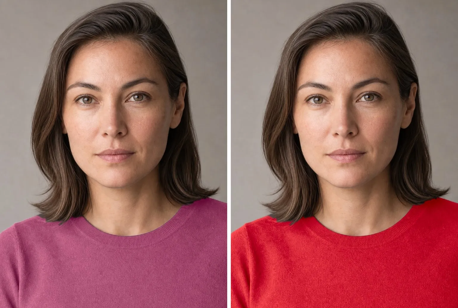
Whichever side wins two of the three is your season. If you own a fuchsia, it makes an even cleaner fourth test than true red: raspberry and fuchsia sit at almost the same depth and hue, and differ only in how clear they are. If the result stays on the line, wear the cool colors of middling clarity while you decide: navy, berry, cool medium gray and soft white. The True Winter color palette shows the clear side.
True Summer outfits and a capsule
The formula: one cool accent near the face, blue gray or soft white beside it, and navy for the larger pieces. A raspberry blouse with a navy blazer works; so does a cornflower shirt under a blue gray sweater with mid blue jeans, or a rose dress with a navy coat.
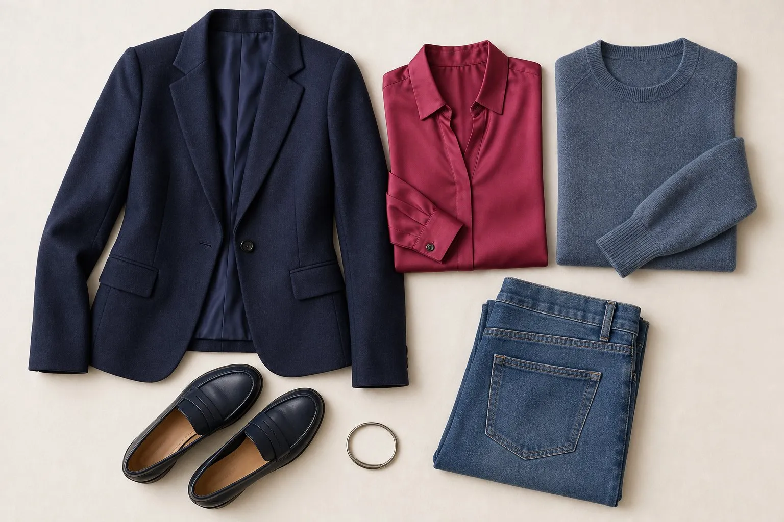
True Summer sits in the middle for contrast, so pair colors one or two steps apart in value. Navy and soft white give the most definition; navy with rose, or slate blue with soft white, feels calmer and still defined. An outfit built only from mid tones, rose with soft violet for example, looks gentle but can lack edge, so add the navy somewhere.
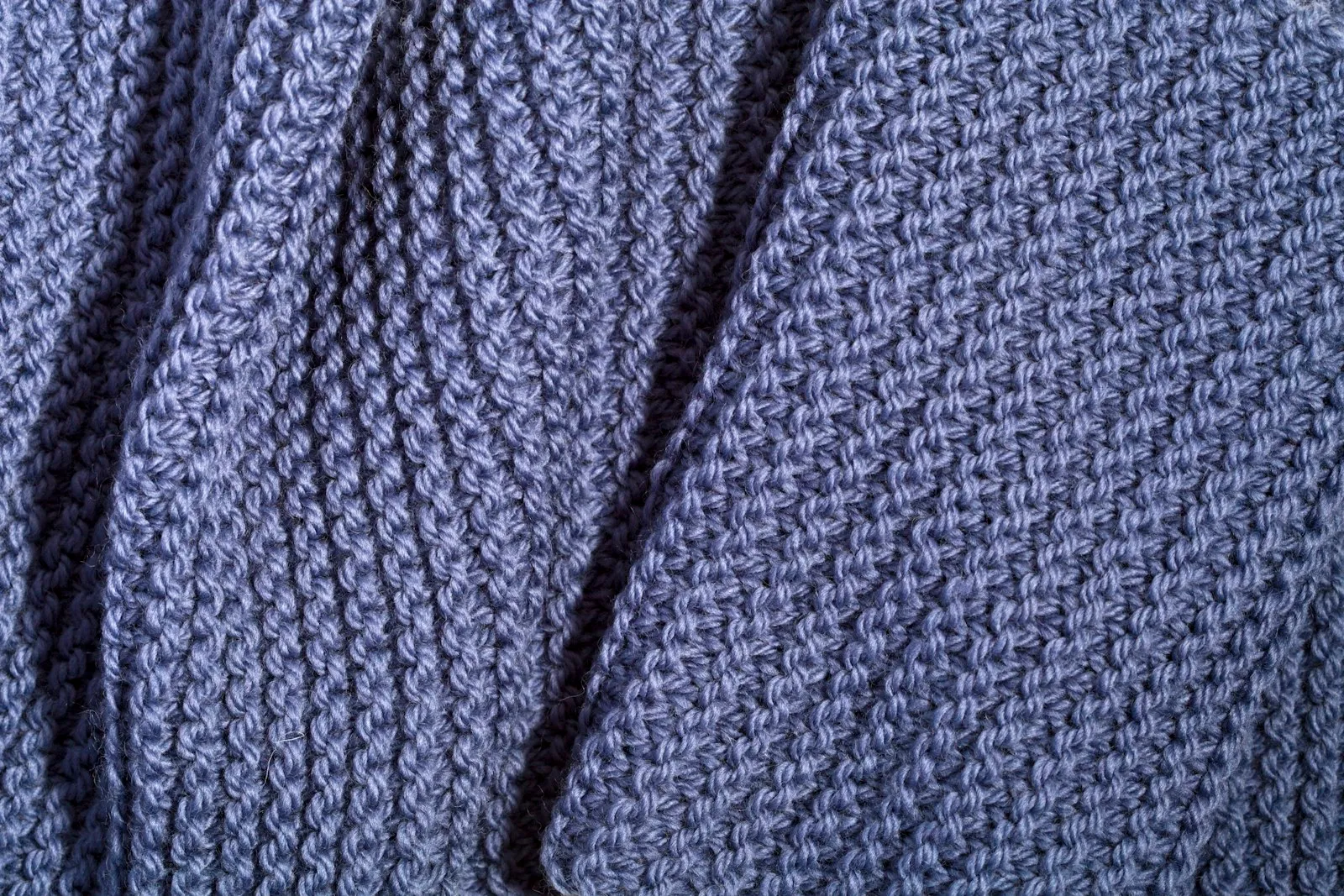
The palette is softened rather than muted, so fabrics with a gentle sheen suit it: silk with a satin finish, fine wool, smooth cotton, cashmere. Very high gloss sharpens the color toward Winter, while rough, heathered textures push it toward Soft Summer.
The capsule formula is three neutrals, four accents and one signature color. True Summer’s eight: soft white, blue gray and navy; rose, soft violet, cornflower and soft teal; and raspberry, worn more often than anything else.
| Piece | True Summer color |
|---|---|
| Coat and trousers | Navy |
| Blazer and one knit | Blue gray |
| Jeans | Mid blue wash |
| Shirt and tee | Soft white |
| Second knit | Cornflower |
| Two tops | Rose, raspberry |
| Dress | Raspberry or navy |
| Light layer | Soft violet or soft teal |
| Scarf | A print mixing the accents on navy |
| Shoes and bag | Navy, blue gray |
The neutral pieces, the expensive and long-lived ones, end up in navy and blue gray, which go with every accent. If your coat is black, it can stay; a rose or cornflower scarf at the collar does most of the repair.
Hair color for True Summer
For True Summer, hair color comes down to ash or beige tones, a medium level close to your natural shade, and a smooth finish with some shine but no high-contrast stripes.
| Safe | Stretch | Avoid |
|---|---|---|
| Ash brown, cool medium brown, dark ash blonde | Beige blonde highlights | Golden, copper, orange-caramel |
Golden, copper and orange-caramel shades put warmth right around the face, the same problem as a mustard scarf. The trap is warmth that creeps in after lightening: brown hair lifted a few levels turns orange before it turns blonde, so highlights need toning toward beige, and they fade back toward brass over time. Very dark, almost black dye raises your contrast toward Winter; a cool medium brown keeps the medium gap your palette is built on.
True Summer makeup
| True Summer | |
|---|---|
| Everyday lip | Rose |
| Pink or berry lip | Soft berry |
| Statement lip | Raspberry |
| Lip finish | Satin or cream |
| Blush | Rose |
| Eyeshadow base | Blue gray, soft violet |
| Liner | Navy, gray-brown or plum |
| Nails | Rose-beige nude, raspberry, navy or soft violet |
True Summer can wear more pigment than Light Summer: a satin or cream lip in full color looks finished rather than painted. The color still needs to stay cool and medium: rose by day, raspberry when you want a red lip. Raspberry rather than a true red is the same choice as in clothes, for the same reason.
Blush follows the lip family in rose, and eyeshadow builds on the cool neutrals: blue gray on the lid, soft violet as the color, navy, gray-brown or plum as the line. Black is not in the palette, so a black line tends to look drawn on; navy defines the eye with less edge.
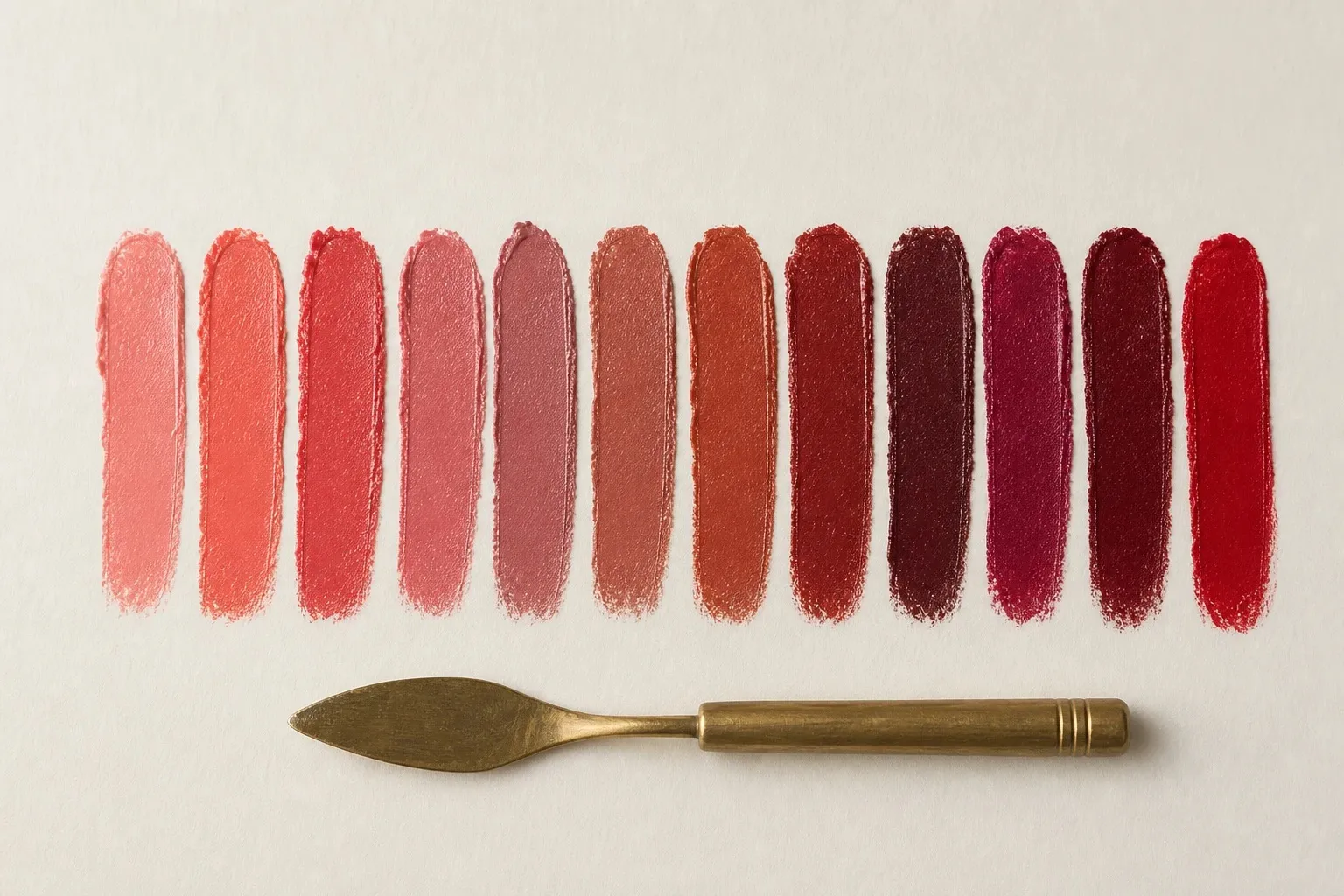
On the nails the rules can relax. A rose-beige nude matched to your fingers, raspberry as the red and navy or soft violet as the dark simply keep the hands in the same family as the outfit.
Metals, glasses, denim and prints
Metals. Silver and pewter. Their cool color matches the palette, and a brushed finish echoes the slight softness. Polished silver works too; yellow gold usually looks too warm next to True Summer coloring.
Glasses. Cool tortoiseshell, the kind with gray-brown and brown-black patches rather than amber, is the True Summer tortoise. Blue-gray, rose and navy acetate work as well, in a depth close to your brows. Golden brown and orange-toned tortoise add the warmth the palette leaves out. Which frame shape to choose depends on your face, not your season: see what suits your face shape.
Denim. A mid blue wash matches medium depth. Soft white jeans replace white ones and blue gray denim is an easy second neutral. A very dark rinse is fine below the waist, and even black jeans cost far less there than a black top would.
Prints. Match the print’s contrast to your face: medium. Navy and soft white stripes, a rose and slate floral, a cornflower check. Stark monochrome graphics are sharper than the face, and a print built on rust, mustard and olive is warmer than it.